The creators of StreetCredrecently brought their work to my attention. They like data. So do I. They’re trying to flesh out the situations when police kill an unarmed person. Unarmed does not automatically mean a person isn’t a threat. It’s interesting that the majority of these cases are not officer initiated but involve police response to a call for service for a crime in progress.
Of the 125 incidents in which police killed an unarmed civilian, 25% (31) began on traffic stops, and 65% (81) began as a response to a 911-call about a violent crime (robber, E.g.,[i], carjacking[ii], domestic violence[iii] or assault[iv]) or property crime (burglary[v], car theft[vi] or vandalism[vii]) in progress.
In addition to those, there were nine people (7%) whom 911 callers described as being, “crazy[viii],” or, “on drugs[ix]”, “covered with blood[x]”, and “yelling[xi]”, or threatening people[xii]. Three (2%) were wanted[xiii] fugitives[xiv] in the act of escape[xv] — and one was unarmed when he died but was acting as part of a gang of three who were wanted in a recent homicide and were at the time of the incident in the progress of a kidnapping a woman[xvi].
In all, there were 26 incidents that involved an assault by the unarmed civilian against another civilian before police arrived, and in two cases, the murder of other civilians by the decedent.
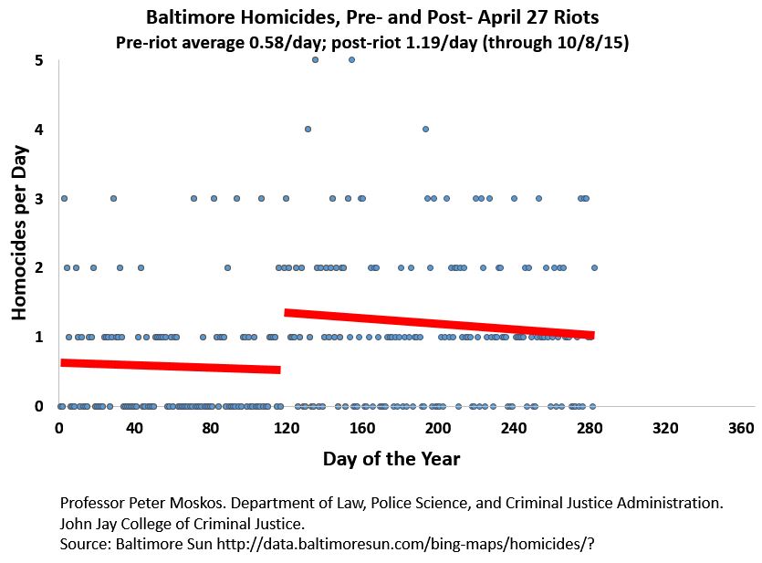
Here’s the latest in terms of Baltimore homicides, pre and post riot. The downward slope is a slight silver lining in a homicide rate the doubled overnight.
A few months ago I warned people not to believe the hype (at least in NYC). But all signs do now indicate the murders are up. The numbers below come from “The Brainroom” at Fox News. They compiled publically released data from city police departments. There are some cities where murder isn’t up, of course, but fewer and fewer. The list isn’t a random sample, but it does includes all the biggies.
All stats are 2015 year-to-date % increases versus the same time period last year.
• Austin, TX: +83.3% (22 murders versus 12, through Aug. 31)
• Denver: +75% (28 murders versus 16, through July 31)
• Milwaukee, WI: +68.3% (101 murders versus 60, through Sept. 28)
• Baltimore, MD: +54.5% (255 murders versus 165, through Oct. 3)
• St. Louis: +51.5% (153 murders versus 101, through Aug. 31)
• Washington, DC: +46.3% (120 murders versus 82, through Oct. 6)
• Houston: +34.4% (168 murders versus 125, through July 31)
• Chicago: +21.3% (359 murders versus 296, Sept. 27)
• New Orleans: +13.8% (131 murders versus 115, through Oct. 6)
• Los Angeles: +12.2% (221 murders versus 197, through Oct. 3)
• Atlanta: +9.2% (71 murders versus 65, through Sept. 26)
• New York: +7.1% (257 murders versus 240, through Sept. 27)
• Philadelphia: +6.6% (209 murders versus 196, through Oct. 6)
The New York Timesadds Kansas City, Mo and Dallas to the list:
KC is up from 45 to 54. Dallas from 71 to 83.
In these cities you have a total 25 percent increase in killings. It’s hard to imagine decreases elsewhere that would compensate for this. A nationwide 10 percent increases needs an additional 1,400 murders. What we have here, extrapolating a bit, is a year end total of maybe 770 more killings in 15 cities.
Why is this? Who knows? Anti-police ideologues will insist on the same tried and failed theories of the past. Call me crazy, but it seems to me the only really relevant variable in the past year has been all the police-related events of the past year.
“We have allowed our police department to get fetal and it is having a direct consequence,” Chicago Mayor Rahm Emanuel told Lynch. “They have pulled back from the ability to interdict … they don’t want to be a news story themselves, they don’t want their career ended early, and it’s having an impact.”
When the researchers [in San Francisco] sat by the call handlers and noted down what was happening – they found 30% of calls coming in from mobiles were accidental butt-dials, also known as pocket-dials.
As well as being time-consuming taking the call, the impact of butt-dials doesn’t stop there.
Each one requires further attention – after all, the 911 handler doesn’t know if it was a mistake, or someone trying to call for help but unable to talk at that point.
And so, all butt-dials are followed up. In the sample period, it took an average of one minute and 14 seconds to get back to people and determine the call was a mistake.
In a survey of handlers at the San Francisco 911 centre, 80% said chasing these calls back was a time-consuming part of their already overstretched day.
About 39% said it was the single biggest “pain point” they had in the job.
I heard this somewhere recently and it made me go, really? So I thought I would double check.
Indeed, one is more at risk to be murdered as a black person in America than as a police officer.
For 2013 and 2014 I get an average of about 80 officers killed on duty per year (this excludes correctional officers, traffic accidents, a few other categories.) That’s a rate of 9.0 per 100,000 (based on 885,000 officers).
Meanwhile the homicide for blacks in 2013, men and women, is 15 per 100,000. (Based on a black population of 41.7 million and 6,261 homicides in 2013.) That’s crazy. Blacks are three or four times more likely to be shot and killed as on-duty police officers.
[Now of course one could quibble that cops are only on duty 1/6 of the time and a good chunk of cops never see the street. Meanwhile being black is a 24/7 job. So hour by hour it might be more dangerous to be a cop. But stop quibbling. Even with a flawed comparison, sometimes you just need a stat just to smack you on the side of the head.]
I’m a stickler for the honest presentation of data. Too many people, it seems me, just don’t care. I mean, it is easier to just make numbers up and share a picture on facebook if it supports your ideological position.
When it comes to data analysis, I didn’t expect to find an ally in late-night TV. So check this out.
If you don’t have 7 minutes, watch from about 2:22 when Meyers (A Northwestern Alum) talks about a misleading slide presenting in a congressional hearing.
At 3:40 Meyers says, “Let’s take a closer look at this graph.” Let’s. Because nothing says pure comic gold like data analysis. And Meyers nails it:
A) “There’s a bigger number at bottom and a smaller number at the top.”
B) “You can’t have 2 million here and 300,000 there [in line with each other, horizontally].”
C) “And they made a chart with no Y-axis!”
Well played, Seth. If we ever made a bet about the words, “and they made a chart with no Y-axis” never being said on late-night TV, I guess I lose.
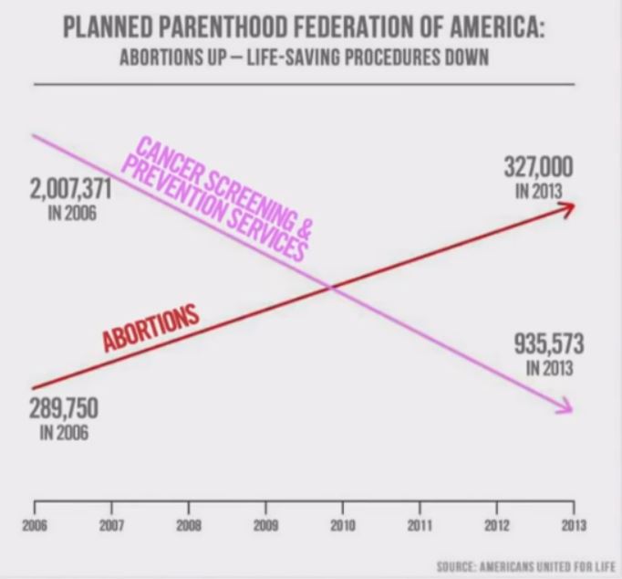
Update: Let’s play with graphs a bit. Why not? It’s fun.
Given the numbers above (which may be false), the chart should look like this:
What is “prevention services”? I don’t know. Why pick one category that perhaps (probably) decreased a lot? Well, to mislead. And based on two minutes of online research, it seems more reasonable to look at the total number of patients and the number of abortions (the abortion numbers seem to be correct, by the way). Then the chart looks like this:
Of course this looks less dramatic. And that’s exactly the point.
Now keep in mind the charts above don’t have 2 y-axes. There’s just one: the number. To use two different scales for the same measurement is weird and suspicious. But there are times when you do want to use 2 y-axes. But you can also do so to mislead. Take this:
The data are correct. But it’s still intentionally misleading. Why? Because a reasonable interpretation would be that greater incarceration numbers correlate with fewer murders. Indeed, during this time period, they did. But why did I select this decade? Because it’s the only decade where this is true. I cherry-picked the data. Not cool.
I mean, I could have picked any of these years:
Now homicide and incarceration are positively correlated now! The more people we lock up, the more people kill each other. The facts have changed. And all the data are correct. This is where it’s important to repeat that popular phrase: correlation does not equal causation.
But along with cherry picking data, I’ve done another misleading thing. I’ve changed the scale of the left y-axis: From 2000-2007 it goes from just 5.4 to 6.2! That’s just me trying to intentionally mislead (for educational purposes only).
Of course there are choices and selections you have to make in any chart. Here’s the same data but going back to 1983:
Both axes go down to zero. That’s not necessary, but other things being equal, it’s good.
I mean look at this crime drop in NYC:
Compare it to this one:
Of course it’s the same data. It’s just that on the first one the y-axis doesn’t go to zero. It makes the drop look bigger. Is that misleading? Potentially. Depending on what your point is. If your point is to highlight the actual numbers, then it’s fine. If your point is that homicide plummeted during those years (which it did), it would be somewhere between odd and misleading to start the y-axis at the lowest data point, because that seems to imply that murder dropped to zero.
Here are homicide and incarceration going back to 1925:
Now this is legit. The y-axis goes to zero. Nothing funny there. But why is it homicide rate and incarceration number? It turns out it’s just easier to get homicide rates and incarceration numbers. And it so happens, I happen to know, that in this case it doesn’t matter. The chart looks basically the same. But that switcheroo should still be a red flag to the discerning statistical consumer.
In the end, I use this:
Both y-axes are rates. No funny stuff there. I’ve also bolded the numbers and thickened the lines for better clarity. (It might also be nice to make the chart readable for black-and-white reproduction, by making one line dotted or something. But I don’t like the way that looks. And I know I’ll be showing this in color.)
Also note the left y-axis does not go to zero. That’s a choice I made. It’s not to mislead but to create a better visual presentation. The point I’m trying to make, based on the data, is that there isn’t any inherent correlation between crime and incarceration. Homicides go up and down for whatever reason; incarceration is a political choice related to the war on drugs.
But the discerning reader might observe, “how the hell do you know numbers from 2015 when they year isn’t over?!” Good point. I don’t. I basically made an educated guess for the sake of visual clarity. Can I do that? Sure. I’ll update the info next year when I do know. It matters that the specific 2015 data point isn’t really important here. This is a choice based on my needs for this chart. I want the x-axis labeled at nice intervals. And if the data ends in 2014, it looks funny (like in the chart immediately above).
Adrian Schoolcraft wanted money and he got it, according to the Post.
Schoolcraft wasn’t the first to point out that the NYPD was under intense (and illegal) quota pressure. He’s just, as I wrote.
The only one, in my humble opinion, who has tried to martyr himself and turn number fudging into a tidy personal $50 million profit. He and his father have tried twice before to sue police departments for money. Maybe the third time is the charm.
It was.
Here’s what I’ve written about this, in chronological order.
In the New York Times David Brooks repeats John Pfaff’s argument in Slate that the war on drugs isn’t responsible for our crazy high prison population. Brooks vouches for Pfaff as “wonderfully objective, nonideological and data-driven.” That might all be true. Pfaff is probably a swell guy and kind to animals, too.
There’s something to be said for talking to warm human beings rather than correlating cold data. Now admittedly being “data-driven” does beat the alternative of just making shit up. But the problem one sees in the “data-driven” fields (and Brooks is an economist) is that if you don’t understand the data in the first place, you can be “data-driven” till the polynomial regressions correlate with statistical certainty… and still be wrong.
The fact of the matter is in today’s state prisons, which hold about 90 percent of all of our prisoners, only 17 percent of the inmates are there primarily for drug charges.
No shit. But who really thinks that only convictions related to the War on Drug are “drug charges”? (It’s worth mentioning that a violent drug dealer might cop a plea to a “non-violent possession” charge, but still be sent to prison for the crime actually committed.)
The War on Drugs doesn’t just create “drug” prisoners. Prohibition creates unregulated public drug markets. That’s where the violence is. Prohibition doesn’t lessen addiction. And that’s where you find the property crimes. We need to end the drug war not to release a bunch of pot-heads from prison but to change the violent culture of the streets.
The main problem with the War on Drugs — and it’s not locking up too many non-violent drug users — is the violence inherent in an illegal public drug market. Pacifists don’t last long slinging on the corner. Arresting a drug dealer creates a job opening for another potentially violent street-corner dealer. Lawyers and economists should be able to understand that.
As I suspected (and hoped) crime was not up last year. Of course it was up some places (and thus down in others). What a country we live in: we can send a man to the moon and don’t know how many people were murdered in 2014 until late September, 2015.
When the 2015 figures come out in a year and show a 2 percent increase in homicides, mark my words: people are going to scream about skyrocketing crime. I mean, people in NYC have been screaming for skyrocketing crime (yes, I “for” as well as “about”) since, well, De Blasio (about 2 years now). Imagine the crescendo if crime were actually go up nationwide. Gee, I wonder if some will blame Obama?
From the Crime Report: “Murders, which are the most accurately reported crime, decreased .5 percent last year to 14,249, the FBI said. The total was a drop of nearly 15 percent from the 2005 national count.”