Nick Selby and I made a podcast! Check it out at qualitypolicing.com/. The first episode is up. And cut us some slack, it’s the first episode.

Nick Selby and I made a podcast! Check it out at qualitypolicing.com/. The first episode is up. And cut us some slack, it’s the first episode.
Building on my previous post on data presentation, I did some grunt work to get a count of murders and shootings for each and every day since January 1, 2012. (If you think that’s easy or [that] can be readily downloaded, you’re wrong. Update: I could have saved a few hours of grunt work had I thought of using the =VLOOKUP function in excel to fill in missing dates that had no major crimes.)
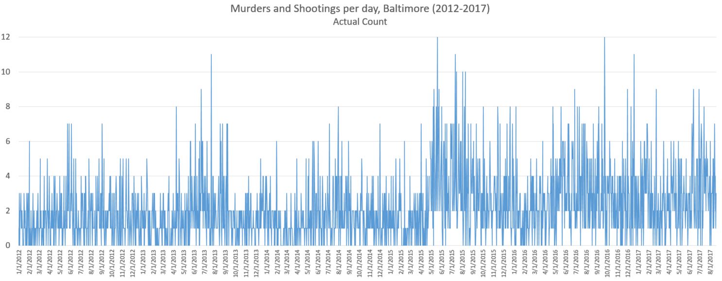
If you simply chart the data, you get this kind of chart, which might be cool in an abstract expressionist blurry kind of way, but it’s next to worthless as a form of data presentation.

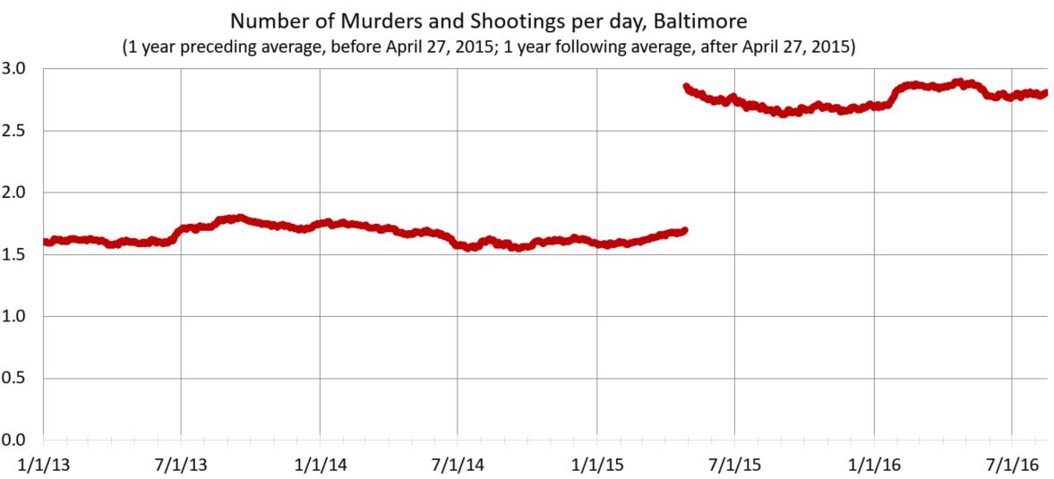
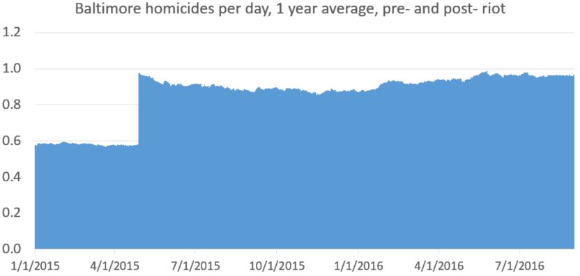
Here’s the same data, given a bit of love and handling. For all the reasons mentioned in my previous post. I went back to a one-year moving average, split on April 27, 2015, the day of the Baltimore riots. (Pre-riot takes the average from preceding year; post-riot from the year following.) What I’m trying to highlight, in an honest way, is the large spike in murders and shooting immediately after the riots and Mosby’s decision to bring flimsy criminal charges against six Baltimore City police officers.

Unlike other crimes, shootings and homicides are reported quite accurately. Other crimes will rise and fall in sync. (And if the data doesn’t show that, consider those data flawed, particularly in terms of less accurate reporting.) And if you’re more partial to a line graph:
The riots were a big deal, but nobody died. More important to policing and public safety was what happened after the riots. Nobody was holding the tiller. The department was basically leaderless. The mayor had been almost in hiding. Then Mosby made the biggest mistake of all. She criminal charged six officers for doing their job — legally chasing and arresting a man running from an active drug corner (this man, Freddie Gray, then died in the police van and that led to riots). Mosby got no convictions because she had no case. She couldn’t prove a crime, much less culpability. She would later say, “I think the message has been sent.” Police got the message: if you do your job and somebody dies, you might face murder charges. Activists and Baltimore’s leaders pushed a police-are-the-problem narrative.
Police were instructed — both by city leaders and then in the odd DOJ report city leaders asked for — to be less proactive since such policing will disproportionately affect minorities. Few seem to care that minorities are disproportionately affected by the rise in murder. Regardless, police were told to back off and end quality-of-life policing. So police did. But, unlike the arrest-’em-all strategy formulated by former Mayor O’Malley (which worked at reducing crime a little) discretionary enforcement of low-level offenses targeting high-risk offenders reduced violence a lot. It also sent a proper message to non-criminals that your block and your stoop were not going to be surrendered to the bad boys of the hood.
Of course these efforts will disproportionately affected blacks. In a city where more than 90 percent of the murderers and murder victims are black, effective anti-violence policing will disproportionately affected blacks (Of course, bad policing will, too). The rough edges of the square can be sanded down, but this is a square that cannot be circled. Reformers wanted an end to loitering and trespass arrests. Corner clearing basically came to a stop. Add to this other factors — fewer police officers, the suspension of one-person patrol units, poor leadership — and voilà: more violent criminals committing more violent crime.
Murders and shooting increased literally overnight, and dramatically so. Of course this took the police-are-the-problem crowd by surprise. By their calculations, police doing less, particularly in black neighborhoods, would result in less harm to blacks. And indeed, arrests went way down. So did stops. So did complaints against policing. Even police-involved shootings are down. Everything is down! Shame about the murders and robberies, though.
Initially this crime jump was denied. Now we’re supposed to think it’s just the new normal for a city in “transition.” How about this narrative: police and policing matter; and despite all the flaws in policing at a systemic and individual level, police and policing are still more good than bad, especially for society’s most at risk. There is no reason to believe that the path to better policing much pass through a Marxist-like stage of “progressive reform” before improving. We pay police, in part, to confront violent criminals in neighborhoods where more than 20 percent of all men are murdered. We own this to those, all of those, who live there. To abdicate police protection in the name of social justice in morally wrong.
And lest you think this rise in crime is only a problem in Baltimore, be aware that over the past three years, homicide is up dramatically in America, almost everywhere. Not just Baltimore and Chicago. Unprecedentedly so, in fact.
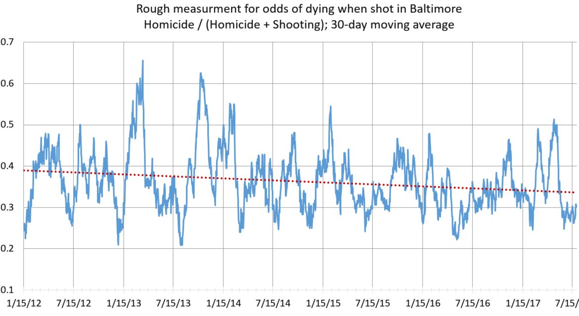
In related news, the odds of dying if shot in Baltimore have gone down slightly since 2012, presumably because of better medical care. It’s a crude measure, but notice the downward slope of the trend line. The chance of dying has gone down from 39 percent to 34 percent. Also note the seasonal changes in mortality. I don’t know why that is.

Data presentation fascinates me because it’s both art and science. There’s no right way to do it; it depends on both hard data, good intentions, and interpretive ability. Data can be manipulated and misinterpreted, both honestly and dishonestly. And any chart is potentially yet another step removed from whatever “truth” the hard data has.
Where I’m going isn’t exactly technical, but there’s no point here other than data presentation and honest graph making (and also crime being f*cking up in Baltimore after the riots, but that’s not my main point). If that doesn’t interest you, stop here. [Update: Or jump to the next post.]
I took reported robberies (all), aggravated assaults, homicides, and shootings from open data from 2012 to last month. I then took a simple count of how many happen per day (which is strangely not simple to simple to analyze, at least with my knowledge of SPSS and excel). You get this.
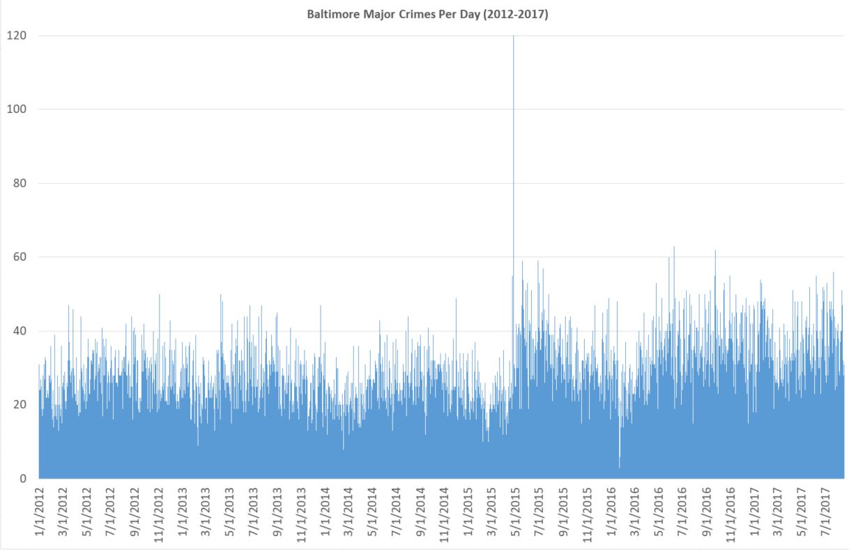
It takes a somewhat skilled eye to see what is going on. Also, since the day of riot is so high (120), the y axis is too large. With some rejiggering and simply letting that one day go off the scale unnoticed, you get this.
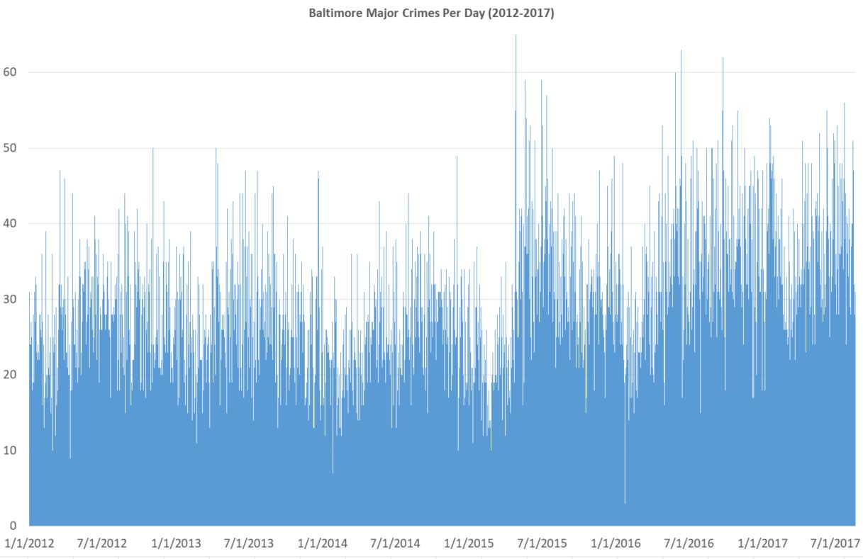
It’s still messy, but is the kind of thing you might see on some horrible powerpoint. Things bounce up and down too much day-to-day. And there are too many individual data points. Nobody really cares that there were more than 60 one day in July 2016 and less than 5 in early 2016 (I’m guessing blizzard). It’s true and accurate, but it’s a bad chart because it does poor job of what it’s supposed to do: present data. Again, a skilled eye might see there’s a big rise in crime in 2015, but the chart certainly doesn’t make it easy.
Here’s crimes per day, with a two-week moving average. A moving average means that for, say September 7, you take Sep 1 through Sep 14 and divide by 14. Why take an average at all? Because it smooths out the chart in a good way. It’s a little less accurate literally but much more accurate in terms of what you, the reader, can understand. One downside is that the number of crimes listed for September 7th isn’t actually that number of major crimes that happened on that day. You can see why that might be a big deal in another context. But here it isn’t.
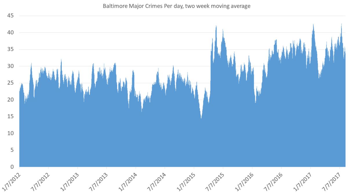
For a general audience it’s not clear what exactly the point is. You still have lots of little ups and downs, and the seasonal changes are an issue. (Crimes always go up in summer and down in winter. And it’s not because of anything police do. And it’s nothing do to with the non-fiction story I’m trying to tell.) On the plus side, you do see a big spike in late April, 2015, after the riots and the absurd criminal prosecutionof innocent Baltimore cops. But it needs explaining.
Also, you need some buffer for the data. The bigger the average, the more of a buffer you need. But for this I think this is one perfectly fine way to present these data, at least for an academic crowd used to charts and tables.
Another tactic is to take the average for the past year. Jeff Asher on twitterover at 538.comdoes good work with NOLA crime and is a fan of this. It totally eliminates seasonal issues (that’s huge) and gives you a smooth line of information (and that’s nice).
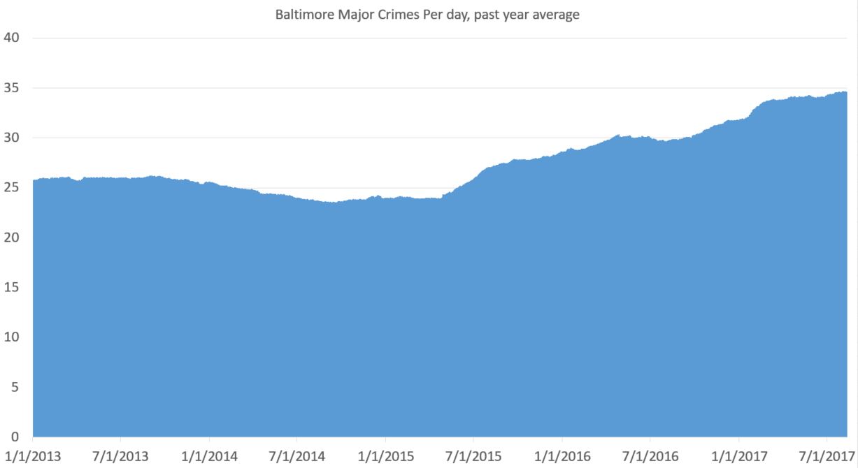
You can see a drop in crime pre-riot (true) and a rise in crime post-riot (also true). That’s important. Baltimore saw a drop in crime pre-2015 that wasn’t seasonal. It was real. And the rise afterward is very real. But there are two problems with this approach: 1) you need a year of data before you get going and 2) everything is muted. What looks like a steady rise (the slope since 2015) is actually a huge rise. But it looks less severe than it is because it takes an average from the previous year. But that’s not exactly true. Crime went up on April 27, 2015. And basically stayed up, with a slight increase over time.
Here’s my problem. I want to show the rise in crime post-riot. But I want to do so honestly and without deception. But yes, for the purpose of this data presentation, I have a goal. (My previous attempts were pretty shitty.)
Also, you need at least a year of data before you can graph anything. That’s a downside.
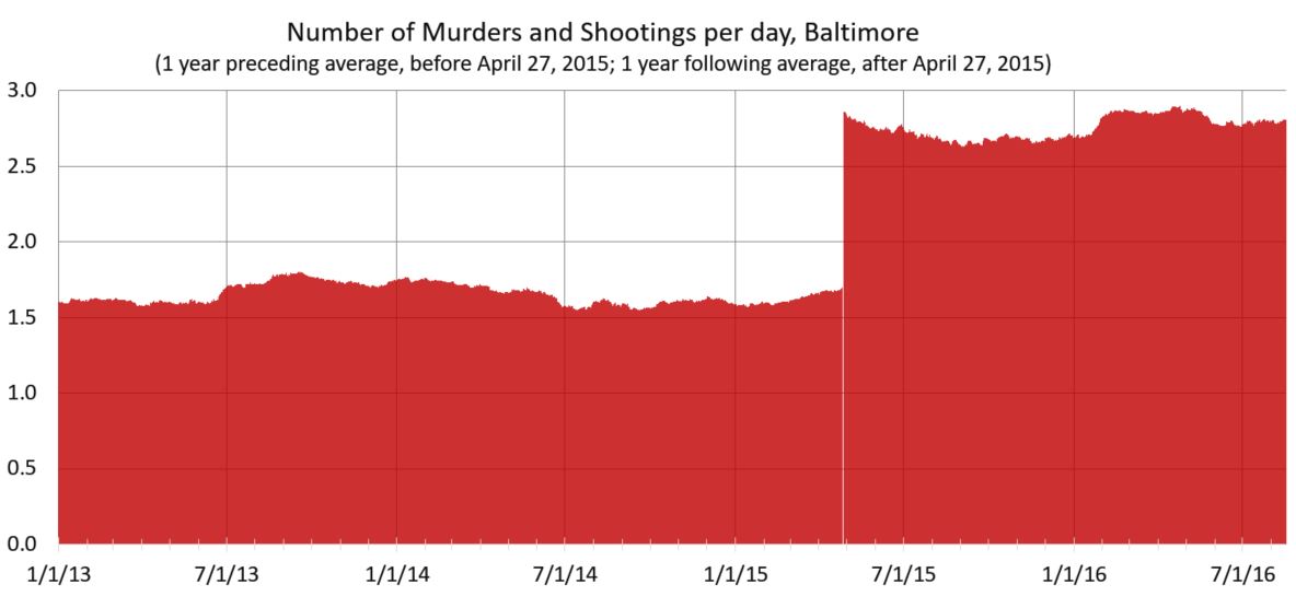
Here’s my latest idea. If one is looking at a specific date at which something happened — in this case the April 27, 2015 — and trying to eliminate seasonal fluctuations, why not take the yearly average for the previous year before that time and the yearly average after that date for dates after that time? I think it’s kosher, but I’m not certain.
Here’s how that works out:
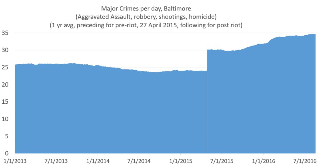
This shows the the increase that was real and immediate. And as minor point I like the white line on the day of the riot, which I got from removing April 27 from the data (because it was an outlier).
Now if I wanted to show the increase in more stark form, I would move the y axis to start at 20. But being the guy I am, I always like to have the y-axis cross the x-axis at 0. That said, if the numbers were higher and it helped the presentation of data, I have no problem with a y-axis starting at some arbitrary point.
Take into account that graphs are like maps. While very much based on truth, they exist to simplify and present selected data. I mean, you can have my data file, if you want it. But I do the grunt work so you don’t have to. But of course my reputation as an academic depends on presenting the data honestly, even though there’s always interpretation (e.g.: in the case of a map, the world, say scientists, isn’t flat). The point, rather, is if the interpretation honest and/or does the distortion serve a useful purpose (In the case of the Mercator Projection it was sea navigation; captains didn’t gave a shit about the comparative size of the landmass of Greenland and Africa.)
So taking an average smooths out the line of a chart, which is a small step removed from the “truth,” but a good stop toward a better chart. It’s not a bad approach. But it tends to mask quick changes in a slow slope, since each data point in the average for a lot of days. A change in slope in the graph actually indicates a rather large change in day-to-day crime. There are always pluses and minuses.
If you’re still with me, here’s what you get when just looking at murder. Keep in mind everything up to this point has been the same data on the same time frame. This is different. But homicides matter because, well, along with people being killed, it’s gone up much more than reported crime.
[My data set for daily homicides (which is a file I keep up rather than from Baltimore Open Data) only goes back to January, 2015. So I don’t have the daily homicide count pre-2015. 2014 is averaged the same for every day (0.5781). This makes the first part of the line (pre April 27, 2015) straighter than it should be. This matters, and I would do better for publication, but it doesn’t change anything fundamentally, I would argue. At least not in the context of the greater change in homicide. Even this quick and imperfect methods gets the major point across honestly. ]
Update and spoiler alert: Here’s a better version of that chart, from my next post.
Last postI talked about what didn’t cause the 2015 riots in Baltimore. Well, what did? Macro theory too often assumes happenings and history are per-ordained, that leadership decisions don’t have consequences, and that individuals have no free will. But what if the buses kept running? What if police continued to disperse crowds in the street instead of retreating? What if Gregory Lee Butler hadn’t cut (or been able to cut) a fire hose outside the burning CVS? What if police had arrested him on the spot? These things matter. If they don’t, I don’t know why we bother to try at all.
The riots were not inevitable. Systemic problems matter, but they’re a constant. As important as they are, poverty and segregation and drug addiction and broken families and violence are nothing new in Baltimore. And they certain were not worse in 2015 than they were in the preceding decade. Why on April 27, 2017 and not on April 25 or 26? Or why not in 2003, when police arrested 312 people a day, many for minor zero-tolerance bullshit reasons? By 2014, the arrest rate had dropped by two-thirds and violence was down. God did not ordain Baltimore would burn a week after the death of Freddie Gray. It didn’t have to happen.
Bad leadership caused the Baltimore riot of April 27, 2015. Effective leadership and tactics can be the difference between a protest or even a violent disturbance and a riot. The latter happens not just because people are pissed off. People are always pissed off, sometimes for good reason. Now this is a weird point to make, but Freddie Gray wasn’t the first guy to die in the back of a police van; sadly, since the city still hasn’t procured safe transport vehicles, he probably won’t be the last. Angry people are a necessary but insufficient cause of rioting. Poor decisions in planning, message, and tactics let a bad situation spiral out of control.
Bad leadership has consequences. If not, why seek good leadership? Actions and inaction matter. Only on April 26, 2015, for instance, did the mayor, Stephanie Rawlings-Blake, defended a “measured” police response to protests by saying: “We also gave those who wish to destroy space to do that as well.” The riots started the next day.
At the time, in 2015, many said the mayor’s words didn’t matter. And also that she didn’t mean what she said, which may be true, but those were the words she said and the words people repeated. Also, now it’s 2017. Does anybody still believe that the words from a chief elected executive have no impact? That they can’t incite violence?
But it took many more bad decisions before the riots started. Somebody (and oddly, we still don’t know who) made horrible transit and crowd control decisions at Mondawmin Mall on April 27. School kids were stranded en masse because the transit system was stupidly shut down. Kids couldn’t get home. It was bad, but the city still wasn’t in riot mode.
Ultimately the riots started because when things got rough, and cops received orders to pull back. The fear at the top, the mayor and Commissioner Batts, was that was police would be criticized for over-reacting. (And truth be told, they probably would have been.) But good leadership is willing to face criticism.
This video shows where and when the riot started, at the corner or North and Pennsylvania Avenues. (And just a block from the aptly named Retreat St). The looting began at 4:37pm. A line of cops was present near the CVS at 4:41pm. Even after looting began, cops didn’t act. For more than hour cops stood by while the store was set on fire. A fire hose was cutwithin steps of officers who followed orders and did not engage. Police didn’t move till 6pm, and even then it took 50 minutes to regain control of the corner. By then it was too late. “Hold the line,” police officers were ordered, and they did. And while waiting for orders to act, the “Thin Blue Line” (that ever-trite but here apt cliché) broke down, and the city burned out of control.

Last postI presented the depressing fact that at current level of violence, the chance for a man in Baltimore’s Western District to live to age of 35 without being murdered is just 93% [updated to include 2018 data]. Yes, more than 7 percent of black men in the Western District will be murdered unless Baltimore can get a grip on violence. It hasn’t always been so bad.
Before the riots and failed “reform,” there were about 217 murders a year in Baltimore (2010-2014). That’s not great, mind you. Not at all. Police Commission Davis said:
They [celebrated] when they got to a certain artificial number of murders. As if 200 murders is acceptable for a city of 600,000 people.
You know, darn it, at some level he’s right. Two-hundred murders is not acceptable. But… but… the chutzpah. Last year 318 people were murdered in Baltimore. 344 were murdered in 2015. In 2011 murders dropped to 197, the first time in decades murders were below 200. And the current police commissioner has the nerve to disparage city leaders who took a brief celebratory lap? The nerve.
Right now, for Baltimore, 200 murders wouldn’t just be “acceptable,” it would be a dream. 229 people have been killed this year, and we’re not even out of August.
(Murders in 2011 vs 2015, Baltimore Sun, click to embiggen)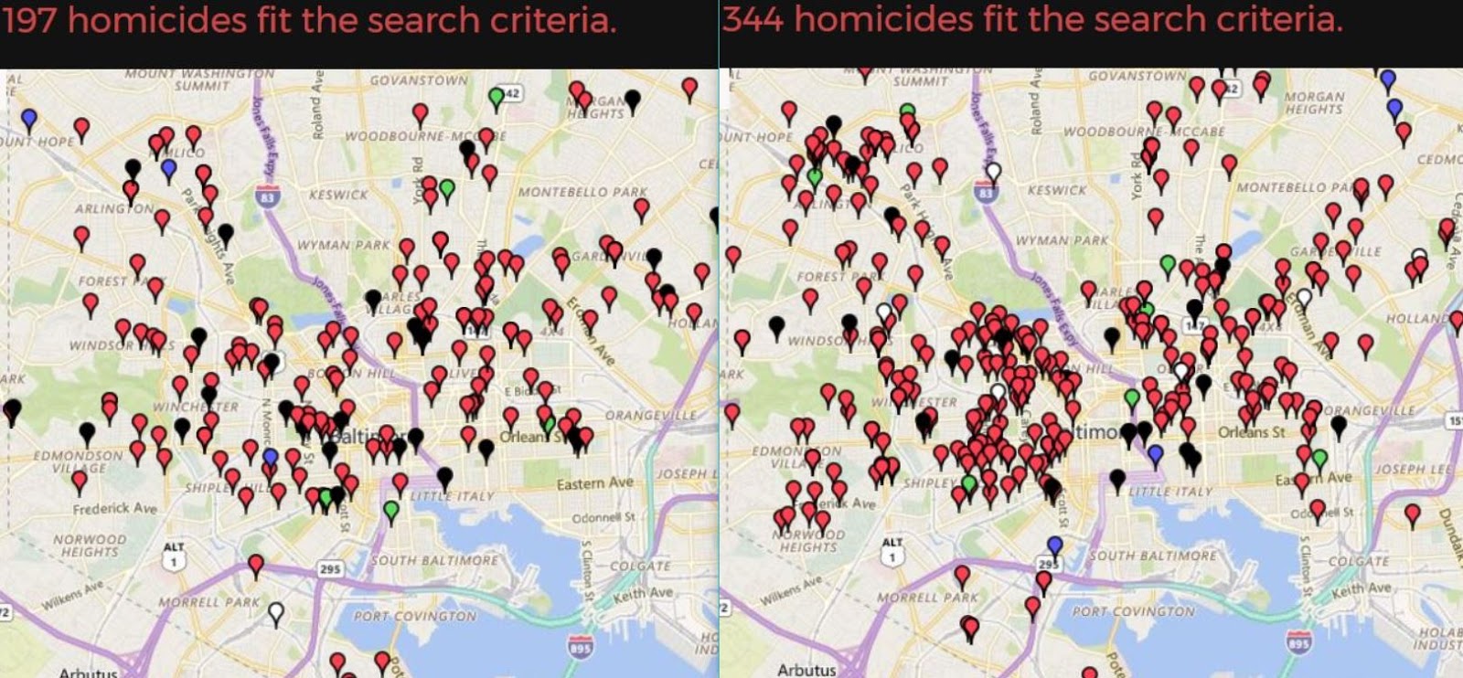
It’s not just the violence, it’s that Baltimore’s leaders blame everybody but themselves.
[Baltimore State’s Attorney Marilyn] Mosby cited zero-tolerance policing as a “failed strategy” that continued in Baltimore long after it was formally disavowed by the city’s leaders. “Those failed policies are what got us to the place we were at in the spring of 2015,” she said, referring to the unrest.
Blame O’Malley? He left office ten years ago. Violence went up two years ago.
Davis says:
“There was a price to pay for” the drop below 200 homicides, a price “that manifested itself in April and May of 2015,” Davis said, referring to the uprising following the death of Freddie Gray.
Really? So according Davis, years of oppressive policing led to riots. It could be true. (Though I’m shocked to hear Progressives float the idea that repressive policing reduced homicides.) Perhaps the yoke of police oppression led people to rise up righteous indignation?
Between 1994 and 2014, annual arrest numbers in Baltimore varied from a low of 39,654 to a high of 114,075. You think more than 100,000 arrests each year for four years in a row might spark a riot? Well, it didn’t. That was 2002 to 2005. Murders went up slightly during those years, to 269. If 114,000 arrests didn’t start a riot, it’s hard to imagine fewer than 40,000 doing so. By 2011, arrests were down 50 percent.
1994arrests: 77,545 — 321 murders
1995: 81,140 — 325
1996: 61,403— 331
1997: 77,750 — 312
1998: 89,149 — 313
1999: 85,029 — 205
2000: 86,093 — 261
2001: 97,379 — 256
2002: 106,117 — 253
2003: 114,075 — 271
2004: 104,033 — 278
2005: 103,837 — 269
2006: 93,393 — 276
2007: 86,334 — 282
2008: 82,656 — 234
2009: 79,552 — 238
2010: 69,617 — 224
2011: 59,877 — 197
2012: 55,451 — 217
2013: 42,097 — 235
2014: 39,654 — 211
2015: 27,765 — 344
2016: 25,820 — 318
Look at at 2007 to 2014, a Baltimore miracle happened! Arrests were cut in half while homicides went down 25 percent, from 282 to 211. This was hard work and good policing. Not perfect, mind you. Sometimes not even good. But better, incrementally, year by year.
Davis and Mosby are trying to rewrite history, pretending years of progress never happened. Now it’s one thing to be pissed on and be told it’s raining, but these two are pissing all over our feet and telling us we’re better off with wet shoes.
Go ahead and fix long-term systemic problems. But while you’re doing that, in the meantime, let’s tell police what we want them to do with criminals today. Violence varies independently of poverty, racism, unemployment, segregation, an family breakdown, the so-called “root causes” of crime. These didn’t change in 2015. Policing did. Discouraging proactive legal discretionary policing allowed violent criminals to be more violent. Telling cops not to make legal but discretionary low-level arrests on drug corners was a bad idea.
There’s only so much decline a city can take. Baltimore’s population is at a 100-year low. And the people leaving, hard-working non-criminal taxpayers, are sick of crime.
Mosby admits Baltimore “is kind of in transition right now.” I’m afraid Baltimore is transitioning from a city with failures to a failed city.
Back when I wrote Cop in the Hood, I was horrified to figure out that 11.6 percent of men in the Eastern District were being murdered (see the footnote on pp. 219-222).
[Updated to include 2018 data and more accurate population figures.]
From 2015 through 2018, 226 people were murdered in Baltimore’s Western District. 145 were black men age 18 to 34. 36.25/year. This is about twice as high as the pre-2015 rate. There are approximately 7,226 black men aged 18 to 34 in the Western District. (And a total population of 47,600. So the annual homicide rate for 18-to-34-year-old men in the Western District over the past four-years is 419 per 100,000. (The national homicide rate is now about 6 per 100,000; Baltimore’s is 50.)
What does a murder rate of 419 mean? Well, here’s a survival function:
1 – (1 – r)^x
r is the death rate and x is number of years. The death rate is 1 in 239 or .0042. The number of years from 18 to 34 is 17.
So 1 – (1-.0042)^17 =0.069.
This means that if homicide levels don’t drop, a 17-year-old man in the Western District today will have a 7 percent chance of being murdered before he reaches the age of 34. And since about one-third of murders in Baltimore happen to those 35 and over, approximately a 10 percent lifetime chance.
One-in-ten men murdered?! I don’t know what else to say.
[I thought of some things to say in my next post.]

Yesterday this video came outof Baltimore officer putting gel caps of heroin in a can, placing the can in trash in an alley, leaving the alley, and then “starting” his body cam and going to discover the heroin where he put it. Problem is, for the cops, the camera records video for 30 seconds preceding the press of the on button.
A man was arrested related to this and held on $50,000 bail. Nobody put up the 10 percent needed to get out, so he had been in jail for the past 7 months. He was released yesterday (eventually) after the video came out.
These seem to be possibilities, based on the video:
Option A: Dirty cops planted drugs on an innocent person.
Option B: Dirty cops planted drugs on a guilty person.
Option C: Dirty cops realized they forgot to turn on their body cameras, and decided to recreate the discovery, based on a true story.
Option D: Well-intentioned but stupid cops forgot to turn on their body cameras when the did find the drugs, and decided to recreate the discovery, inspired by a true story.
Option E: It’s all some great misunderstanding and somehow this is acceptable police work.
I’m going to dismiss Option E, as has every cop I’ve spoken to.
Here’s what makes this video so odd. Not exactly the “what,” but the “why?” If you were planting drugs to frame an innocent (or guilty of something else) person, you’d plant the drugs on the person. It doesn’t make sense to plant drugs in a stash because (absent other evidence) people in Baltimore City don’t get prosecuted for a stash of drugs. This is why drug dealers use a stash (it also provides loss protection against robbery). You can’t prove possession without a direct eyes-on chain-of-custody from person to stash. And even then you can’t prove the stash belongs to a person who just happens to be reached into it.
I wrote about this kind of scenario in Cop in the Hood.
Could there be a chase of an innocent person, with drugs planted to provide probable cause for arrest? Could be in theory, but I don’t think so here because the drugs were not planted in a place where somebody would throw them while running from cops. No, the drugs were placed in a can, in a drug stash. So maybe this was a reenactment based on a true story. This scenario, which is where I would place my money, is also the saddest. I mean, it was stupid, damaging to police, and harmful to the prosecution of criminals. It was also career ending directorial choice. And for what? That’s what gets me about so-called “noble cause” corruption. Why? (See #3, below.)
Other issues:
1) $50,000 bail is a lot of bail, especially for a drug arrest in Baltimore.
2) Even after watching the video, the State’s Attorney’s office (the public prosecutor) at first only offered time-served. What the hell? It can’t be said often enough what a disaster Marilyn Mosby, Baltimore City’s elected State’s Attorney, has been. Baltimore is a city without effective leadership at the top. One quality of leadership is to take responsibility for what happens under your watch. This does not happen in Baltimore. Bad leadership has consequences.
3) And it’s always a good time to periodically repeat that almost all police corruption stems from drug prohibition. How’s that war working out? You think the fifth decade will be charm? I don’t. The war on drugs will not be won. And the damage from the fight — to families, communities, incarceration, police — is immense and entirely self-inflicted. Society could better deal with the problems of drug use without police.
And it’s not that all drug cops are dirty. That’s important to say not to defend cops, but to not excuse the dirty ones. Being involved in narcotics is not an excuse to be a dirty cop; that’s on the cop. But if we want to get rid of police corruption on a systemic level, you need to get police out of the drug game. Just like we did with gambling: regulate and control the supply and distribution. Voila! Cops are no longer on the take with the numbers’ racket.
But back to the issue at hand. In some ways this is all academic. (But hell, I am an academic.) I’d really like to read the arrest report and statement of probable cause. But there is no scenario where this video is good or defensible. Whether it’s planting drugs or a dramatic re-enactment, it’s bad. David Rocah is 100 percent correct. From Justin Fenton’s and Kevin Rector’s story in the Sun (well worth reading):
David Rocah, senior staff attorney with the ACLU of Maryland, said that even “a faked recreation of officers finding the untied bag of drugs” would still be “potentially criminal” and should be a violation of police rules.
Rocah criticized the state’s attorney’s office for “the total lack of any apparent systemic response” to the incident, including putting the officer on the stand in another case after the video was flagged.
Rocah said it was “insane” that state laws that bar the disclosure of disciplinary records for police officers would prevent the public from seeing the results of the Police Department’s investigation or knowing how it punished the officers internally.
Rocah also said “there is zero reason to trust any video or any statement from any of these officers” given what was clearly observable in the video flagged by the public defender’s office.
“So even if it is indeed true that they simply staged a re-creation of finding the drugs, these officers have not only destroyed their own credibility, they have single-handedly destroyed the credibility of every piece of video where BPD officers find contraband without a clear lead-in that negates the possibility of it being staged,” Rocah said. “That’s quite a day’s work.”
Update: Indeed, this officer forgot to turn on his body-cam when he went and found the stash. So he decided to recreate the scene as it actually happened, potentially a firing offense. Counterfactually, had he simply fessed up (or been caught) failing to turn on his body camera, the departmental punishment would have been verbal counseling.
Recently I came across a breathless headline in Salon: “Number of fatal shootings by police is expected to reach 1,000 for third year.” That’s an odd way to put it because A) it implies the number has been at a record high the past three years when B) this is only the third of three years the Washington Post has been counting and C) it’s not true.
According to the Washington Post data they cite, there were 991 people shot and killed by police in 2015 and 963 in 2016. The more accurate headline, as see in the actual Washington Post is: “Number of fatal shootings by police is nearly identical to last year.” Well, that’s a bummer if one is trying to hype a crisis. Also “reach” is not synonymous with “approach.” But I’m not hear to quibble about the semantics of a few dozen deaths.
The number of those killed by police seems to be steady at just under 1,000 per year. But given the increase in homicide, it’s actually surprising the number killed by police hasn’t increased. When violence goes down, as it did in the 1990s, police shoot fewer people. When violence goes up, as it did in the late 1980s, police shoot more people. I suspect there are two variables pulling in opposite directions. One involves more violence in general — increasing police-involved shootings — and the other involves less police engagement and fewer interactions with citizens. Less proactive policing means fewer interactions and less that can go wrong (and also more crime).
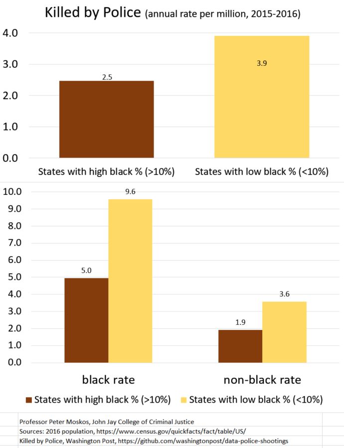
I looked at the Washington Post dataof those shot and killed by police in 2015 and 2016 and broke it down by states with more and fewer African-Americans. States that are more than 10 percent African American include 21 states plus D.C. (198 million people, 18 percent black, 36 million blacks). There are 29 states less than 10 percent African American (126 million people, 6 percent black, 7 million blacks).

People, all people, are 1.6 times more likely, per capita, to be shot and killed by police in states that are less than 10 percent black compared to states more than 10 percent African American. Blacks are still more likely than whites, per capita to be shot overall. But this ratio (2.6:1) doesn’t change significantly based on how black a state is.
For both whites and blacks, the likelihood of being shot by police is greater in states with fewer blacks. And the difference is rather large. There are seven states less than two percent black. In 2015 and 2016, zero blacks were shot and killed in Maine, New Hampshire, Utah, Vermont, Wyoming, Idaho, and Montana. But if you think cops don’t shoot people in these states, you’re wrong. Compared to the four states with the highest percentage of African-American (Mississippi, Louisiana, Georgia, and Maryland are more than 30 percent black), the overall rate of police-involved killings in states with few blacks is higher. And this is despite a lower rate of overall violence.
The implications of this are many, but for starters, if one wishes to reduce the number of people shot by police, it would make sense to focus on states that have more police-involved shootings in general. New Mexico, Alaska, Oklahoma, Wyoming, and Arizona have rates two and even three times the national average. Even though California ranks only 13 out of 51 (4.2 per million compared to 3.0 nationally), California is significant because it’s so large. In terms of reducing police-involved shootings, these are the low-hanging fruits.
Were the states with fewer blacks able to reduce their rate of lethal force to the level of states with more blacks, there would be an 18 percent nationwide reduction in the number of those killed by police. But this would require a move away from a general focus on policing and race toward a focus on police departments that shoot a lot of people of all races (particularly hispanics, it should be noted, and not examined here). Alas, at the intersection of police, race, and ideology, I’m not holding my breath.
And there’s a caveat: though state-level data is revealing, it’s often too general in terms of policy solutions. Intra-state differences are very large (and not examined here). Policing is local, and some local jurisdictions simply shoot a lot more peoplethan others. (That linked-to post is from two years old, but the basic points are solid).
Here are the raw numbers. As always, click to “embiggen.” Data available on request. Corrections welcomed. Strongly encouraged, even.

Sources: 2016 population, https://www.census.gov/quickfacts/fact/table/US/
Killed by Police, Washington Post, https://github.com/washingtonpost/data-police-shootings
Update July 17: Thanks to I.L., corrected and updated.
Update: 2020 caveat.
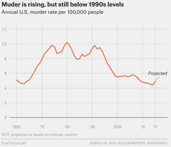
Murder in 2017 continues to go up. (The increase is at slower pace compared to the previous two years, but that is minor consolation.) At what point do you sound the alarm? Yes, the murder rate is still lower than when it was high, but the increase since 2014 is equal (or may surpass) the largest homicide increase in America ever (1966-1968). Here’s a very good summary of the murder rise by Jeff Asher at 538.com. It’s both fact based and spin free. Refreshing.
Asher brings the data up to mid-year 2017. Overall, nationwide, on average, it’s not good. There’s an estimated 27 percent homicide increase since 2014. And no, it’s not just isolated to a few cities. My previous post gives data for cities 2014-2016.

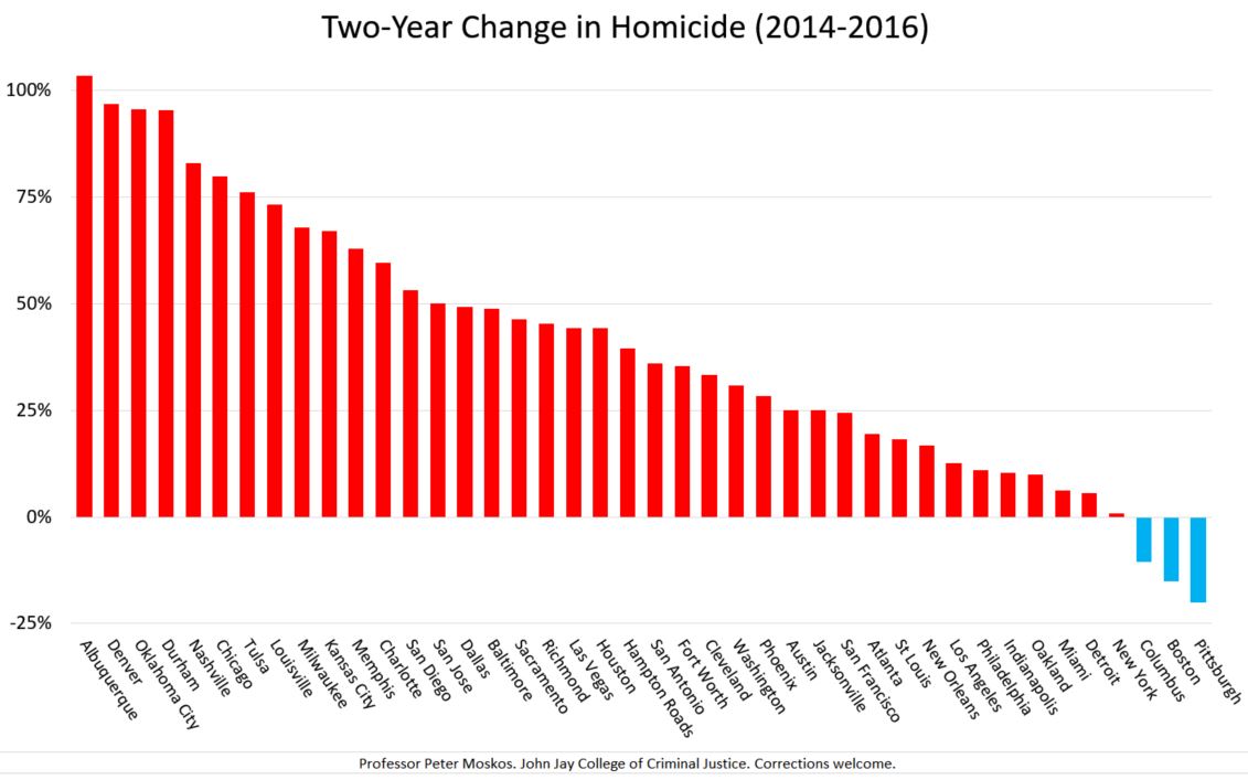
Over the past two years, homicide increased 31 percent in America’s 52 largest cities.

The cities range from little Richmond (220,000 people) to big NYC (8.5 million), from comparatively safe San Diego (homicide rate 3.5 per 100,000) to dangerous St. Louis and Baltimore (rates of 50+).
Collectively 50.5 million people live in these 52 cities, or roughly one-sixth of America’s population. Homicides increased 31 percent over two years (4,946 to 6,496, which is about 36 percent of all US homicides). 45.3 million people live in cities in which homicide rose; 5.3 million live in cities in which homicide decreased.
For graphic representation in the chart above, I removed cities with fewer than 40 or more murders in 2016 because a low n leads to overly dramatic year-to-year changes. This affected El Paso, Seattle, Portland, Raleigh, Omaha, Tucson, Wichita, Long Beach, Minneapolis, and Fresno. (I also dropped Bakerfield its 153-percent increase is either a crazy outlier or my numbers are wrong.) Of the 43 remaining cities, 39 saw homicides go up.
The cities that seem to be bucking the trend of greater violence over the past few years are Seattle, Portland, Fresno, Boston, Tucson, Columbus, and New York City. In terms of raw numbers, the cities with the largest increases in murders are Chicago, Houston, Baltimore, Memphis, Dallas, Milwaukee, Las Vegas, and Kansas City. Were one to take the eight cities with the biggest increase out of the equation — and there’s not any moral or statistical justification for doing so, but just for fun, because the Brennan Center likes doing this trick — the rest of the cities have a collective 2-year 20-percent increase. That’s 20 percent more than we’ve seen in a very long time. So, no. It’s not “just Chicago.”
Here are the top 52 cities and their two-year change in homicides, 2014-2016.
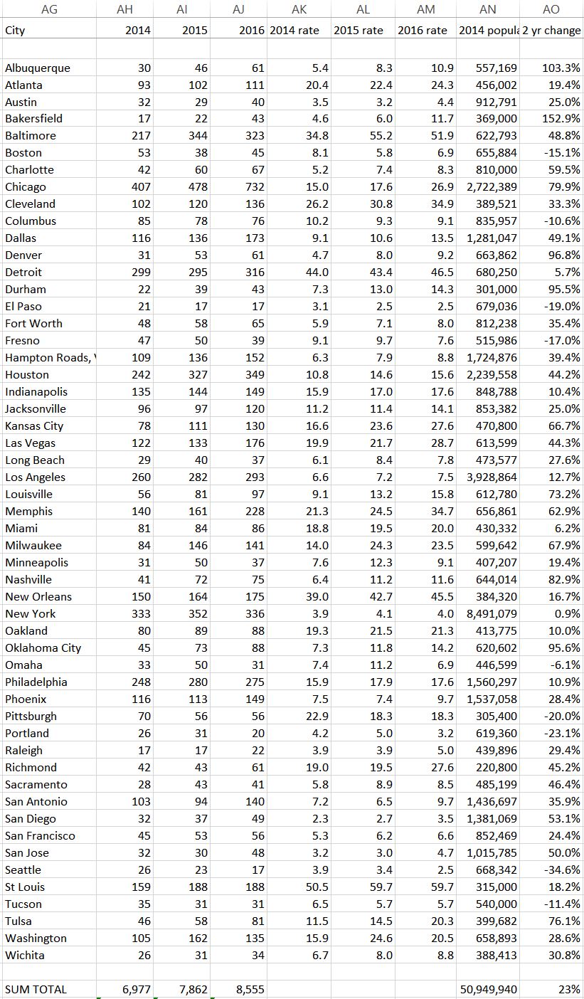
And the data in text form, for your cut-and-pasting needs. Albuquerque: +103% | Atlanta: +19% | Austin: +25% | Baltimore: +49% | Boston: -15% | Charlotte: +60% | Chicago: +80% | Cleveland: +33% | Columbus: -11% | Dallas: +49% | Denver: +97% | Detroit: +6% | Durham: +95% | El Paso: -19% | Fort Worth: +35% | Fresno: -17% | Hampton Roads, VA: +39% | Houston: +44% | Indianapolis: +10% | Jacksonville: +25% | Kansas City: +67% | Las Vegas: +44% | Long Beach: +28% | Los Angeles: +13% | Louisville: +73% | Memphis: +63% | Miami: +6% | Milwaukee: +68% | Minneapolis: +19% | Nashville: +83% | New Orleans: +17% | New York: +1% | Oakland: +10% | Oklahoma City: +96% | Omaha: -6% | Philadelphia: +11% | Phoenix: +28% | Pittsburgh: -20% | Portland: -23% | Raleigh: +29% | Richmond: +45% | Sacramento: +46% | San Antonio: +36% | San Diego: +53% | San Francisco: +24% | San Jose: +50% | Seattle: -35% | St. Louis: +18% | Tucson: -11% | Tulsa: +76% | Washington: +29% | Wichita: +31%
July 13 Update: A short while back I finally sent an email to one of the authors at the Brennan Center expressing my concerns about what I see as their deception. I received a brief reply stating, in part, “the statistics you cite [to wit: “Chicago accounted for more than 55 percent of the murder increase last year” & “A similar phenomenon occurred in 2015, when three cities — Baltimore, Chicago, and Washington, D.C. — accounted for more than half (53.5 percent) of the increase in murders”] refer to the increase in murders in a group of 30 cities that we study in our reports – not the national increase in murder.” I replied:
Thanks for replying. But these clarifications do not negate the basic mis-truth of the highlighted statements (which have been cited and repeated which clarification). As as academic, I do not understand this. It’s not enough to have the truth somewhere in a publication. The summary and abstract, especially when right beneath the title, need to be be accurate standing alone. Surely you understand that readers, especially journalists on deadline, may not have the time or statistical knowledge to parse data as I do. They read and quote the summary. And isn’t that what you want them to do? So these need to be factually correct.
Chicago simply does not account for half of the increase in “urban murders.” Personally, I would only feel comfortable saying “Chicago accounted for (roughly) 12 percent of last year’s homicide increase” (assuming a national increase of about 2,000). But since we have the two-year data, why not use it? I would feel more comfortable saying “Chicago is (approximately) 9 percent of the nation’s homicide increase over the past two years.”
You’ve chosen to highlight a large percentage (55.5%) that is large only because of the self-selected limitations in your sample size (“in this group of cities”). Taking a percentage increase within a limited sample is not correct. For instance, were we to look at just the top five cities (NY, LA, Chicago, Houston, and Philadelphia), one could say Chicago accounts for 95.5 percent of the total increase in urban murders. While mathematically true, this would be substantively meaningless if not downright misleading. Or, to further illustrate this point, why not just take the top three cities? The numbers would allow us to say: “Looking at the three largest cities, Chicago accounts for 102 percent(!?) of last year’s urban homicide increase.” Of course, the numbers come out this way, but one city accounting for more than 100 percent of an increase is both conceptually impossible and mathematically absurd. Does this make sense? The larger sample you use lessons the magnitude of the absurdity, but not the nature of its existence.
Were one to take a larger sample, looking at the top 50-plus cities, then Chicago accounts for 38 percent of last year’s increase. And 20 percent of the two-year increase. Were one to include all urban areas, of course, the percentage would be much smaller. But any arbitrary limit on the denominator is statistically dubious.
But back to my initial point — what is highlighted (and cited in the media) is right there is the lede/summary/subtitle without qualification — how is one expected to interpret, “Chicago accounted for more than 55 percent of the murder increase last year”? Do you think this is an accurate presentation of data?
Here our correspondence seems to end.
In addition to the UCR, here are some of my source. Corrections welcome.
https://www.abqjournal.com/923137/city-sees-highest-number-of-murders-in-20-years.html
http://www.kerngoldenempire.com/homicide-tracker http://www.city-data.com/crime/crime-Bakersfield-California.html
http://www.cleveland.com/metro/index.ssf/2017/01/year_in_review_homicides_surge.html
http://www.newsobserver.com/news/local/community/durham-news/article123339719.html
http://www.elpasotimes.com/story/news/crime/2017/03/23/rash-homicides-anomaly-police-say/99555590/
http://www.star-telegram.com/news/local/community/fort-worth/article128019874.html
http://abc30.com/news/domestic-violence-related-murders-rise-sharply-in-fresno-during-2016/1679846/
http://fox59.com/2017/03/02/early-2017-homicide-total-climbs-as-mayor-hogsett-stays-the-course/
http://jacksonville.com/homicides/2016
http://www.kshb.com/homicide-tracker-2016
http://homicide.latimes.com/neighborhood/long-beach/year/2016
http://www.miamiherald.com/news/local/crime/article104679101.html
https://projects.jsonline.com/apps/Milwaukee-Homicide-Database/
http://www.startribune.com/statistics-show-minneapolis-violent-crime-edged-up-in-2016/409711555/
http://www.nola.com/crime/index.ssf/2017/01/new_orleans_finishes_2016_with.html
https://oaklandmofo.com/blog/oakland-homicide-count-is-rising
http://dataomaha.com/homicides/2015
https://www.phillypolice.com/crime-maps-stats/
http://www.azcentral.com/story/news/local/phoenix/2017/03/29/maricopa-county-phoenix-area-homicide-map-2017/99735018/
https://newsinteractive.post-gazette.com/homicide/
http://koin.com/2017/01/01/4-of-portlands-20-homicides-from-2016-remain-unsolved/
http://www.kcra.com/article/meet-the-tiniest-deer-being-nursed-back-to-health/10247250
http://www.sandiegouniontribune.com/news/public-safety/sd-me-county-homicides-20170226-story.html
https://www.tucsonaz.gov/files/police/pt1_16_summarytable_0.pdf
http://www.kjrh.com/news/local-news/tulsa-homicides-in-2016-interactive-map-shows-location-of-homicides-during-record-year
http://www.sandiegouniontribune.com/news/public-safety/sd-me-county-homicides-20170226-story.html
http://wtkr.com/2015/12/22/norfolk-is-the-deadliest-city-in-hampton-roads/
[Posts in this series: 1, 2, 3, 4, 5, 6]