
Data presentation fascinates me because it’s both art and science. There’s no right way to do it; it depends on both hard data, good intentions, and interpretive ability. Data can be manipulated and misinterpreted, both honestly and dishonestly. And any chart is potentially yet another step removed from whatever “truth” the hard data has.
Where I’m going isn’t exactly technical, but there’s no point here other than data presentation and honest graph making (and also crime being f*cking up in Baltimore after the riots, but that’s not my main point). If that doesn’t interest you, stop here. [Update: Or jump to the next post.]
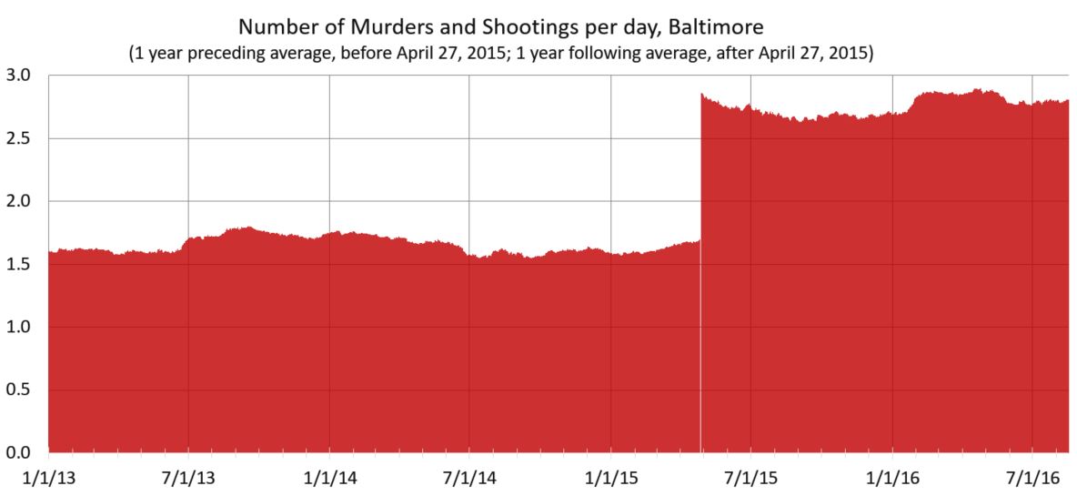
I took reported robberies (all), aggravated assaults, homicides, and shootings from open data from 2012 to last month. I then took a simple count of how many happen per day (which is strangely not simple to simple to analyze, at least with my knowledge of SPSS and excel). You get this.
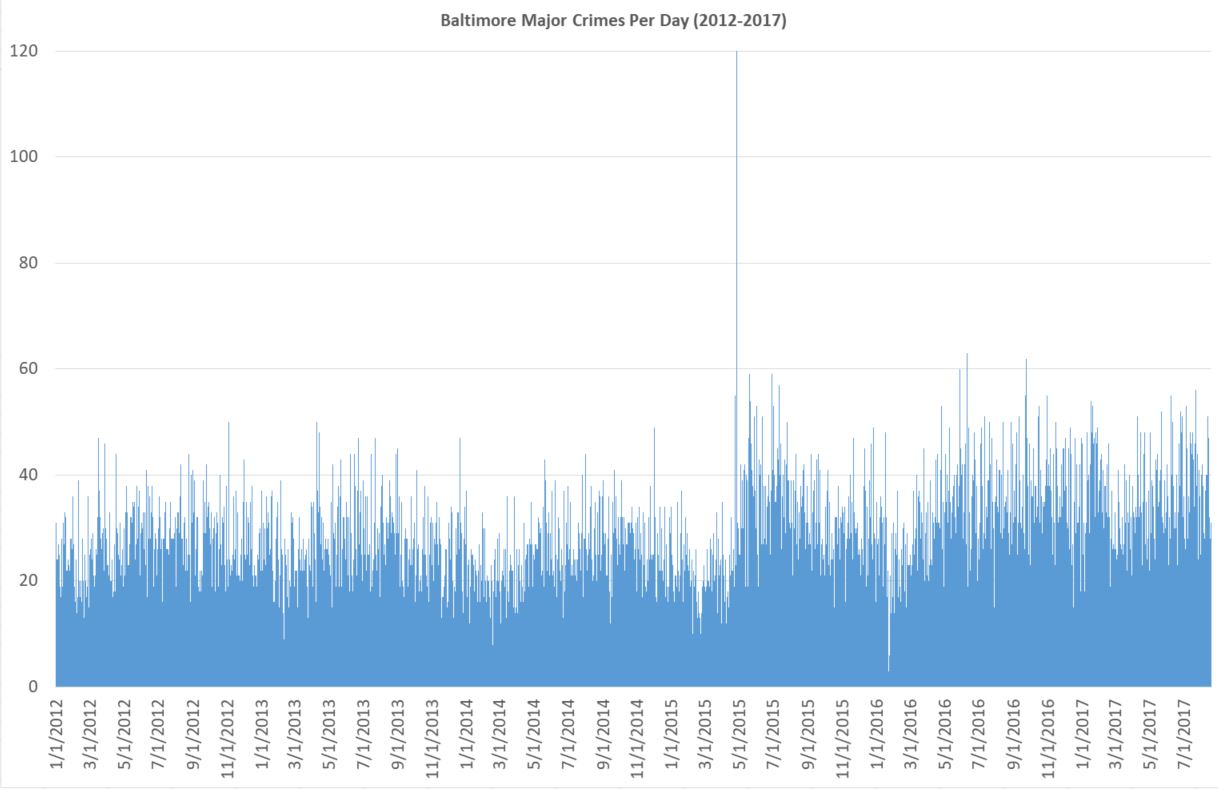
It takes a somewhat skilled eye to see what is going on. Also, since the day of riot is so high (120), the y axis is too large. With some rejiggering and simply letting that one day go off the scale unnoticed, you get this.
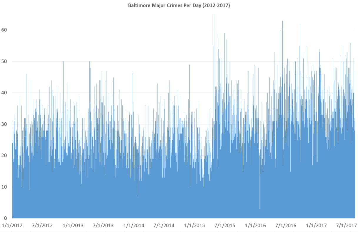
It’s still messy, but is the kind of thing you might see on some horrible powerpoint. Things bounce up and down too much day-to-day. And there are too many individual data points. Nobody really cares that there were more than 60 one day in July 2016 and less than 5 in early 2016 (I’m guessing blizzard). It’s true and accurate, but it’s a bad chart because it does poor job of what it’s supposed to do: present data. Again, a skilled eye might see there’s a big rise in crime in 2015, but the chart certainly doesn’t make it easy.
Here’s crimes per day, with a two-week moving average. A moving average means that for, say September 7, you take Sep 1 through Sep 14 and divide by 14. Why take an average at all? Because it smooths out the chart in a good way. It’s a little less accurate literally but much more accurate in terms of what you, the reader, can understand. One downside is that the number of crimes listed for September 7th isn’t actually that number of major crimes that happened on that day. You can see why that might be a big deal in another context. But here it isn’t.
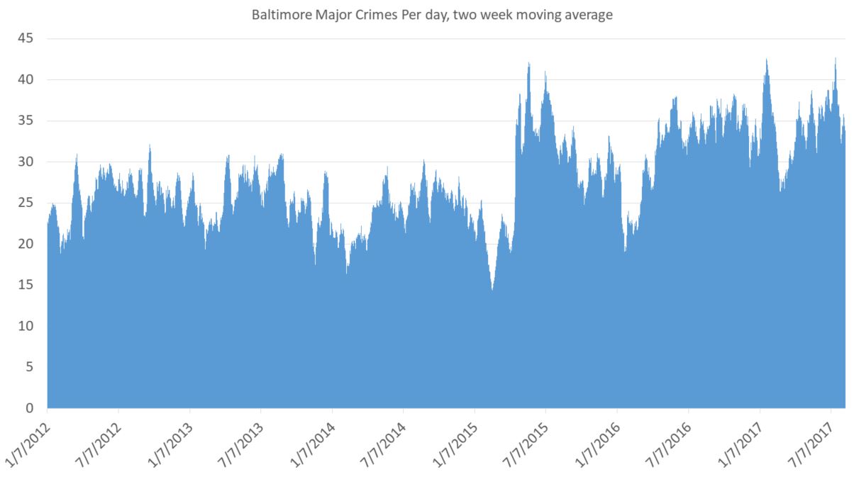
For a general audience it’s not clear what exactly the point is. You still have lots of little ups and downs, and the seasonal changes are an issue. (Crimes always go up in summer and down in winter. And it’s not because of anything police do. And it’s nothing do to with the non-fiction story I’m trying to tell.) On the plus side, you do see a big spike in late April, 2015, after the riots and the absurd criminal prosecutionof innocent Baltimore cops. But it needs explaining.
Also, you need some buffer for the data. The bigger the average, the more of a buffer you need. But for this I think this is one perfectly fine way to present these data, at least for an academic crowd used to charts and tables.
Another tactic is to take the average for the past year. Jeff Asher on twitterover at 538.comdoes good work with NOLA crime and is a fan of this. It totally eliminates seasonal issues (that’s huge) and gives you a smooth line of information (and that’s nice).
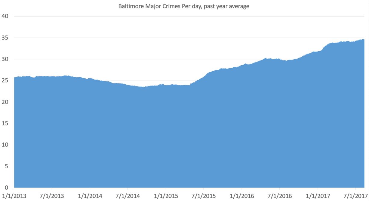
You can see a drop in crime pre-riot (true) and a rise in crime post-riot (also true). That’s important. Baltimore saw a drop in crime pre-2015 that wasn’t seasonal. It was real. And the rise afterward is very real. But there are two problems with this approach: 1) you need a year of data before you get going and 2) everything is muted. What looks like a steady rise (the slope since 2015) is actually a huge rise. But it looks less severe than it is because it takes an average from the previous year. But that’s not exactly true. Crime went up on April 27, 2015. And basically stayed up, with a slight increase over time.
Here’s my problem. I want to show the rise in crime post-riot. But I want to do so honestly and without deception. But yes, for the purpose of this data presentation, I have a goal. (My previous attempts were pretty shitty.)
Also, you need at least a year of data before you can graph anything. That’s a downside.
Here’s my latest idea. If one is looking at a specific date at which something happened — in this case the April 27, 2015 — and trying to eliminate seasonal fluctuations, why not take the yearly average for the previous year before that time and the yearly average after that date for dates after that time? I think it’s kosher, but I’m not certain.
Here’s how that works out:
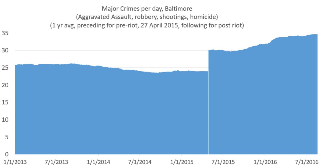
This shows the the increase that was real and immediate. And as minor point I like the white line on the day of the riot, which I got from removing April 27 from the data (because it was an outlier).
Now if I wanted to show the increase in more stark form, I would move the y axis to start at 20. But being the guy I am, I always like to have the y-axis cross the x-axis at 0. That said, if the numbers were higher and it helped the presentation of data, I have no problem with a y-axis starting at some arbitrary point.
Take into account that graphs are like maps. While very much based on truth, they exist to simplify and present selected data. I mean, you can have my data file, if you want it. But I do the grunt work so you don’t have to. But of course my reputation as an academic depends on presenting the data honestly, even though there’s always interpretation (e.g.: in the case of a map, the world, say scientists, isn’t flat). The point, rather, is if the interpretation honest and/or does the distortion serve a useful purpose (In the case of the Mercator Projection it was sea navigation; captains didn’t gave a shit about the comparative size of the landmass of Greenland and Africa.)
So taking an average smooths out the line of a chart, which is a small step removed from the “truth,” but a good stop toward a better chart. It’s not a bad approach. But it tends to mask quick changes in a slow slope, since each data point in the average for a lot of days. A change in slope in the graph actually indicates a rather large change in day-to-day crime. There are always pluses and minuses.
If you’re still with me, here’s what you get when just looking at murder. Keep in mind everything up to this point has been the same data on the same time frame. This is different. But homicides matter because, well, along with people being killed, it’s gone up much more than reported crime.
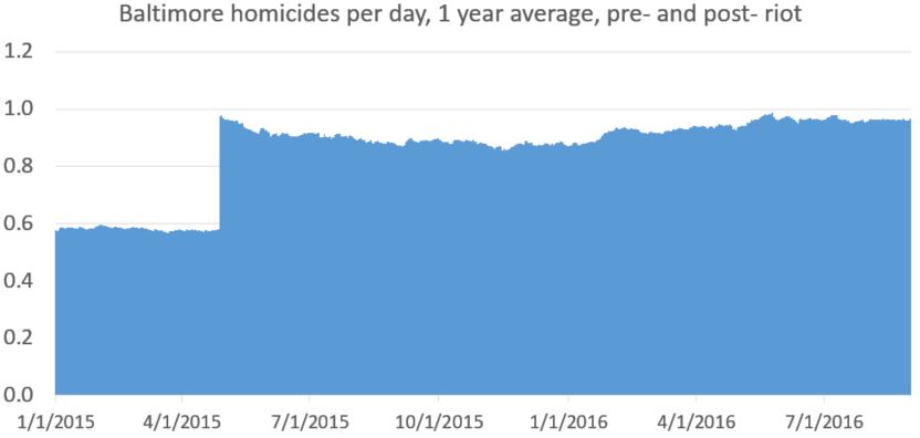
[My data set for daily homicides (which is a file I keep up rather than from Baltimore Open Data) only goes back to January, 2015. So I don’t have the daily homicide count pre-2015. 2014 is averaged the same for every day (0.5781). This makes the first part of the line (pre April 27, 2015) straighter than it should be. This matters, and I would do better for publication, but it doesn’t change anything fundamentally, I would argue. At least not in the context of the greater change in homicide. Even this quick and imperfect methods gets the major point across honestly. ]
Update and spoiler alert: Here’s a better version of that chart, from my next post.
Comments
9 responses to “Data presentation and the crime rise in Baltimore”
I like that the method of smoothing the data here is easy to understand and only involves two things that could be fiddled with (the cutoff point and the size of the window used for smoothing). And the cutoff is set by the date of the riots. And yearly smoothing is reasonably set by the connection between seasons and crime. So it's almost like you have no free parameters for the procedure. Very cool.
In the final smoothed/cutoff data, it seems there is still an increase occurring in major crimes per day but that homicide has been roughly level. Do you think this indicates anything interesting? Could the reporting rate of major crimes have been gradually increasing creating the appearance of a rise whereas the actuality number of major crimes increased in one jump? Or is it more likely the two trends are somewhat decoupled by another factor besides the changes post-riot?
A final less important note: someone skeptical might question the importance of your choice of cutoff and smoothing values. I think a plot of the size of the discontinuity as a function of the cutoff date might be useful for showing the cutoff is real and not an artifact of the method. I'm pretty convinced myself considering the size of the discontinuity relative to the baseline, but I'm applying my mathematical intuition which is less ideal than calculating. If I'm thinking correctly, as you move the cutoff point the delta y should be roughly flat until april 2014 then roughly linearly increase until april 2015 and then roughly linearly decrease until april 2016. The clear peak should provide further confirmation of the date and give an idea of how well you could localize the change in time if you lacked the relevant knowledge.
I just did a quick interrupted time series analysis. Post riot these major crimes went up by 7~8 per day. That is taking into account the large outlier, as well as weekly and seasonal trends.
Standard error for the ARIMA model is around half a crime, so the 95% confidence interval is about 6.5~8.5 crimes.
You get pretty close to the same estimate if you just look at the mean before the riot (25) versus after the riot (33).
IMO line graphs show the trend much clearer than when you use bars or areas. I will write a blog post showing some these factors myself.
Regarding daily homicide data … a blogger claims to have collected detailed data for a number of years.
"Much of the information above is originally provided by Baltimore Police press releases.Judicial histories are checked on the Maryland Judiciary Case Search. CCTV camera locations are listed on OpenBaltimore. My Baltimore City homicide victim lists back to 2001. According to multiple conversations and formal Maryland Public Information request responses, the BPD claims it is unable to list homicide names prior to 2001 without a herculean effort if at all. They actually didn't want to do it for 2001 to 2006 either, but I don't go away easily."
It is a victim level dataset with quite a bit of detail. At least the 2015 and 2016 data I looked at.
chamspage.blogspot.com/2016/03/2016-baltimore-city-homicides-list-and.html
Can you do some sort of seasonal adjustment? Based on past historical data, there should be a way to adjust every day (or 14 day rolling average or whatever) so that there's no seasonal variation. Numbers for winter would be adjusted upward and the others downward, but the total would stay the same. Then do a 14 day rolling average. That should show any dramatic changes.
That is beyond my capabilities. And you'd have to have a complicated equation that reflects the seasonal variation, adjusting for every date (which would bring in issues relating to every year isn't the same).
I think for short term you could just do a rolling average (though 14 days isn't enough for homicides). And even a 14 day average wouldn't show the immediate jump after the riots.
But even if it were good, I don't know how to do it.
Having granular data is great. But there isn't much information until it is aggregated. Granular data allows you to re-aggregate it by, for example, police precinct. Or drill down on something interesting.
For something like corporate earnings, there are very routine approaches to reduce noise. People compare this year's quarter to last year's quarter. Trailing twelve month to TTM. YTD to YTD. Etc. It eliminates seasonality since both periods have the same calendar dates. And from there, managements will often suggest more adjustments based on eliminating anything else that tends to reduce comparability.
It seems to me that Peter has done a good job trying to aggregate data in a meaningful way. And also being sensitive to possible distortions that can occur during this process.
This is something that is new in the Social Sciences ….. displaying raw, granular data in public prior to presenting the results of an analysis. It has only been a short time that it has been technically easy to publish detailed data along with results — and seems to be becoming best practice.
The initial thought that came to mind when I looked at the prior post using 20 years of data is that the population of Baltimore is declining. From Census data:
1990 736,014 −6.4%
2000 651,154 −11.5%
2010 620,961 −4.6%
It's not huge, but an increase in numbers of homicides would result in even higher rates if the population is declining.
In Chicago, some of the worst South Side 'Community Areas' have large population declines. Chicago uses fixed community areas which were defined in 1920 to provide a relatively uniform basis for comparison. en.wikipedia.org/wiki/Community_areas_in_Chicago
This is the population for Englewood:
1990 48,434 −18.0%
2000 40,222 −17.0%
2010 30,654 −23.8%
In terms of your chart method, if you simply do a loess (localized regression), then your line curve would show the sharp change in trend.
So I did a loess and it actually doesn't look that great. But I did something else that I think also is a good way to show this data. I just did a linear regression pre-April 27 and another one for the data post-April 27. The pre one is low and declining, the post one is higher and rising.
posted the graph on twitter: pbs.twimg.com/media/DJPt9TWW0AE6ZK_.jpg
I made it in R:
# data from data.baltimorecity.gov/Public-Safety/BPD-Part-1-Victim-Based-Crime-Data/wsfq-mvij
library(tidyverse)
baltcrime <- read_csv("C:/etcetc/BPD_Part_1_Victim_Based_Crime_Data.csv")
descriptions <- c("AGG. ASSAULT", "HOMICIDE", "ROBBERY – CARJACKING",
"ROBBERY – COMMERCIAL", "ROBBERY – RESIDENCE", "ROBBERY – STREET",
"SHOOTING")
toplot <- baltcrime %>%
filter(Description %in% descriptions) %>%
mutate(CrimeDate = as.Date(CrimeDate, format = "%m/%d/%Y")) %>%
group_by(CrimeDate) %>%
count()
ggplot(toplot, aes(CrimeDate, n)) +
geom_point(alpha = .5) +
geom_smooth(data = toplot %>% filter(CrimeDate < as.Date("2015-04-27")),
aes(CrimeDate, n), color = "blue", method = "lm") +
geom_smooth(data = toplot %>% filter(CrimeDate > as.Date("2015-04-27")),
aes(CrimeDate, n), color = "red", method = "lm") +
labs(title = "Violent crime in Baltimore",
subtitle = "linear trend lines") +
geom_vline(xintercept = as.numeric(as.Date("2015-04-27")))
The post riot data is a bit hidden by the trend line. There's a drop after the riots and then, perhaps, an even stronger increase. But it's a still a good other way to look at the data.
Aesthetically, which does matter in graph presentation, I'm not a fan of all the data points. I also think, perhaps wrongly, that for the lay person, all those dots turn people off. But hey, when it goes to presenting data, the more the merrier.