So I’ve done a little work using the data from FatalEncounters.org on people shot and killed by police. Fatal Encounters is like the Washington Post database, but for adults. I combined/merged this with a city or police department’s population, number of cops, average number of murders in the jurisdiction (over 4 or 3 years), median household income, percentage Black, and percentage Latino/Hispanic. The dataset includes every city/town where cops killed somebody between 2015-2019 and also every city above 100,000 population. I end up with 2,872 cases.
I also looked at counties, which nobody has ever seem to have done before. If you live in a state like Maryland, Texas, California or Arizona, you probably know that county police of sheriff can be the major police department. Some of the counties are huge, and their very existence is seemingly noticed by research despite the fact that there are 88 county police departments that have jurisdictions of more than 100,000 people. The police departments of 20 counties police more than 500,000 people. County data is tricky. So take this with grain of salt. Population (the denominator is the rate) is based not on the entire county but on the population policed by the department. It could be wrong (corrections welcome). And I tried to exclude jail operations from cop population (by taking only sworn officers).
LA County Sheriff’s Department kills an average of 12 people a year (2015-2019). That’s a lot. Their rate is 11 per million population (if my population figures are correct, which is tricky for county police and overlapping jurisdictions). The rate for Los Angeles City Police Department is 4.2. The national average is about 3. Riverside County and San Bernardino Counties also have very high rates. Riverside County is 32 per million, the highest in the nation. But that is only if Riverside County Sheriff’s Department polices but 180,000 people (which is the population of Riverside County minus the cities that have their own police department… but maybe that’s not a good way to figure it out; the population of Riverside County is 2.4 million). Either way, 1,795 cops killing 5.8 people a year over 5 years is a lot. That’s 1 killing for every 310 cops. In NYC, the comparable figure is 1 killing for every 4,605 cops.
The Bernalillo County Sheriff’s department (Albuquerque) has a rate of nearly 20 (per million). Three-hundred Sheriff Deputies killed 10 people over 5 years. That’s a lot. Could be bad luck. Could be unfortunate but necessary shootings in cases for which there was no less-lethal alternative. But if the NYPD killed two people for every 300 cops, it would be over 200 police-involved shooting deaths a year in NYC. Last year in NYC police shot 15 people and killed 5.
Other county sheriff departments in which there aren’t that many cops and kind of a lot of people killed are Spokane WA, Pierce WA, Clark WA, Volusia FL, and Lexington SC, King WA, and Greenville SC
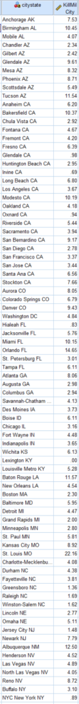
Riverside County CA and Bernalillo County NM are interesting because the largest city police departments in their county (Riverside City and Albuquerque, respectively) also shoot a lot of people (but not nearly at such a high rate). Here are the cities of over 100,000 population with the highest rate of people shot and killed by police.
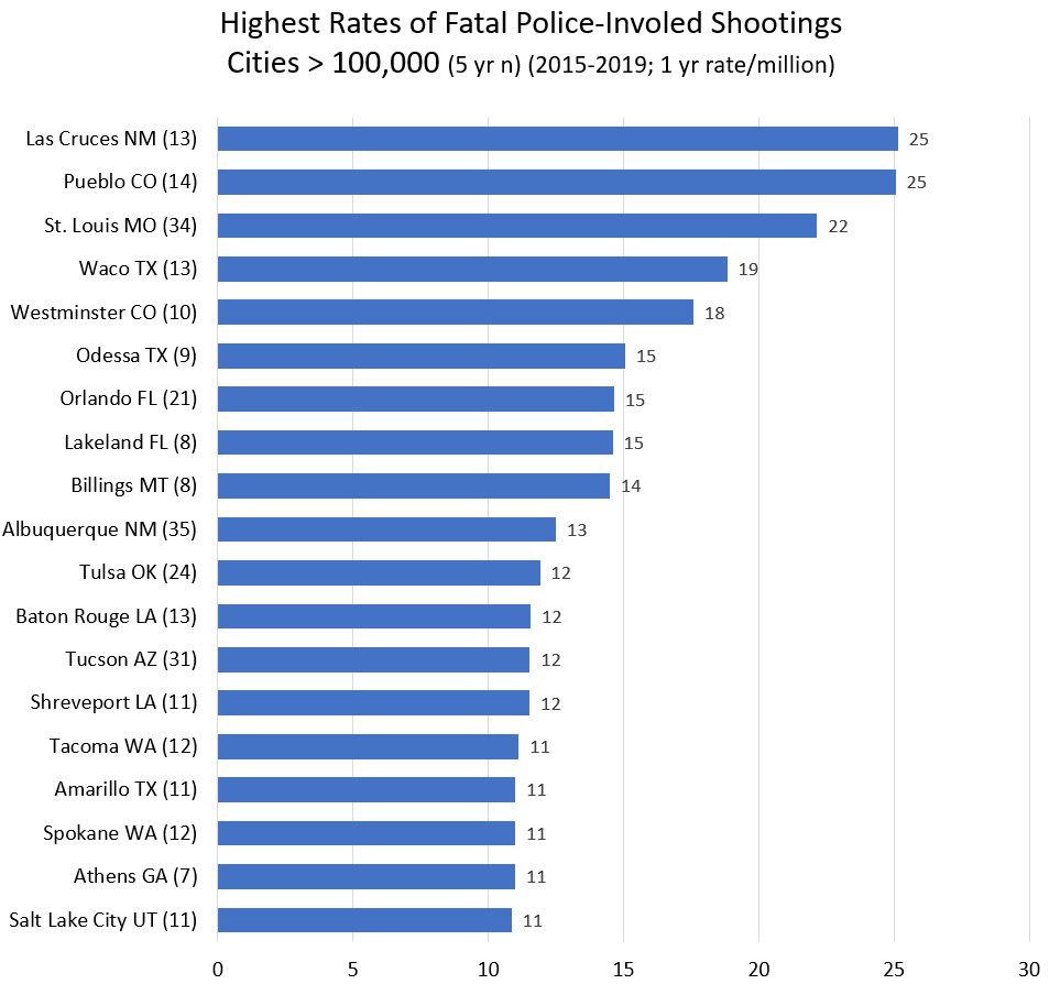
Every single city on this list is west of the Mississippi (or in Florida). Every single one. The mean rate for cities in eastern states is 3.8. If you take Florida out of the east, the mean goes down to 3.5. For cities in western states, the mean rate is 5.4. That’s a big difference. (The median is 3.2 and and 4.2.) And whatever real differences account for the arbitrary geographic difference, there are many department in cities over 100,000 that shot and killed few few people from 2015-2019, or at a rate less than the national average: Plano TX, Irvine CA, Fairfield CA, Grand Prarie TX, Pasadnia CA, Mesquite TX. Were they just lucky? Or were they doing something right. Or maybe both.
Maybe population greater than 100,000 isn’t the right cut off. The top cities just make the greater than 100,000 list. The total n (for 5 years) is between 8 and 35. So a little good or bad luck can affect the rate a lot. But still, a lot of shooting goes on in cities of this size. Also, the murder rate is high in a lot of these cities… but not all of them. And the murder rate is also high in Birmingham, Baltimore, New Orleans, Jackson, and Detroit, and they’re not on the list. And a lot of cities that are on this list have very few black people (Las Cruces, Pueblo, Westminster, Billings, Albuquerque, Tucson, Spokane, Salt Lake City).
Once you start getting into larger cities, I should look not only at places where cops shoot a lot, but also at places where cops shoot very little. Sure, since shootings are rare, at might just be luck. But it might be police departments are doing something right.
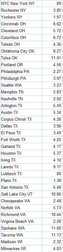
Thirty-one cities have rates under 1 per million. All but 4 have fewer than 200,000 people. So maybe they’re lucky. Irvine California is on the list. But hey, Irvine is rich. But what about Hialeah FL? Or Lexington KY? Or Lubbock TX? Zero fatalities all. What about New York City? 8.5 million people. And a rate of 0.89, less than a third the national average? That’s not an accident. That’s policy, training, and leadership. Why not learn from the cities doing it right?
Βetter cities (rate < 1.5 / million, half the national average) in the 200,000 to 300,000 range (n = 52), include Lubbock, Hialeah, and Greensboro. They aren’t rich. (Irvine, Oxnard, Glendale, Plano, and Jersey City are also on the good list.) In the most-shooting category (rate > 10 / million, 3 times the national average) are Orlando, Baton Rouge, Tacoma, Spokane, Salt Lake City, Birmingham AL, Richmond VA, and Modesto CA. These are mostly middle income places with a wide variety of racial demographics.
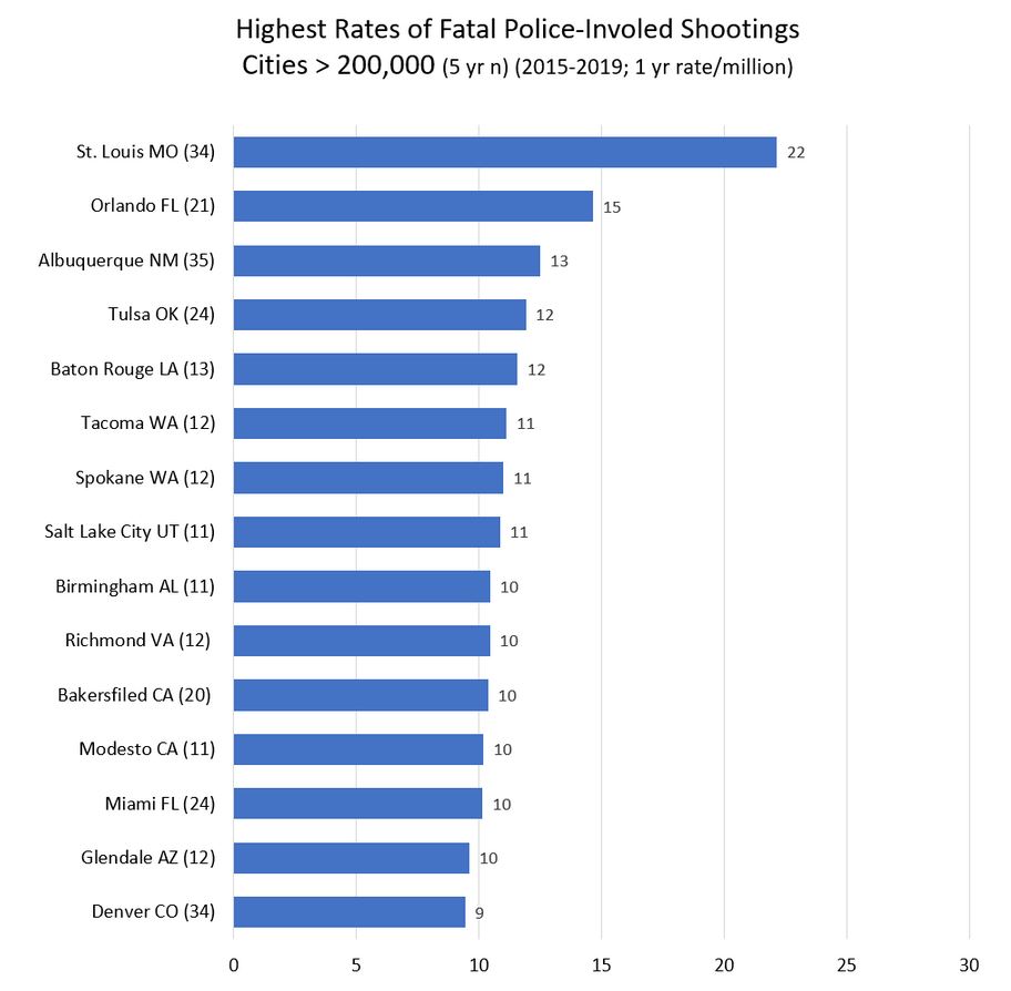
In the 300,000 to 500,000 category (n=29), only Lexington KY and Raleigh NC stand out as better than average (rate < 2). Though Virginia Beach, Minneapolis, Pittsburgh have rates < 4. On the high end (rate > 10) are Miami, Bakersfield, Tulsa, and St. Louis. St. Louis tops the chart at a whopping rate of 22.2 / million. Though St. Louis has a terribly high murder rate of 60 (per 100,000). Though New Orleans has a high murder rate of 39,000 and a cop-involved killing rate of (just?) 4.5 per million. (The US murder rate is about 5 per 100,000.)
Above half a million population, the range in rates of killed by police goes from above 8 in Albuquerque, Tucson, Denver, Mesa, Oklahoma City down to New York City with a rate of 0.89. Nothing comes close. Nashville, Philadelphia, Boston and San Diego have annual rates between 2 and 3 per million.
(Note I’ve changed the scale from the above charts. The x axis went to 30. Now it’s 14.)
Keep in mind there are hundreds of smaller cities and counties between Albuquerque and New York City. But the disparity between cities at the top and bottom of the list! It’s immense. And nobody sees to be able to look up from the latest outrage and ask, why?
So let’s give credit where it is due. By my figuring these departments all have killing rates under 1 per million (and serve populations over 180,000. If my data is correct, which it may not be). Their success should be applauded and emulated:
Travis County Sheriff’s Office
Montgomery County Department of Police
New Castle County Police Department
Gwinnett County Police Department
Loudoun County Sheriff’s Office
Chesterfield County Police Department
Prince William County Police Department
Santa Clara County Sheriff’s Office
Fairfax County Police Department
Monroe County Sheriff’s Office
Arlington County Police Department
Macomb County Sheriff’s Office
Oxnard Police Department
New York City Police Department
Lubbock Police Department
Lexington Police Department
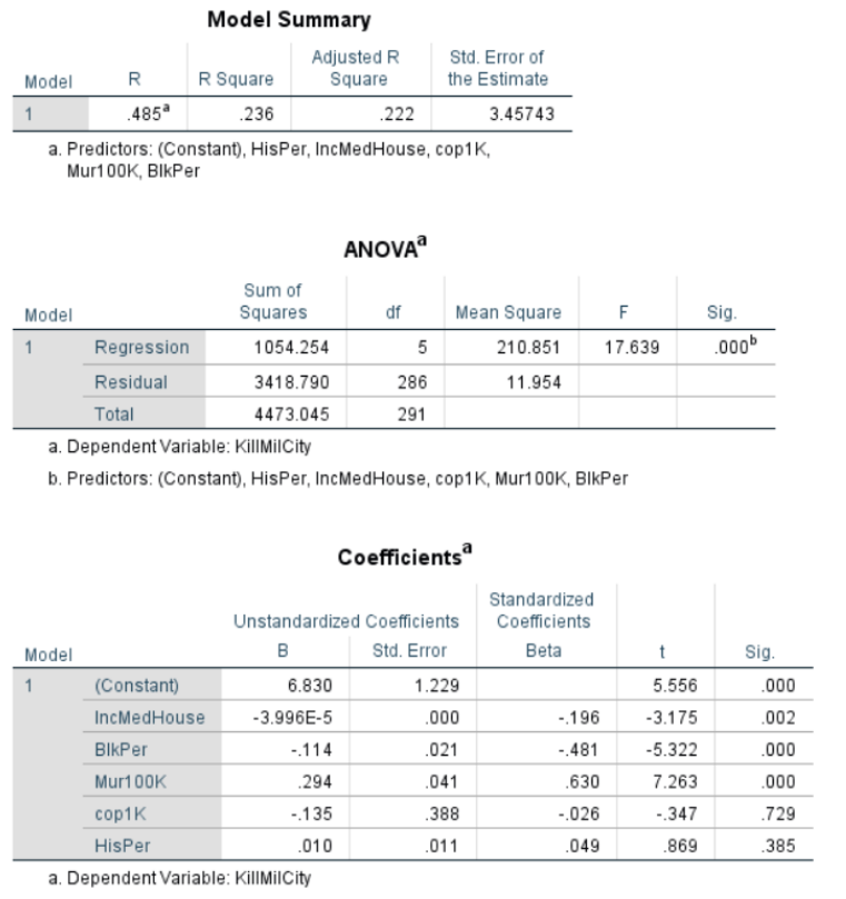
For those who understand such things, I also ran this regression for cities > 100,000. Dependent variable being the rate of police killings and independent variables being median household income, percentage black, murder rate, cops per capita and Hispanic/Latino percentage. Income matters (not a surprise). So does murder rate (obviously). But the negative correlation with Black percentage is of note. I was not expecting the lack of correlation with Hispanic/Latino percentage. My knowledge of advanced statistics doesn’t get much advanced that this, alas.
And this is all subject to errors and corrections. This a blog. Not a peer-review article. Leave a comment or better yet email me. Or twitter @petermoskos
Methods and sources:
Fatal Encounters. https://fatalencounters.org/
Population and police numbers mostly from here: https://ucr.fbi.gov/crime-in-the-u.s/2018/crime-in-the-u.s.-2018/tables/table-78/table-78.xls/view.
City murder number I mostly keep track of. But through 2018 from this kind of source: https://ucr.fbi.gov/crime-in-the-u.s/2016/crime-in-the-u.s.-2016/tables/table-6/table-6.xls/view
Other number from wikipedia and police department websites.
And here: https://www.census.gov/quickfacts/fact/table/US/
Killed by police data is from https://fatalencounters.org/. I gave $100; you should give few bucks, too. This is really important data, and it’s all the work of one guy. Plus he puts the format of the Washington Post’s gathering of similar data to shame.
Then I filtered for intentional gun killings for each city, county, and police agency. From this I created a data set (one row) for each city, county, and/or agency. County data is tricky. Best I could, I figured out the population policed by large police agencies. But it’s not an exact science. (Basically take a county and subtract the cities and towns that have their own police.) There’s a lot of overlapping jurisdiction. There’s also the issue that a lot of sheriff department are responsible for jails, and I tried to exclude correctional officers (by leaving out non-sworn employees). But then in the end it turns out the number of cops per capita seems to not be that revealing, other than being correlated with murders per capita (yes, cities with more murders have more cops, presumable in that direction of causality).
It’s also likely that some of the counties shouldn’t be included because their work is limited to courts and jails. Some of the police in these counties probably aren’t doing active policing, and hence shoot nobody. Also, murder data is probably accurate, because it comes from county departments reporting. And departments don’t generally claim other people’s murders. And some county department just don’t report any data. So some of the rates may be wrong. Long way of saying take county data with a grain of salt. But it’s still worth looking at.
[Update] Here are the rates for every city in America with more than 200,00 people. Because somebody asked requested. This is the annual rate of people shot and killed by cops (2015-2019) in this city. Rate per million.
Here’s county data. (Sorted by state, then city). Here I am including more data because I’m not confident about these rates. What is correct is the number of people killed by the agency in 5 years (Avg1yrKillAgcy). I’m not certain about the rate (KillMilAgcy) because I’m not certain about the population policed (Or the number of cops). If you know better, let me know.
2020 caveat.
Here’s some fancier statistical regression courtesy of Professor Gabriel Rossman. This is a work in progress.
I think we get a few things from the Poisson:
- The satisfaction that it’s done right, or at least that it’s less wrong.
- Cops/1000 population is now significant. Given that the specification is technically better, as in the data better fit the model’s assumptions, you can probably trust this, or at least trust it at least as much as you could the OLS of rates
- You no longer need to worry about small n and zeroes biasing the models which means that even with a rare event you can include small cases. You no longer need to drop Mayberry from the dataset though obviously data cleaning is a pain with a bunch of small towns.
12/7/2020 KillMilCity and KillMilAgcy are deaths as police homicides per million population.
cops <- read_csv(file = "moskos_copshootings.csv")## Parsed with column specification:
## cols(
## .default = col_double(),
## citystate = col_character(),
## statecity = col_character(),
## statecounty = col_character(),
## state = col_character(),
## agcy = col_character()
## )## See spec(...) for full column specifications.glimpse(cops)## Rows: 166
## Columns: 30
## $ citystate <chr> "Kansas City KS", "Escondido CA", "Pomona CA", "S...
## $ statecity <chr> "KS Kansas City", "CA Escondido", "CA Pomona", "M...
## $ murder1Avg <dbl> 6.50, 4.50, 14.25, 15.00, 6.66, 1.25, 14.25, 4.00...
## $ statecounty <chr> "KS Wyandotte", "CA San Diego", "CA Los Angeles",...
## $ FlagCityCounty <dbl> 0, 0, 0, 0, 0, 0, 0, 0, 0, 0, 0, 0, 0, 0, 0, 0, 0...
## $ spendCapita <dbl> NA, NA, NA, NA, NA, NA, NA, NA, NA, NA, NA, NA, N...
## $ Population <dbl> 152958, 153073, 153496, 155179, 155503, 155637, 1...
## $ cop1K <dbl> 2.4516534, 1.0125888, 0.9511649, 3.1511996, 1.929...
## $ Mur100K <dbl> 4.2495326, 2.9397738, 9.2836295, 9.6662564, 4.282...
## $ BlkPer <dbl> 23.5, 2.4, 6.0, 20.9, 18.0, 1.7, 24.1, 1.4, 1.3, ...
## $ HisPer <dbl> 29.9, 51.9, 71.5, 44.7, 37.5, 17.3, 11.5, 23.1, 7...
## $ IncMedHouse <dbl> 43573, 62319, 55115, 36730, 51917, 131791, 53007,...
## $ KillMilCity <dbl> 9.152839, 1.306566, 5.211862, 0.000000, 3.858446,...
## $ KillMilAgcy <dbl> 7.845291, 1.306566, 2.605931, 0.000000, 2.572298,...
## $ state <chr> "KS", "CA", "CA", "MA", "FL", "CA", "TN", "CO", "...
## $ EastWest <dbl> 2, 2, 2, 1, 1, 2, 1, 2, 2, 1, 1, 2, 2, 2, 2, 2, 1...
## $ agcy <chr> "Kansas City Police Department", "Escondido Polic...
## $ Cops <dbl> 375, 155, 146, 489, 300, 217, 278, 285, 151, 340,...
## $ countCity <dbl> 7, 1, 4, 0, 3, 4, 3, 8, 2, 4, 1, 3, 6, 9, 1, 2, 1...
## $ killedByAgency5Yr <dbl> 6, 1, 2, 0, 2, 4, 2, 7, 2, 4, 2, 3, 4, 9, 0, 1, 1...
## $ CopsKill1Yr <dbl> 0.003200000, 0.001290323, 0.002739726, 0.00000000...
## $ CopsKill20Yr <dbl> 0.06400000, 0.02580645, 0.05479452, 0.00000000, 0...
## $ Murder4yrTotal <dbl> 26, 18, 57, 60, NA, 5, 57, 16, 113, 244, 21, 32, ...
## $ LEO <dbl> NA, 209, 269, NA, 394, 282, 342, 409, 204, NA, 40...
## $ Civs <dbl> NA, 54, 123, NA, 94, 65, 64, 124, 53, 250, 88, 11...
## $ unique <dbl> 26448, 19403, 24380, NA, 26303, 350, 25627, 27185...
## $ zip <dbl> 66111, 92027, 91768, NA, 33024, 94089, 37042, 802...
## $ lat <dbl> 39.11662, 33.14459, 34.05056, NA, 26.02650, 37.39...
## $ long <dbl> -94.81942, -117.03364, -117.82068, NA, -80.22943,...
## $ `filter_$` <dbl> 1, 0, 0, 0, 0, 0, 0, 1, 0, 0, 0, 0, 0, 1, 0, 0, 0...Replicate post
Reasonably good match for Moskos’s 7/5/2020 blog post but numbers aren’t exact. Perhaps it’s minimum population of 100,000 (blog) vs 150,000 (this notebook). Alternately may be a counties issue.
summary(lm(data=cops,KillMilCity~IncMedHouse+ BlkPer + Mur100K + cop1K + HisPer))##
## Call:
## lm(formula = KillMilCity ~ IncMedHouse + BlkPer + Mur100K + cop1K +
## HisPer, data = cops)
##
## Residuals:
## Min 1Q Median 3Q Max
## -6.3049 -1.6853 -0.1688 1.5078 9.7141
##
## Coefficients:
## Estimate Std. Error t value Pr(>|t|)
## (Intercept) 8.333e+00 1.347e+00 6.185 5.05e-09 ***
## IncMedHouse -4.975e-05 1.434e-05 -3.469 0.000673 ***
## BlkPer -1.288e-01 2.242e-02 -5.742 4.61e-08 ***
## Mur100K 2.752e-01 3.707e-02 7.423 6.53e-12 ***
## cop1K -2.078e-02 3.636e-01 -0.057 0.954492
## HisPer -1.659e-02 1.220e-02 -1.360 0.175703
## ---
## Signif. codes: 0 '***' 0.001 '**' 0.01 '*' 0.05 '.' 0.1 ' ' 1
##
## Residual standard error: 2.782 on 159 degrees of freedom
## (1 observation deleted due to missingness)
## Multiple R-squared: 0.3511, Adjusted R-squared: 0.3307
## F-statistic: 17.21 on 5 and 159 DF, p-value: 1.368e-13cops %>% ggplot(aes(x=KillMilAgcy)) + geom_histogram() + labs(x='Police Homicides Per Million Population', caption='Agency, not city')## `stat_bin()` using `bins = 30`. Pick better value with `binwidth`.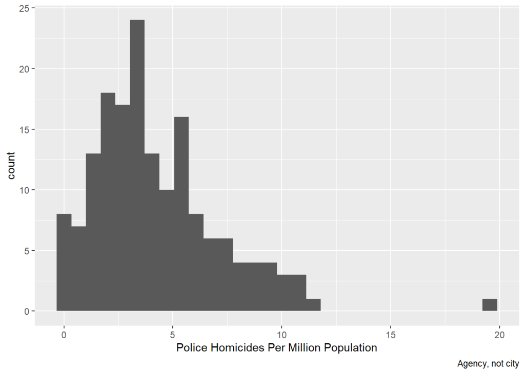
cops %>% ggplot(aes(x=killedByAgency5Yr)) + geom_histogram() + labs(x='Police Homicides Over 5 Years, Raw Count', caption='Agency, not city')## `stat_bin()` using `bins = 30`. Pick better value with `binwidth`.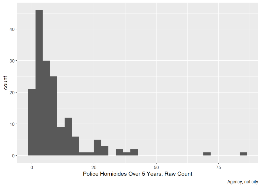
cops %>% ggplot((aes(x=cop1K,y=killedByAgency5Yr,size=Population))) +
  geom_point() +
  labs(x='Number of Cops / 1000 Population',y='Police Homicides Over 5 Years, Raw Count')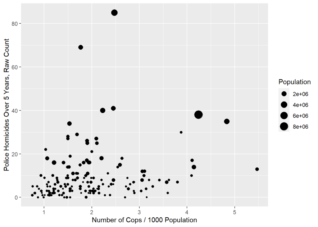
cops %>% ggplot((aes(x=Population,y=cop1K))) +
  geom_point() +
  labs(x='Population',y='Number of Cops / 1000 Population')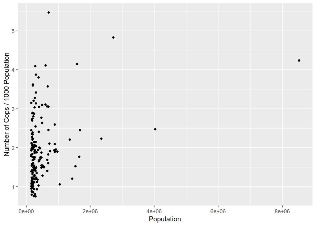
Poisson
Because police homicides are events, they can be modeled with a count model. Assuming the events are independent net of observables, a Poisson is appropriate. This seems consistent with the histogram. If the histogram were much more right-skewed or if there were strong theoretical reasons to think police homicides were not independent, then a negative binomial could be appropriate.
Because cities/ agency jurisdictions vary wildly in size, it’s best to include population as an offset to model the different exposure. That is, more people means more people at risk of getting shot by cops and the model accounts for that.
Compared to the OLS analysis of rates, the Poisson analysis of counts is similar but now everything is significant, including number of cops and percent Latino, both of which are negatively associated with the counts of police homicides.
summary(glm(killedByAgency5Yr~IncMedHouse+ BlkPer + Mur100K + cop1K + HisPer + offset(log(Population)),
            data=cops,family="poisson"))
##
## Call:
## glm(formula = killedByAgency5Yr ~ IncMedHouse + BlkPer + Mur100K +
## cop1K + HisPer + offset(log(Population)), family = "poisson",
## data = cops)
##
## Deviance Residuals:
## Min 1Q Median 3Q Max
## -3.9061 -1.2174 -0.1628 0.9152 3.3863
##
## Coefficients:
## Estimate Std. Error z value Pr(>|z|)
## (Intercept) -9.609e+00 1.748e-01 -54.973 < 2e-16 ***
## IncMedHouse -1.068e-05 2.140e-06 -4.993 5.95e-07 ***
## BlkPer -2.789e-02 3.018e-03 -9.242 < 2e-16 ***
## Mur100K 5.070e-02 3.583e-03 14.149 < 2e-16 ***
## cop1K -2.050e-01 3.459e-02 -5.926 3.10e-09 ***
## HisPer -5.088e-03 1.536e-03 -3.312 0.000925 ***
## ---
## Signif. codes: 0 '***' 0.001 '**' 0.01 '*' 0.05 '.' 0.1 ' ' 1
##
## (Dispersion parameter for poisson family taken to be 1)
##
## Null deviance: 654.06 on 164 degrees of freedom
## Residual deviance: 369.63 on 159 degrees of freedom
## (1 observation deleted due to missingness)
## AIC: 960.63
##
## Number of Fisher Scoring iterations: 4Percent Black vs Murder Rate
There is a 0.772 correlation between % black and the murder rate, which suggests possible collinearity. As such,
Note that the murder only version has a lower AIC so if forced to choose that’s the better model. Also note that when only one at a time is included, murder remains positive and black remains negative. Whatever is driving the murder and black effects, it is not collinearity.
cops %>% ggplot((aes(x=BlkPer,y=Mur100K,size=Population))) +
  geom_point() +
    labs(x='Percent Black',y='Murders per 100,000')
## Warning: Removed 1 rows containing missing values (geom_point).
cops %>% ggplot((aes(x=Mur100K,y=killedByAgency5Yr,size=Population))) +
  geom_point() +
  labs(x='Murder Rate',y='Police Homicides, Raw Count')
## Warning: Removed 1 rows containing missing values (geom_point).
cops %>% ggplot((aes(x=BlkPer,y=killedByAgency5Yr,size=Population))) +
  geom_point() +
  labs(x='% Black',y='Police Homicides, Raw Count')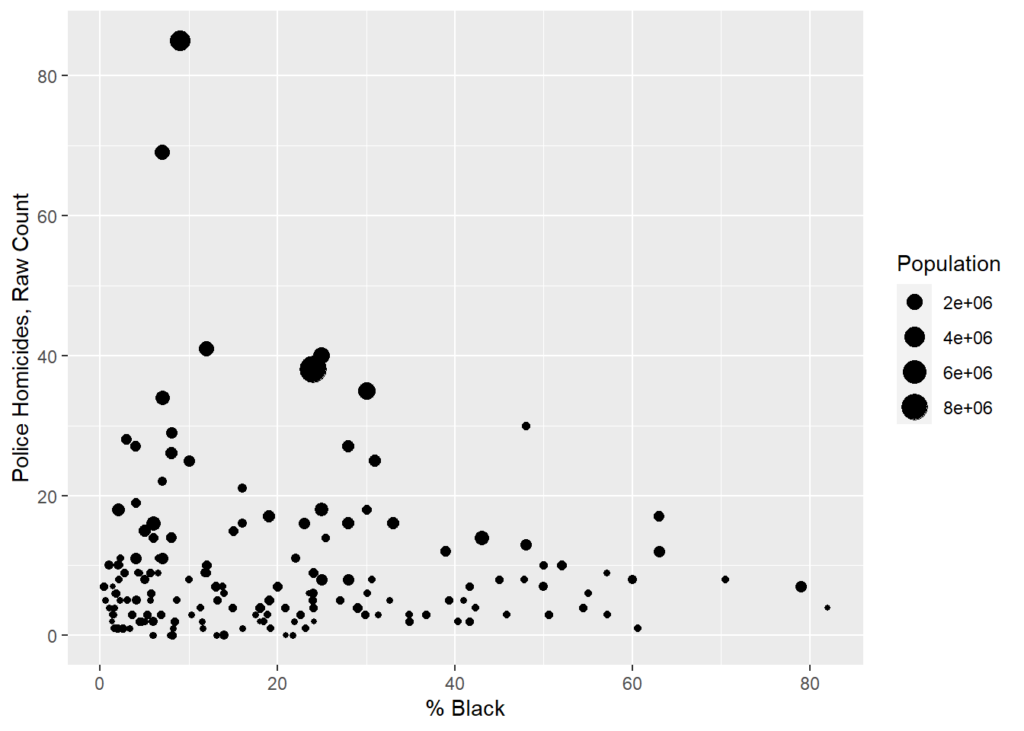
summary(glm(killedByAgency5Yr~IncMedHouse+ Mur100K + cop1K + HisPer + offset(log(Population)),
            data=cops,family="poisson"))
##
## Call:
## glm(formula = killedByAgency5Yr ~ IncMedHouse + Mur100K + cop1K +
## HisPer + offset(log(Population)), family = "poisson", data = cops)
##
## Deviance Residuals:
## Min 1Q Median 3Q Max
## -4.068 -1.450 -0.369 1.020 4.553
##
## Coefficients:
## Estimate Std. Error z value Pr(>|z|)
## (Intercept) -1.015e+01 1.696e-01 -59.874 <2e-16 ***
## IncMedHouse -5.010e-06 2.025e-06 -2.474 0.0134 *
## Mur100K 3.071e-02 3.195e-03 9.612 <2e-16 ***
## cop1K -3.397e-01 3.132e-02 -10.846 <2e-16 ***
## HisPer 1.663e-03 1.378e-03 1.207 0.2274
## ---
## Signif. codes: 0 '***' 0.001 '**' 0.01 '*' 0.05 '.' 0.1 ' ' 1
##
## (Dispersion parameter for poisson family taken to be 1)
##
## Null deviance: 654.06 on 164 degrees of freedom
## Residual deviance: 458.59 on 160 degrees of freedom
## (1 observation deleted due to missingness)
## AIC: 1047.6
##
## Number of Fisher Scoring iterations: 5summary(glm(killedByAgency5Yr~IncMedHouse+ BlkPer + cop1K + HisPer + offset(log(Population)),
data=cops,family="poisson"))##
## Call:
## glm(formula = killedByAgency5Yr ~ IncMedHouse + BlkPer + cop1K +
## HisPer + offset(log(Population)), family = "poisson", data = cops)
##
## Deviance Residuals:
## Min 1Q Median 3Q Max
## -7.4545 -1.3608 -0.2578 1.0028 7.3989
##
## Coefficients:
## Estimate Std. Error z value Pr(>|z|)
## (Intercept) -9.177e+00 1.750e-01 -52.428 < 2e-16 ***
## IncMedHouse -1.642e-05 2.183e-06 -7.524 5.33e-14 ***
## BlkPer -6.959e-03 2.518e-03 -2.764 0.00572 **
## cop1K -1.973e-01 3.238e-02 -6.094 1.10e-09 ***
## HisPer -4.604e-03 1.548e-03 -2.973 0.00295 **
## ---
## Signif. codes: 0 '***' 0.001 '**' 0.01 '*' 0.05 '.' 0.1 ' ' 1
##
## (Dispersion parameter for poisson family taken to be 1)
##
## Null deviance: 654.55 on 165 degrees of freedom
## Residual deviance: 533.19 on 161 degrees of freedom
## AIC: 1125.7
##
## Number of Fisher Scoring iterations: 5
Comments
15 responses to “Disparities in Police-Involved Shootings by City and County”
This is really important work and thanks for taking it on, Peter. I can answer the question about Grand Prairie, and Plano in Texas, by saying that it’s not luck. As an example, one cannot get a job at Grand Prairie Police Department if one has credit card debt. I don’t mean bad credit, I mean you’re carrying a rotating balance. The chief wants their officers’ lives to be completely squared away before he’ll even consider hiring them on. They also have worked very closely for years with activists and interest groups like NAACP and ACLU. Plano is similar, a very professional police department. I am surprised that you didn’t look at Tarrant County, Texas, because I’d be interested in those numbers.
Also I second your call for giving fatal encounters donations. Most people don’t understand that before fatal encounters there was literally nothing. The guardian and Washington post rated fatal encounters to begin their projects, but because those projects were more popular, people seem to think that they came first. They did not. I also use fatal encounters data for my PKIC database in 2015-2016. That’s because Brian, who runs it, encourages everyone to use this data. It’s exactly the kind of project that we who are serious and disciplined about understanding police use of deadly force all want to see
I’ve got Arlington and Fort Worth in Tarrant County. But as to Tarrant CO Sheriff, TX, I might have just missed it. Or maybe thought they didn’t do policing as the have no deaths from 2015-2019. But I see 1,245 officers. You know how many are doing police work (as opposed to jail)? And what size population they serve? 1,810,000 county population. Minus 893,756 (Fort Worth), 400,920 (Arlington), 47,000 (Bedford) 51,000 (Euless), 37,000 (Hurst) 10,000 (Azle) = 370,324. I might be missing some city depts as well. Since for most places under 100,000, I only have them when the kill somebody.
Anyway, I’ve now added Tarrant County as its own county entity. I would also like to know how many murders there.
This is super interesting, and is a great example of how different levels of analysis can really obscure variation within datasets. I’m sure your Yiayia and Papou are very proud of you.
Thanks for sharing the data! I think a huge factor that explains huge differences across states in rates of fatal police shootings is the prevalence of gun ownership and closely tied to that, very lax gun laws. David Hemenway and colleagues published an article in 2018 that showed that much of the state-level variation in fatal police shootings was attributable to differences in the prevalence of gun ownership. DOI: 10.1007/s11524-018-0313-z Law enforcement in these states are far more likely to encounter an angry, agitated, or violent person with a firearm than is the case in states with much lower rates of firearm ownership. Hemenway found that the relationship held for shooting unarmed civilians as well as those armed with guns. I assume that this is the case because LEOs are anticipating that the person they are encountering is armed with a gun. The LEAs with the highest rates of fatal police shootings are all in states in the West or South. California is the only state that has some jurisdictions with unusually high rates of police shootings that are fairly restrictive gun laws. But they do not require handgun purchasers to get a license – something that my team at JHU has found to be consistently linked with lower rates of homicides, fatal mass shootings, suicides, and the rate at which LEOs are shot in the line of duty. We’ve also shown that a key mediating variable is that licensing reduces the diversion of firearms from legal to illegal markets. I also suspect that another important mechanism at play is that the criteria for legal purchase of firearms in states with licensing is generally higher, so fewer risky folks can easily acquire a firearm. Given what we know about licensing and the associations that I’m seeing at the state level between the policy and much lower rates of fatal police shootings, I think we’re building a case for causal inference. I’m writing something on this issue now – the association between handgun purchaser/owner licensing and lower rates of fatal shootings by law enforcement officers.
Yet there are still important variation at the local level that is more likely due to differences in policies and culture within those agencies. I would be interesting to see if sworn officers per capita explains much of the variation. The more cops, the more likely someone will get shot by one. The negative association between the percent of the population that is Black is likely confounded with a number of things, including the prevalence of gun ownership. Gun ownership among Blacks is lower than among Whites and Blacks are more likely to live in places with stricter gun laws and enforcement practices that focus on illegal gun possession.
Is California the exception that proves the rule or should Florida be regarded as the exception in the East? Peter noted that Birmingham & Jackson don’t have such high rates, and if those places aren’t Deep South then nowhere is (New Orleans couldn’t be further south geographically, but like southern Florida is somewhat culturally distinct from most of the South).
Thanks for getting the data. I wonder how you square this with the Nick Selby article you tweeted, the article that defends killings by police. “Some people truly need to be killed.” Why are do Pueblo and Las Cruces have so many more of these need-to-be-klled people than do NYC and Nashville?
I’m not certain if they do. That’s kind of my whole point here. Want to reduce shootings? Flag departments that shoot more people. Learn from the departments that shoot fewer. Individual each shooting can be justified (or not) but at statistical level, a rate in one department 5X higher than a comparable department means one department is doing it wrong. (Though with a small n, sometimes it is bad luck. But it’s a still a flag worth noting.)
But that’s different from the point both Nick and I sometimes make, which is all police-involved shootings are _not_ bad (tragic, at some level, but not bad). He (and I) never said that every shooting is good! Just that the goal isn’t zero shootings. And every time a discussion/narrative _starts_ with the premise that all police-involved shooting are bad, the discussion isn’t going anywhere good.
[…] 6. The shooting cops problem is much worse out in the west, and other regularities. […]
Is Athens GA in Florida or out west?
Here are a few thoughts on this regression from another barely statistically literate person.
Firstly, I think a linear regression is not ideal for this kind of analysis. You are modelling the rate of events per unit time in many different counties, of a phenomenon that has very low counts per county or city. Therefore I think a Poisson or possibly negative binomial regression would be a better model. You have a fairly low number of samples (cities), so it will be hard to get significant coefficients, especially so the more coefficients you add as you develop this analysis, but Poisson regression might get you more statistical power for your data.
Secondly, the results on the coefficients of black and Hispanic percentages is interesting, and your observation that western states have higher rates than eastern states could partially explain this: I don’t know for sure, but I assume that there is a higher concentration of blacks in the east, and more Hispanics in the west. So the negative correlation for blacks and (nonsignificant) positive correlation with hispanics could actually be explained by this longitude effect.
In light of this it might be interesting to add to the regression either or both of: longitude, and maybe a regional (i.e., is the state in the Southeast, Midwest, etc) categorical variable. Even something like the political party that the state voted for president could matter, as obviously Republican and Democratic states have different attitudes towards gun control and the police, and this could be reflected in the way police behave. But I could understand if you didn’t want to wade into such political waters, particularly at this sensitive time. Each new variable added changes the interpretation of the regression, though, particularly when there is such covariation among ethnicities, regions, and income. Should there be an interaction between ethnicity and income, for example, on the hypothesis that poor whites and poor minorities are treated differently? I’d consult a local statistician about all this.
If you haven’t tried this before and you are looking for collaborators, and haven’t been able to find an interested statistician, you might ask around your local College of Public Health. Certainly this is a public health problem and the level of effort required for helping you out here would be low compared to the kind of work they normally do. Certainly it is topical as well. If you didn’t get any takers at John Jay, I work next door to our College of Public Health, and could ask them if you’re interested, because I love your work. You should have my e-mail.
It is so fascinating to think of all the different explanations or “stories” that could be told from this data. There are a lot of them. Your emphasis seems to be on finding out what factors affect quality policing, so one potential story is that states in the West are “younger” than states in the East, so perhaps there has been less time for the “institutional knowledge” of their police departments to develop? As Daniel Webster points out, gun ownership is a potential confounder too, one that is likely to differ between the West and East.
That’s a fabulously helpful comment. I’m more than happy to share the data. I’m open to any collaboration. And I don’t even need publishing credit.
I was going to say the same thing about Poisson. Note though that the jurisdictions vary wildly in size so it would have to be Poisson with jurisdiction population as exposure, not just as an independent variable.
[…] Disparities in Police-Involved Shootings by City and County by Peter Moskos for Cop in the Hood. […]
[…] 2. Police-involved shootings by city. The murder of George Floyd by police has triggered a rising awareness of police violence. Sadly, its not isolated and uncommon. The website Cops in the Hood has tabulated data on “police-involved shootings”—itself a tortured and evasive term—and computed the per capita instance of such shootings in major US cities. […]
[…] there are also big differences in police departments across the country based on training and policies. And the inconvenient fact is that a […]