Tag: rising crime

  • 2020: A Bad Year

    I’m just playing with charts and data presentation. If I graphed the number of people shot in NYC and the percent change on the previous year, it’s a challenge when a number that is between -20 and +7 suddenly goes to 100best I can come up with is something like this.

    Without 2020 it’s much easier to do.

    Though without knowing about 2020, I’d probably use a more traditional format and not even include percentage change. (Plus I could go back one more year, to as far back as I this data.)

    Add 2020 to the simple chart and you get this. But I think it’s important to show just how absolutely absurd the percentage increase in shootings was last year. The last time there was even a 10% increase in shootings was probably 1990. My NYC shooting data only goes back to 2001. Though I read somewhere reliable that 5,866 people were shot in 1993.

  • Murder down for whites but not blacks

    The 2018 murder rate is down from the previous two years, but higher than we’ve seen in 6 of the past 10 years. Last year’s murder rate is the same as 2015. And 2009! And yet I keep hearing every year that violence is down. So what’s this trend? And sort of related, why do some people insist on the “violence is down” message year after year, even when it’s not true?

    Yes, violence is lower than it was in 1991. Violence will hopefully always be lower than 1991. But that doesn’t mean violence is trending down year after year. If we keep starting the graph around 1991, violence will always look downward trending.

    The murder rate in the US actually peaked in 1980 at 10.2 (per 100K). And then there was the lesser but better-known crack-trade-related murder peak of 1991 (9.8 per 100K). So we’re down from there, no doubt.

    Violence plummeted in America between 1994 and 1999. It might be worth pointing out that is right after the Biden-supported and now maligned crime bill. I don’t actually think that’s why crime went down, but it does correlate. And it didn’t hurt. It might have helped.

    Whatever the causes — and I do think better policing (along with changes in drug dealing) was a huge part of the solution — many lives were saved between 1994 and 1999. Of course, as always, there were racial disparities. Blacks benefited most from the decline in violence. From 1994 to 1999 the number of black murder victims dropped from about 12,000 to 7,000 per year! White murder victims declined, too (but less so, from 11,000 to 8,000). This brings us to 1999.

    Since 1999, the murder rate for whites has dropped even more, another 20%. Great news! But not for blacks. In absolute numbers, more blacks were murdered in 2018 than in 17 of the past 20 years. That’s not a good trend.For African Americans, murder has been up and down over the past 20 years. But the murder rate is no better in 2018 than it was in 1999.

    Image


    What bother me is some of my friends who insist “violence is down” are well intentioned white people who live in safe neighborhoods, hashtag#BLM, and believe those who advocate less policing in other people’s neighborhoods. (Neighborhoods they won’t set foot in, mind you.)


    Yes, violence is down compared to 1991. But is it a sustained “trend”? Not really. Not if you start the clock in 2000. And not for non-whites. Not for young black men in particular. So when people say violent crime is down, ask “For whom?”


  • Pushing the Ideological Narrative

    Pushing the Ideological Narrative

    I updated the Brennan Center’s crime report from 2016, to update it for 2018. I still have this urge to show how goofy their methods are. Why? Because, the authors are still cited by reputable journalists as experts, despite never acknowledging or correcting their past efforts to intentionally mislead journalists and the public. It’s advocacy data-analysis. It’s unethical, wrong, and harmful to the cause of truth.

    Here’s my parody of the Brennan Center style, adopted for 2019. The numbers I use are actually accurate, based on the best available city-data. The logic and conclusions and push, however, are just as absurd.

    Crime in 2018: Final Year-End Data

    Chicago accounted for more than 34 percent of the murder decrease last year, according to a new analysis of crime data based on faulty methods often used by the Brennan Center.

    January 4, 2019

    This analysis finds that Americans are less safe today than they have been at almost any time since 2014.

    Based on new year-end data collected from the 30 largest cities, murder in 2018 remained higher than just 4 years ago. Although there are some substantial decreases in murder in specific cities, these trends do not signal the start of a new national crime drop. What’s more startling, this analysis finds that the decrease in murders is even more concentrated than initially expected. Just three cities — Baltimore, Chicago, and Columbus — accounted for more than half (59.9 percent) of the decrease in murders. Chicago alone now accounts for more than 34.3 percent of the total decrease in urban murders.

    Final Year-End Findings:

    • The murder rate fell in this group of cities last year by 7 percent.

    • Amazingly, Chicago accounted for 34.4 percent of the total decrease in urban murders.

    • Three cities — Baltimore, Chicago, and Columbus — accounted for more than half (59.9 percent) of the decrease in murders.

    • Some cities are experiencing a decrease in murder while other forms of crime remain relatively high. Celebration about a national crime drop are premature, but these trends suggest a need to understand how and why murder is decreasing in these cities.

    Highlights of this style (faulty logic obscured by dressed-to-impress layout, footnotes, and statistical concepts).

    1) The murder rate fell in this group of cities last year by 7 percent.

    * “In this group of cities” added only when called out. http://www.copinthehood.com/2017/07/two-year-increase-in-homicide.html

    2) Amazingly, Chicago accounted for 34.4 percent of the total decrease in urban murders.

    *Note: this simply is not true. But is a reflection of only looking at a number cities.

    3) Three cities — Baltimore, Chicago, and Columbus — accounted for more than half (59.9 percent) of the decrease in murders.

    *This is true when one includes the caveat “of the sample used.” And if one includes this caveat, the statement is statistically worthless.

    4) Celebration about a national crime drop are premature — America remains much more violent than just 4 years ago — but these trends suggest a need to understand how and why murder is decreasing in these cities.

    *If you cherry pick the baseline year, you can say anything!

    One lesson is always be suspicious of data presentation. Is somebody pissing on your leg and saying it’s raining? Trust your gut or your “lying eyes.” When crime is up and people say it’s not, be wary. But use the same vigilance when crime is down and people say “be afraid!”

    Know your source, if possible. Assuming people aren’t just making numbers up, see when people use one form of logic when data go one way, but sing another tune when the same data go in the opposite direction. (Could be crime, the stock market, gas prices, etc.)

    Luckily, murder really was down in 2018. I wouldn’t want to waste your time pretending otherwise.

  • Two-year homicide increase in cities

    Two-year homicide increase in cities

    Now that the UCR data for last year is out, here is the homicide rate increase in cities over 400,000 people. This is two year, 2014-2016.

    Homicide is up in 40 of the 48 largest cities.

  • Still trying to explain…

    Still trying to explain…

    What’s wrong with the Brennan Center’s analysis? There are many problems. But here are a few:

    1) They take a non-random sample (which isn’t bad in and of itself) and then A) don’t tell the reader in the text and B) state conclusions as if the sample were a random sample (every data point equal chance of being picked), representative of the nation.

    2) They take short time frames (1 year) to point out that fluctuations could be random. True. For a short time frame. They could take a longer time frames (3 years) and see more clearly developed patterns.

    3) This is bit trickier to explain. And that’s why I’m giving it another shot. They base their findings on a magnitude of changes within their sample. This has the perverse effect of attention getting conclusions — “more than half” — that are noteworthy only in direct proportion to the limitations of their sample.

    Let’s take an analogy. Say they want to look at murder in the City of Moskopolis (a fine city, despite a bit of a crime problem). So they take a sample of three police districts (out of ten equally sized police districts). Now it just so happens that we already know that murder in Moskopolis is up 20 percent. But our study looks at District #1, where murder is up 30 percent, and District #2, where murder is up 10 percent.

    Now maybe District #1 is important for its own reasons. “Murder is up 30 percent in District #1.” No problem there. Or maybe, the mayor of Moskopolis prefers to give a bit of spin: “Murder is up 30 percent in District #1, but not so much in rest of city.” That’s fine, too.

    But you can’t say this: “District #1 accounts for 75 percent of the murder increase in Moskopolis.” This is not true. It is false. District #1 accounts for 15 percent of the city’s murder increase.

    So some guy who has a stick up his ass about accurate data (me, even though I really do have better things to be doing with my time) gets all huffy and points out this inconvenient truth to the Washington Post, which listens to me because I’m generally a trustworthy guy.

    So the Washington Post calls the authors and says, “What’s up?”

    “Oh,” they say. “I’m sorry. I was talking about 75 percent in my sample. Did I not make that clear?”

    No. You did not. The Washington Post dutifully makes the correction and updates the story: “District #1 accounted for 75 percent of the murder increase in two districts.”

    This is now no longer a false statement, but it’s a still meaningless one. Who cares about what percentage of change there is in one district in my sample? Why are we talking about two districts when we could be talking about six, eight, or even all ten of them. And here’s a doozy: What if murder went down in District 2? Could District #1 account for more than 100 percent of the increase in my sample? Mathematically, yes, says my calculator. But statistically an increase of 100 percent is absurd. Methodologically, this should be a big red flag.

    Anyway, Moskopolis is still a fine place. And indeed, we shouldn’t overreact to an increase a murder. But if the mayor says murder isn’t up, perhaps you shouldn’t believe the mayor.

  • Quality Policing Podcast: Interview With Jeff Asher

    Quality Policing Podcast: Interview With Jeff Asher

    There’s another quality policing podcast in which I talk to data analyst Jeff Asher about the Brennan Center’s latest report on crime. Asher had posted this thread about methodological problems in their data and analysis.

    Brennan has a new report out showing murder down 2.5% nationally, but there are some major issues with that finding.

    1) The figures cited aren’t year-to-date, they’re projected year end numbers based on around midyear counts.

    2) Murder tends to pick up over the second half of the year, and any projection using midyear numbers will almost certainly be wrong.

    3) They found murder -2.5% but included San Fran’s 2016 count in that. There was no count for 2017. Removing SF makes murder -1.5%.

    4) Detroit is estimated to be -27%, but that’s based on Detroit’s open data site.

    5) That’s problematic because the open data site is slow to add murders, so any year-to-date count will be wrong.

    6) Detroit had over 130 murders as of late June according to the Detroit Police Department, and the 220 murders they project would be the fewest there since 1966.

    7) Taking Detroit’s inaccurate count out takes murder in their sample from -1.5% to +0.7% overall. So Detroit’s inaccuracy explains the drop

    8) The Phoenix count is similarly wrong. Phoenix had about 150 murders in 2016 but this report says they had 80 and project 60 for 2017.

    9) The Phoenix figure was reached by using MCCA midyear data and doubling it, but Phoenix only reported Q1 data to the MCCA.

    10) As of May Phoenix had 58 murders year-to-date in 2017 and 56 in 2016. Take away Phoenix and Detroit and suddenly murder is up 1.2% in the sample.

    11) Which is to say nothing of the methodological issue of projecting midyear for 30 cities to a full year and calling it a national trend.

    12) For what it’s worth, my midyear piece for @FiveThirtyEight shows murder up a few % but rising slower than previous years.

    13) Also worth reading is @Jerry_Ratcliffe on why doing year-to-date analysis isn’t a great idea

    14) Larger point is that measuring murder nationally is tough, drawing sweeping conclusions from badly incomplete data is a huge mistake in my opinion

    This isn’t the first time the Brennan Center has released faulty and misleading reports on the rise in homicide. In July, after the last one, I finally made an attempt to talk to one of the report’s authors. Once I laid out my concerns, the correspondence ended. Today I asked the other author (via twitter) if he wished to be interviewed or engage in a civil discussion of methods. No dice, apparently he’s “alright, thanks.” It’s still an open invitation.

    There are numerous problems with their analysis, but the most irksome to me is the straight-up misleading statement. I asked:

    Is this statement [from your report] true? “Notably, 55.6% of murder increase 2014 to 2017 is attributable to two cities — Chicago and Baltimore.”

    Because I know it’s not true, since about 14 percent of the murder increase from 2014 to 2017 is attributable to Chicago and Baltimore. He replied:

    Yes. It’s true for the 30 largest cities (our cohort), not nationally.

    This not an explanation as much as a confession because they don’t say “for the 30 largest cities (our cohort), not nationally” in their report.

    I understand how they got their numbers; on my calculator, I can replicate their methods. That’s good, but not good enough. Their methods are faulty.

    Here are some of my remaining unanswered questions I posted on twitter.

    Since 2013, what is the change in homicides in those 30 cities? I get a decrease in 3 cities and an increase in 27. Is this correct?

    Do you understand problems in saying a “percentage of increase in sample“? Substantively meaningless & statistically absurd.

    If you have three years of data, why do 2017 tables only compare with last year, 2016?

    It may turn out to be true, but still seems a odd choice that only mention of (20%!) 2-year homicide increase is as “short-term fluctuation”

    If twitter can’t do this justice, I’d be happy to interview you for @QualityPolicing podcast.

    I asked if we could “continue w/ a civil discussion of your methods?” Alas, the reply was: “I’m alright, thanks.

    For two main reasons, I’m not OK. I’d like the Left to stay committed to the truth. The generally decent Brennan Center should be above Heritage-Foundation-style BS.

    But more importantly: when you say murder is down when murder is up, it’s not just an issue of truth. It’s also an attempt to make the murder victims — disproportionately poor young black men — disappear from our consciousness. As if they never existed. Do their lives not matter, too?

  • Data presentation and the crime rise in Baltimore

    Data presentation and the crime rise in Baltimore

    Data presentation fascinates me because it’s both art and science. There’s no right way to do it; it depends on both hard data, good intentions, and interpretive ability. Data can be manipulated and misinterpreted, both honestly and dishonestly. And any chart is potentially yet another step removed from whatever “truth” the hard data has.

    Where I’m going isn’t exactly technical, but there’s no point here other than data presentation and honest graph making (and also crime being f*cking up in Baltimore after the riots, but that’s not my main point). If that doesn’t interest you, stop here. [Update: Or jump to the next post.]

    I took reported robberies (all), aggravated assaults, homicides, and shootings from open data from 2012 to last month. I then took a simple count of how many happen per day (which is strangely not simple to simple to analyze, at least with my knowledge of SPSS and excel). You get this.

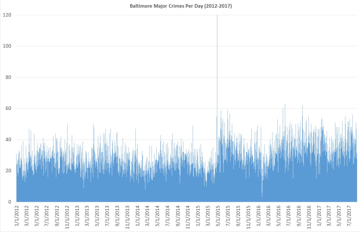
    It takes a somewhat skilled eye to see what is going on. Also, since the day of riot is so high (120), the y axis is too large. With some rejiggering and simply letting that one day go off the scale unnoticed, you get this.

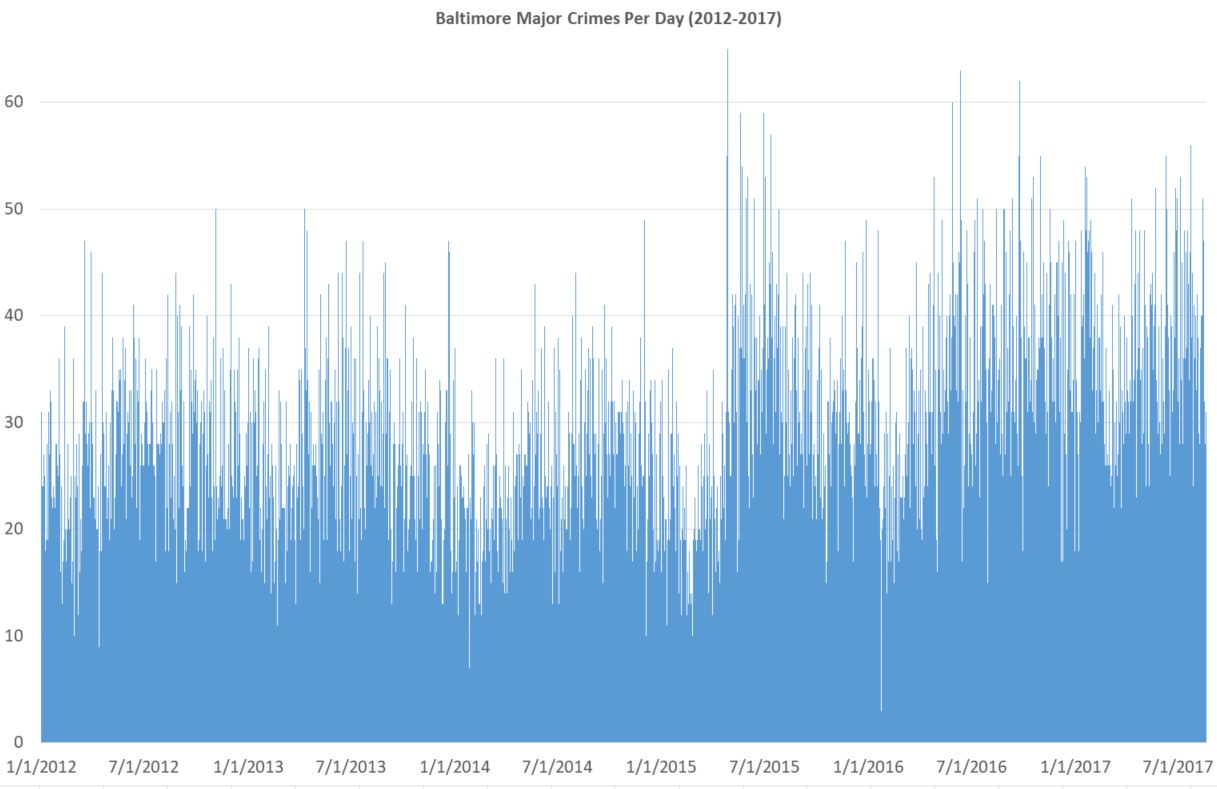
    It’s still messy, but is the kind of thing you might see on some horrible powerpoint. Things bounce up and down too much day-to-day. And there are too many individual data points. Nobody really cares that there were more than 60 one day in July 2016 and less than 5 in early 2016 (I’m guessing blizzard). It’s true and accurate, but it’s a bad chart because it does poor job of what it’s supposed to do: present data. Again, a skilled eye might see there’s a big rise in crime in 2015, but the chart certainly doesn’t make it easy.

    Here’s crimes per day, with a two-week moving average. A moving average means that for, say September 7, you take Sep 1 through Sep 14 and divide by 14. Why take an average at all? Because it smooths out the chart in a good way. It’s a little less accurate literally but much more accurate in terms of what you, the reader, can understand. One downside is that the number of crimes listed for September 7th isn’t actually that number of major crimes that happened on that day. You can see why that might be a big deal in another context. But here it isn’t.

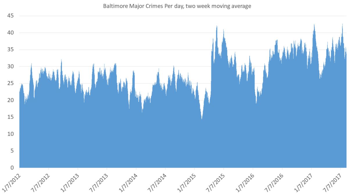
    For a general audience it’s not clear what exactly the point is. You still have lots of little ups and downs, and the seasonal changes are an issue. (Crimes always go up in summer and down in winter. And it’s not because of anything police do. And it’s nothing do to with the non-fiction story I’m trying to tell.) On the plus side, you do see a big spike in late April, 2015, after the riots and the absurd criminal prosecutionof innocent Baltimore cops. But it needs explaining.

    Also, you need some buffer for the data. The bigger the average, the more of a buffer you need. But for this I think this is one perfectly fine way to present these data, at least for an academic crowd used to charts and tables.

    Another tactic is to take the average for the past year. Jeff Asher on twitterover at 538.comdoes good work with NOLA crime and is a fan of this. It totally eliminates seasonal issues (that’s huge) and gives you a smooth line of information (and that’s nice).

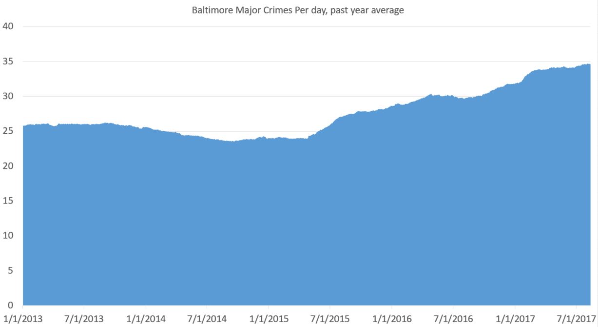
    You can see a drop in crime pre-riot (true) and a rise in crime post-riot (also true). That’s important. Baltimore saw a drop in crime pre-2015 that wasn’t seasonal. It was real. And the rise afterward is very real. But there are two problems with this approach: 1) you need a year of data before you get going and 2) everything is muted. What looks like a steady rise (the slope since 2015) is actually a huge rise. But it looks less severe than it is because it takes an average from the previous year. But that’s not exactly true. Crime went up on April 27, 2015. And basically stayed up, with a slight increase over time.

    Here’s my problem. I want to show the rise in crime post-riot. But I want to do so honestly and without deception. But yes, for the purpose of this data presentation, I have a goal. (My previous attempts were pretty shitty.)

    Also, you need at least a year of data before you can graph anything. That’s a downside.

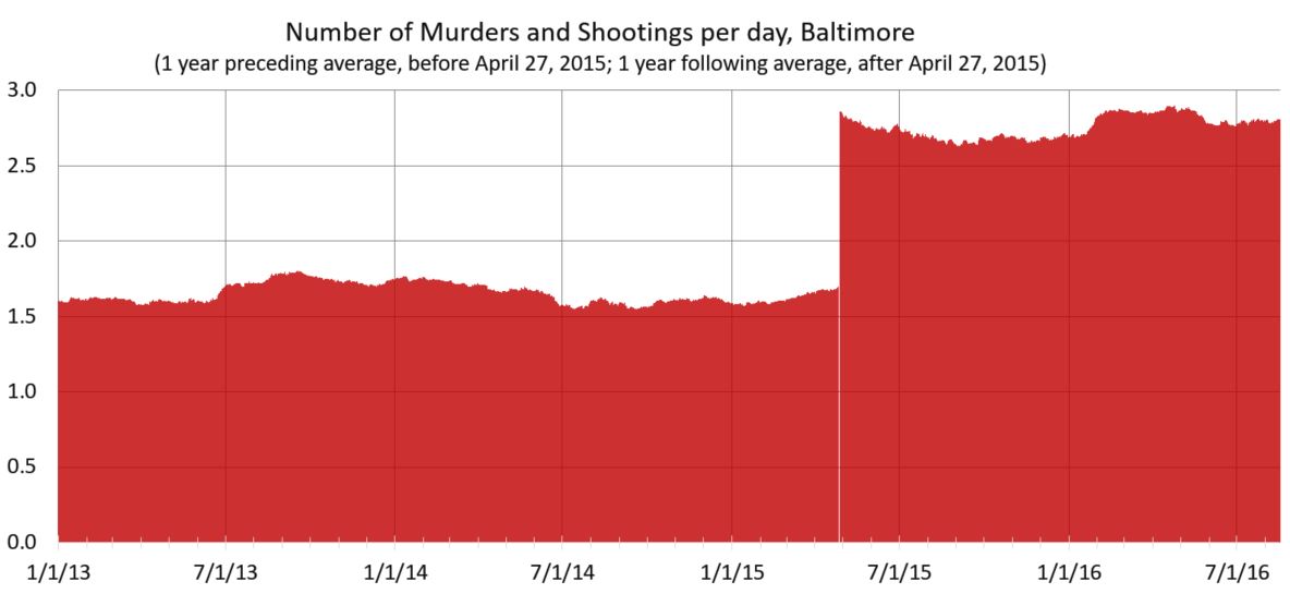
    Here’s my latest idea. If one is looking at a specific date at which something happened — in this case the April 27, 2015 — and trying to eliminate seasonal fluctuations, why not take the yearly average for the previous year before that time and the yearly average after that date for dates after that time? I think it’s kosher, but I’m not certain.

    Here’s how that works out:

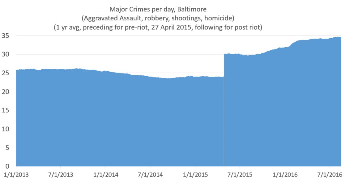
    This shows the the increase that was real and immediate. And as minor point I like the white line on the day of the riot, which I got from removing April 27 from the data (because it was an outlier).

    Now if I wanted to show the increase in more stark form, I would move the y axis to start at 20. But being the guy I am, I always like to have the y-axis cross the x-axis at 0. That said, if the numbers were higher and it helped the presentation of data, I have no problem with a y-axis starting at some arbitrary point.

    Take into account that graphs are like maps. While very much based on truth, they exist to simplify and present selected data. I mean, you can have my data file, if you want it. But I do the grunt work so you don’t have to. But of course my reputation as an academic depends on presenting the data honestly, even though there’s always interpretation (e.g.: in the case of a map, the world, say scientists, isn’t flat). The point, rather, is if the interpretation honest and/or does the distortion serve a useful purpose (In the case of the Mercator Projection it was sea navigation; captains didn’t gave a shit about the comparative size of the landmass of Greenland and Africa.)

    So taking an average smooths out the line of a chart, which is a small step removed from the “truth,” but a good stop toward a better chart. It’s not a bad approach. But it tends to mask quick changes in a slow slope, since each data point in the average for a lot of days. A change in slope in the graph actually indicates a rather large change in day-to-day crime. There are always pluses and minuses.

    If you’re still with me, here’s what you get when just looking at murder. Keep in mind everything up to this point has been the same data on the same time frame. This is different. But homicides matter because, well, along with people being killed, it’s gone up much more than reported crime.

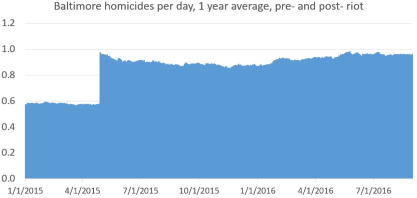
    [My data set for daily homicides (which is a file I keep up rather than from Baltimore Open Data) only goes back to January, 2015. So I don’t have the daily homicide count pre-2015. 2014 is averaged the same for every day (0.5781). This makes the first part of the line (pre April 27, 2015) straighter than it should be. This matters, and I would do better for publication, but it doesn’t change anything fundamentally, I would argue. At least not in the context of the greater change in homicide. Even this quick and imperfect methods gets the major point across honestly. ]

    Update and spoiler alert: Here’s a better version of that chart, from my next post.

  • “A small price to pay”?

    “A small price to pay”?

    Last postI presented the depressing fact that at current level of violence, the chance for a man in Baltimore’s Western District to live to age of 35 without being murdered is just 93% [updated to include 2018 data]. Yes, more than 7 percent of black men in the Western District will be murdered unless Baltimore can get a grip on violence. It hasn’t always been so bad.

    Before the riots and failed “reform,” there were about 217 murders a year in Baltimore (2010-2014). That’s not great, mind you. Not at all. Police Commission Davis said:

    They [celebrated] when they got to a certain artificial number of murders. As if 200 murders is acceptable for a city of 600,000 people.

    You know, darn it, at some level he’s right. Two-hundred murders is not acceptable. But… but… the chutzpah. Last year 318 people were murdered in Baltimore. 344 were murdered in 2015. In 2011 murders dropped to 197, the first time in decades murders were below 200. And the current police commissioner has the nerve to disparage city leaders who took a brief celebratory lap? The nerve.

    Right now, for Baltimore, 200 murders wouldn’t just be “acceptable,” it would be a dream. 229 people have been killed this year, and we’re not even out of August.

    (Murders in 2011 vs 2015, Baltimore Sun, click to embiggen)

    It’s not just the violence, it’s that Baltimore’s leaders blame everybody but themselves.

    [Baltimore State’s Attorney Marilyn] Mosby cited zero-tolerance policing as a “failed strategy” that continued in Baltimore long after it was formally disavowed by the city’s leaders. “Those failed policies are what got us to the place we were at in the spring of 2015,” she said, referring to the unrest.

    Blame O’Malley? He left office ten years ago. Violence went up two years ago.

    Davis says:

    “There was a price to pay for” the drop below 200 homicides, a price “that manifested itself in April and May of 2015,” Davis said, referring to the uprising following the death of Freddie Gray.

    Really? So according Davis, years of oppressive policing led to riots. It could be true. (Though I’m shocked to hear Progressives float the idea that repressive policing reduced homicides.) Perhaps the yoke of police oppression led people to rise up righteous indignation?

    Between 1994 and 2014, annual arrest numbers in Baltimore varied from a low of 39,654 to a high of 114,075. You think more than 100,000 arrests each year for four years in a row might spark a riot? Well, it didn’t. That was 2002 to 2005. Murders went up slightly during those years, to 269. If 114,000 arrests didn’t start a riot, it’s hard to imagine fewer than 40,000 doing so. By 2011, arrests were down 50 percent.

    1994arrests: 77,545 — 321 murders

    1995: 81,140 — 325

    1996: 61,403 331

    1997: 77,750 312

    1998: 89,149 313

    1999: 85,029 205

    2000: 86,093 261

    2001: 97,379 256

    2002: 106,117 253

    2003: 114,075 271

    2004: 104,033 278

    2005: 103,837 269

    2006: 93,393 276

    2007: 86,334 282

    2008: 82,656 234

    2009: 79,552 238

    2010: 69,617 224

    2011: 59,877 197

    2012: 55,451 217

    2013: 42,097 235

    2014: 39,654 211

    2015: 27,765 344

    2016: 25,820 318

    Look at at 2007 to 2014, a Baltimore miracle happened! Arrests were cut in half while homicides went down 25 percent, from 282 to 211. This was hard work and good policing. Not perfect, mind you. Sometimes not even good. But better, incrementally, year by year.

    Davis and Mosby are trying to rewrite history, pretending years of progress never happened. Now it’s one thing to be pissed on and be told it’s raining, but these two are pissing all over our feet and telling us we’re better off with wet shoes.

    Go ahead and fix long-term systemic problems. But while you’re doing that, in the meantime, let’s tell police what we want them to do with criminals today. Violence varies independently of poverty, racism, unemployment, segregation, an family breakdown, the so-called “root causes” of crime. These didn’t change in 2015. Policing did. Discouraging proactive legal discretionary policing allowed violent criminals to be more violent. Telling cops not to make legal but discretionary low-level arrests on drug corners was a bad idea.

    There’s only so much decline a city can take. Baltimore’s population is at a 100-year low. And the people leaving, hard-working non-criminal taxpayers, are sick of crime.

    Mosby admits Baltimore “is kind of in transition right now.” I’m afraid Baltimore is transitioning from a city with failures to a failed city.

  • Too much to bear

    Back when I wrote Cop in the Hood, I was horrified to figure out that 11.6 percent of men in the Eastern District were being murdered (see the footnote on pp. 219-222).

    [Updated to include 2018 data and more accurate population figures.]

    From 2015 through 2018, 226 people were murdered in Baltimore’s Western District. 145 were black men age 18 to 34. 36.25/year. This is about twice as high as the pre-2015 rate. There are approximately 7,226 black men aged 18 to 34 in the Western District. (And a total population of 47,600. So the annual homicide rate for 18-to-34-year-old men in the Western District over the past four-years is 419 per 100,000. (The national homicide rate is now about 6 per 100,000; Baltimore’s is 50.)

    What does a murder rate of 419 mean? Well, here’s a survival function:

    1 – (1 – r)^x

    r is the death rate and x is number of years. The death rate is 1 in 239 or .0042. The number of years from 18 to 34 is 17.

    So 1 – (1-.0042)^17 =0.069.

    This means that if homicide levels don’t drop, a 17-year-old man in the Western District today will have a 7 percent chance of being murdered before he reaches the age of 34. And since about one-third of murders in Baltimore happen to those 35 and over, approximately a 10 percent lifetime chance.

    One-in-ten men murdered?! I don’t know what else to say.

    [I thought of some things to say in my next post.]

  • Murder still trending up

    Murder still trending up

    Murder in 2017 continues to go up. (The increase is at slower pace compared to the previous two years, but that is minor consolation.) At what point do you sound the alarm? Yes, the murder rate is still lower than when it was high, but the increase since 2014 is equal (or may surpass) the largest homicide increase in America ever (1966-1968). Here’s a very good summary of the murder rise by Jeff Asher at 538.com. It’s both fact based and spin free. Refreshing.

    Asher brings the data up to mid-year 2017. Overall, nationwide, on average, it’s not good. There’s an estimated 27 percent homicide increase since 2014. And no, it’s not just isolated to a few cities. My previous post gives data for cities 2014-2016.