Tag: stats

  • Compstat 1.0 and a half

    Kudos to the NYPD for moving up Compstat publicationby about 10 days. Now, on March 18 (who knows, maybe it was even there yesterday), I can learn crime data up to March 13! That’s like, just last week! In the past, because Kelly didn’t release data on principle, you could see on Monday what was going on two weeks ago. Things are getting better under Bratton. Now, if only they would archive the data (even just the PDFs). But hopefully Compstat 2.0 will be as good as Baltimore Open Data. Or maybe, gasp, even better! A man can dream…

    But while we’re still in 1.0, can anybody tell me what the hell “32” means to the right of “Transit.” There have been 452 this year, an increase of 16 percent compared to last. But 452 units of friggin’ what?! It doesn’t say.

  • When the police reform issue is actually a “law reform” issue

    My once (and probably future) co-author Nick Selby has this piece in the Washington Post:

    But a closer look at some statistics shows that the problem is not necessarily an issue of racist cops, and that means fixing the criminal justice system isn’t just an issue of addressing racism in uniform.

    Some racial disparities in treatment by authorities actually appear to be the result of state laws intended to crack down on offenses like drunk driving and scofflaws that have, instead, had the effect of ensnaring poor people in a revolving door of debt, courts, collections firms and police.

    Suspended-license or no-license tickets are expensive. Why were so many blacks and Latinos driving on suspended or missing licenses?

    Poverty.

    But the way Texas tracks stops obscures the broader unfair effects of the law on poor people, and makes it look, instead, like police are the problem. In our subject city, less than 7 percent of the population is black, but in 2015, 11 percent of the people pulled over there were.

    That’s as far as Texas’ racial profiling laws want police chiefs to take their analysis.

    We wanted to compare the traffic stop data to the population of the entire area where drivers came from…. and we compared that model against the race and ethnicity of the drivers who got pulled over.

    Chiefs often do not conduct [more detailed] analyses (which are required to recognize these patterns) because they spend their scarce resources complying with well-intentioned but ill-informed and often underfunded racial reporting requirements.

  • A Refresher on Regression Analysis

    That’s all. And not a bad refresher at that, by Amy Gallo in Harvard Business Review:

    “You have to go out and see what’s happening in the real world. What’s the physical mechanism that’s causing the relationship? … A lot of people skip this step and I think it’s because they’re lazy. The goal is not to figure out what is going on in the data but to figure out is what is going on in the world. You have to go out and pound the pavement,” Redman says.

    “And if you see something that doesn’t make sense ask whether the data was right or whether there is indeed a large error term…. And, he says, never forget to look beyond the numbers to what’s happening outside your office: “You need to pair any analysis with study of real world. The best scientists — and managers — look at both.”

  • The Denominator Problem: Throwing stones from glass houses

    There’s something bordering on the absurd when newspapers write stories about police racism based on claims like, “90 percent of those arrested are African-American while African Americans make up only 65 percent of the population.” The assertion, sometimes explicit and sometimes implied, is that cops are racists hunting black men. Same thing with papers that assume that any arrest not prosecuted is a bad arrests. [That link is particularly great because it features a video from 3 days after the riot explaining, in a progressive wet dream, how “Gangs work together to restore peace in Baltimore.” Aw, how sweet. How did that work out?]

    The absurdity comes from the lack of consideration for the denominator. If you want to talk about race and arrest or traffic stops or use-of-force or anything, you need a relevant denominator. What percent of those with whom cops interact are black? What percent of those who commit violent crimes are black? Answering any one of these won’t answer the question, but it does help complete the picture.

    I mean, what if I told you that 40 percent of the people arrested for murder were black in a country that is 13 percent black. Knowing nothing else, it’s a meaningless statement. Does that imply cops are disproportionately arresting black men for murder? Well, actually… yes. But whether that disproportion is a problem is something else. The arrest and incarceration rates should reflect the crime rate more than the population demographics, I would think. Without looking at the racial disparity in homicide, the racial disparity in the arrest rate for homicide (or incarceration rate or those killed by police) means almost nothing.

    Police use of lethal force, I would posit, should reflect the demographics of armed violent criminals more than the US Census count of population.

    And yet time and time again you see police blamed for racial disparities in society. I honestly don’t know if reporters make these errors out of statistical ignorance or ideological conviction. But either way, college educated journalists should know better. In a similar manner, let me call outsome of the same papers that make these claims. The American Society of News Editors calculates minority representation at newspapers. The Washington Post is 31 percent “minority” (and 14 percent black) in a city that is 60 percent minority! (And 51 percent black.) The New York Times is 19 percent “minority” (and 8 percent black) in a city that is 65 percent minority! (And 25 percent black.)

    [I put minority in “quotes” because minority percentage is often used as a cover for just how few actual blacks are involved. As if, given America’s legacy of slavery and racism, hiring a Chinese immigrant, a “person of color,” is the same as hiring a born-in-Baltimore African American. (Fun fact: did you know that Italian-Americans are an officially recognized minority group at my school when it comes to hiring and promotion?)]

    So should the workforce at a newspaper represent the demographics or the city? I don’t know. Maybe. Or should it reflect the demographics of its readers? Or maybe the demographics of America (36 percent minority). Or maybe just the demographics of those who graduate from journalism school? I don’t know. Sure, it’s a good debate to have. Just like the debate about minority representation in police departments is good to have. But it seems odd for a newspaper that is 46(!) “percent points more white than the residents” to fault police departmentsthat actually does a much better job and reflecting the diversity of the community it serves.

  • Bratton calls out Kelly for calling out Bratton! It’s an NYPD smackdown!

    Bratton calls out Kelly for calling out Bratton! It’s an NYPD smackdown!

    This Kelly vs Bratton feud has been simmering in the backgroundfor a little while.

    But then when Kelly accusedBratton of cooking the books(something Kelly should be familiar with, since book-cooking constantly flared up during his reign)? Well, I’ll just sit back and enjoy the fight.

    And here’s an insiders’ tip: the good money is on Bratton.

    The NYPD took Kelly seriously enough to release an official rebuttal. And hell, Kelly is the former NYPD commissioner. He should be taken seriously.

    Now I will admit my initial thought on Kelly’s accusations: it sure is odd this year that shootings are down and homicides are up. How does that happen? What are the odds? So could Kelly be on to something?!

    Turns out: No.

    In the far corner, the former champion, the man who must be in charge, Raymond Kelly. He’s the consummate micro manager, the marine, and the man would wouldn’t let cops administer a heroin antidote (not on his watch). Kelly completely closed the department to outside researchers, transparency be damned! But he kept crime down and avoided a big scandal. (Stop, question, and frisk was not a scandal so much as a strategy.)

    I don’t think Kelly did a bad job. Not at all. But I was happy to see him go. At some level I just don’t like him. Substantively his conservative micromanaging was insane. Everything transfer and shift of manpower had to go through him. His emphasis on stats led to a lot of problems.

    The fact that below I use week-old data copied from a PDF file is entirely Kelly’s fault. And the fact that he could be so closed, on idiotic principle, even with Mike “open data” Bloomberg as mayor? It was all amazing. Kelly ran the department like nobody has ever been allowed to run that department. For 12 years, he was the boss.

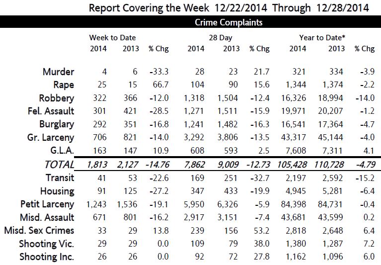
    Murders did drop from a low 587 to an amazingly low 334. The last two years of his reign saw a 35 percent reduction in killings(!). And nobody took credit for it. Kelly didn’t want to take credit for a crime drop at the exact moment it was coinciding with a massive drop in stops, since each and every one of those stops, so he said, was absolutely necessary to prevent a rise in homicides. And Kelly’s opponents sure didn’t want to give the big bad NYPD credit for anything at all. So we had the largest drop in homicides since the mid 1990s… and nobody noticed.

    Kelly ran the NYPD, something Bloomberg didn’t want to do. But Bratton is doing what De Blasio can’t do. De Blasio needs Bratton a lot more than Bloomberg needed Kelly, and also much more than Bratton needs de Blasio.

    So in this corner, the current champion, William Bratton. He’s a bit more polished, a bit more educated, some might even say… smarter. Bratton is also conservative, mind you, but in a more intellectual way. Bratton understands the politics of policing. Bratton is also more open to transparency and sharing data. The fact that the same limited NYPD Compstat data is available in 2015 in spreadsheet form? Well, that’s progress, I guess. (But there’s no reason he couldn’t have (Now can we please get open crime data like this.)

    I like Bratton because of his track record, his intelligence, and his support and understanding of Broken Windows policing. Also Bratton, unlike Kelly, understands why, other things being equal, it’s better if people don’t hate the police. Kelly really didn’t give a shit what people thought. He knew he was doing a good job. That was enough.

    I’ll give Kelly the benefit of the doubt and not doubt his motives. Kelly probably really believes what he’s saying. Unlike some former commissioners, at least Kelly is nota crook. Now that he’s not in charge, he knows things must be going to hell. Besides, people are constantly telling him things are going to hell.

    Kelly always surrounded himself with yes-men. He wasn’t a micromanager because he trusted others. And now you’ve got a bunch of old friends who remain loyal to him. Cops hate de Blasio and everything happening right now (the latter is a constant, by the way, no matter what is happening). And maybe there was actually a case of a shooting that was downgraded. It happens. So these old buddies get together with Kelly and, over a soda water, tell him all the bad that is happening. Kelly believes it to be God’s truth, since it’s coming from his people. His loyal people.

    So why did Kelly do this? Probably not just to sell books. Though maybe Kelly found out he enjoys talking to the press. Those with big egos tend to like seeing themselves on the tee-vee.

    But back to the issue at hand. How do you tell if shooting victims aren’t been counted?

    I thought I would look for smoke in the ratio of homicide to shooting victims. But to find out which of the NYC homicide victims were shot, you have to go the UCR data (the FBI’s Uniform Crime Report). So I did that. After a fun couple of hours on SPSS, I got the answer. For the past 15 years, about 60 percent of homicide victims are shot. It hasn’t changed much. No smoking gun.

    Between 1999 and 2013 (but excluding 2006 and 2008, for UCR data quality reasons. And keep in mind, if you run the numbers, the UCR undercounts homicides by about 5 percent because it looks at incidents. Like everybody else, I ignored this and assumed a constant error rate) approximately 60 percent of homicide victims were shot. But I already told you that. But it’s worth pointing out that this number remains pretty consistent over these years, which I was not expecting. And over these years, it turns out the odds of dying if you’re shot in NYC is about 15 percent (which is substantially lower than I thought it was. Much lower).

    In other words, in 2013 there were 334 people killed in NYC, about 195 of those were shot (188 incidents recorded by the UCR plus a few multiple homicides). There were 1,300 shooting victims, according to the NYPD, people with gunshot wounds.

    Now we, the UCR, doesn’t yet have gunshot deaths from 2014, much less 2015. (Though I’m sure the NYPD does, now about that openness…)

    We do have shooting victims and total homicides recording by the NYPD (the former is surprisingly difficult to tease from the UCR, which is yet another UCR problem).

    If the number of shooting victims were being artificially reduced, one would expect the ratio of shooting victims to total homicides to be way down this year. And it is. But just a bit: to 3.9:1 from 4.2:1 in 2014. But it turns out that 2014 is the odd year, not this year. 4.2 is the highest that ratio has ever been. It was 3.9 also in 2012 and 2013. The average over the past 15 years in 3.4. The ratio is steadily increasing, probably due to better medical care. Maybe hospital closings affect this rate. Or maybe it’s just statistical variance (AKA: bad luck). But no, the numbers don’t look funny this year.

    Anybody still with me? One quick double-check: last year (2014) compared to the previous year (2013) the number of shootings should be down and homicides up (the opposite of this year). And yes, indeed, that is the case.

    Look at the “year to date” columns for the two years and the rows “homicide” and “shooting vic.”


    I’m betting on Bratton.

    Update: Gothamist jumps into the ring with a folding chair! And Bratton hits againin the Daily News. And the Inspector General, that’s the new oversight department under the Department of Investigations that is still in search of institutional meaning, stays mum.)

  • Killed by police, Washington Post analysis

    Washington Post reporters are doing what journalists are supposed to do. They’re looking at those killed by police (like the Guardian, but a bit more fairly).

    815 have been shot dead by police this year as of right now (the Guardian, just FYI, pushes that number to 948. That’s a 15 increase based on people that really shouldn’t be counted because it includes things like suicide and non-police custody).

    Of the 815, 31 are labeled “undetermined” in terms of “threat level” and thus questionable as to their justification. Of those 10 each were white, black, and hispanic. But even among those 30, 11 had a deadly weapon.

    76 of the 815 were “unarmed” (28 of 76 black). 29 of those 76 “unarmed” are labeled “attack in progress.” 39 “other.” 8 “undetermined.”

    Overall, 203 are determined to be mentally ill. That’s one in four. And 40 percent of all whites. “Just” 15 percent of blacks are considered mentally ill. I assume there are labeling errors here. I suspect more mentally ill blacks are not labeled as mentally ill when killed by police. But hell if I know. Regardless, that difference jumps out at me.

    Of the total number, 390 were white, 208 were black, 134 hispanic. 32 were women.

    I keep harping on the state differences. And for good reason. The top ten states by rate (from the Guardian) of police-involved homicides (from the Post) have about 20 of the US population and 298 (36 percent) of police-involved homicides. The rate of police-involved killings in the ten worst states, (extrapolated from 10 to 12 months) about 5.4 per 100,000, is greater than the overall level of homicide in the United States. Period.

    Damn.

    Meanwhile the best ten states (police in these states are least likely to kill people) have nearly the same population as the ten worst states just and 67 (8 percent) police-involved homicides. That’s an annual rate of about 1.2 per 100,000.

    That’s a big difference.

    The states where police kill the most are OK, NM, WY, AK, AZ, LA, WV, NV, CA, and CO.

    The states with the least lethal cops are VT, ME, RI, CT, NY, ND, PA, MA, IL, and IA.

    Is gun control a factor? Maybe. The top 10 average rank is 15 according to the Brady Campaign’s rank of gun control. The bottom ten rank 31. But I suspect that is mutual causation or correlation without causation. Gun culture in general more than gun control in particular. There are outliers galore: California ranks 1 on gun control and cops killed 150 people; meanwhile Vermont (1/60th the size of California, mind you) ranks 44 on gun control, but police have killed nobody.

    The biggest divider I can see is simply East/West. You can draw a sharp line between the top 10 and bottom 10 with the Mississippi and Missouri Rivers.

  • Who’s Counting?

    Chava Gourarie at Columbia Journalism Review with a great piece on data and police-involved killings.

  • “And they made a chart with no Y-axis!”

    “And they made a chart with no Y-axis!”

    I’m a stickler for the honest presentation of data. Too many people, it seems me, just don’t care. I mean, it is easier to just make numbers up and share a picture on facebook if it supports your ideological position.

    When it comes to data analysis, I didn’t expect to find an ally in late-night TV. So check this out.

    If you don’t have 7 minutes, watch from about 2:22 when Meyers (A Northwestern Alum) talks about a misleading slide presenting in a congressional hearing.

    At 3:40 Meyers says, “Let’s take a closer look at this graph.” Let’s. Because nothing says pure comic gold like data analysis. And Meyers nails it:

    A) “There’s a bigger number at bottom and a smaller number at the top.”

    B) “You can’t have 2 million here and 300,000 there [in line with each other, horizontally].”

    C) “And they made a chart with no Y-axis!”

    Well played, Seth. If we ever made a bet about the words, “and they made a chart with no Y-axis” never being said on late-night TV, I guess I lose.

    Update: Let’s play with graphs a bit. Why not? It’s fun.

    Given the numbers above (which may be false), the chart should look like this:

    What is “prevention services”? I don’t know. Why pick one category that perhaps (probably) decreased a lot? Well, to mislead. And based on two minutes of online research, it seems more reasonable to look at the total number of patients and the number of abortions (the abortion numbers seem to be correct, by the way). Then the chart looks like this:

    Of course this looks less dramatic. And that’s exactly the point.

    Now keep in mind the charts above don’t have 2 y-axes. There’s just one: the number. To use two different scales for the same measurement is weird and suspicious. But there are times when you do want to use 2 y-axes. But you can also do so to mislead. Take this:

    The data are correct. But it’s still intentionally misleading. Why? Because a reasonable interpretation would be that greater incarceration numbers correlate with fewer murders. Indeed, during this time period, they did. But why did I select this decade? Because it’s the only decade where this is true. I cherry-picked the data. Not cool.

    I mean, I could have picked any of these years:

    Now homicide and incarceration are positively correlated now! The more people we lock up, the more people kill each other. The facts have changed. And all the data are correct. This is where it’s important to repeat that popular phrase: correlation does not equal causation.

    But along with cherry picking data, I’ve done another misleading thing. I’ve changed the scale of the left y-axis: From 2000-2007 it goes from just 5.4 to 6.2! That’s just me trying to intentionally mislead (for educational purposes only).

    Of course there are choices and selections you have to make in any chart. Here’s the same data but going back to 1983:

    Both axes go down to zero. That’s not necessary, but other things being equal, it’s good.

    I mean look at this crime drop in NYC:

    Compare it to this one:

    Of course it’s the same data. It’s just that on the first one the y-axis doesn’t go to zero. It makes the drop look bigger. Is that misleading? Potentially. Depending on what your point is. If your point is to highlight the actual numbers, then it’s fine. If your point is that homicide plummeted during those years (which it did), it would be somewhere between odd and misleading to start the y-axis at the lowest data point, because that seems to imply that murder dropped to zero.

    Here are homicide and incarceration going back to 1925:

    Now this is legit. The y-axis goes to zero. Nothing funny there. But why is it homicide rate and incarceration number? It turns out it’s just easier to get homicide rates and incarceration numbers. And it so happens, I happen to know, that in this case it doesn’t matter. The chart looks basically the same. But that switcheroo should still be a red flag to the discerning statistical consumer.

    In the end, I use this:

    Both y-axes are rates. No funny stuff there. I’ve also bolded the numbers and thickened the lines for better clarity. (It might also be nice to make the chart readable for black-and-white reproduction, by making one line dotted or something. But I don’t like the way that looks. And I know I’ll be showing this in color.)

    Also note the left y-axis does not go to zero. That’s a choice I made. It’s not to mislead but to create a better visual presentation. The point I’m trying to make, based on the data, is that there isn’t any inherent correlation between crime and incarceration. Homicides go up and down for whatever reason; incarceration is a political choice related to the war on drugs.

    But the discerning reader might observe, “how the hell do you know numbers from 2015 when they year isn’t over?!” Good point. I don’t. I basically made an educated guess for the sake of visual clarity. Can I do that? Sure. I’ll update the info next year when I do know. It matters that the specific 2015 data point isn’t really important here. This is a choice based on my needs for this chart. I want the x-axis labeled at nice intervals. And if the data ends in 2014, it looks funny (like in the chart immediately above).

    And last but not least:

  • The War on Drug does create prisoners

    In the New York Times David Brooks repeats John Pfaff’s argument in Slate that the war on drugs isn’t responsible for our crazy high prison population. Brooks vouches for Pfaff as “wonderfully objective, nonideological and data-driven.” That might all be true. Pfaff is probably a swell guy and kind to animals, too.

    There’s something to be said for talking to warm human beings rather than correlating cold data. Now admittedly being “data-driven” does beat the alternative of just making shit up. But the problem one sees in the “data-driven” fields (and Brooks is an economist) is that if you don’t understand the data in the first place, you can be “data-driven” till the polynomial regressions correlate with statistical certainty… and still be wrong.

    Pfaff says:

    The fact of the matter is in today’s state prisons, which hold about 90 percent of all of our prisoners, only 17 percent of the inmates are there primarily for drug charges.

    No shit. But who really thinks that only convictions related to the War on Drug are “drug charges”? (It’s worth mentioning that a violent drug dealer might cop a plea to a “non-violent possession” charge, but still be sent to prison for the crime actually committed.)

    The War on Drugs doesn’t just create “drug” prisoners. Prohibition creates unregulated public drug markets. That’s where the violence is. Prohibition doesn’t lessen addiction. And that’s where you find the property crimes. We need to end the drug war not to release a bunch of pot-heads from prison but to change the violent culture of the streets.

    The main problem with the War on Drugs — and it’s not locking up too many non-violent drug users — is the violence inherent in an illegal public drug market. Pacifists don’t last long slinging on the corner. Arresting a drug dealer creates a job opening for another potentially violent street-corner dealer. Lawyers and economists should be able to understand that.