Tag: for academics

  • Disparities in Police-Involved Shootings by City and County

    Disparities in Police-Involved Shootings by City and County

    So I’ve done a little work using the data from FatalEncounters.org on people shot and killed by police. Fatal Encounters is like the Washington Post database, but for adults. I combined/merged this with a city or police department’s population, number of cops, average number of murders in the jurisdiction (over 4 or 3 years), median household income, percentage Black, and percentage Latino/Hispanic. The dataset includes every city/town where cops killed somebody between 2015-2019 and also every city above 100,000 population. I end up with 2,872 cases.

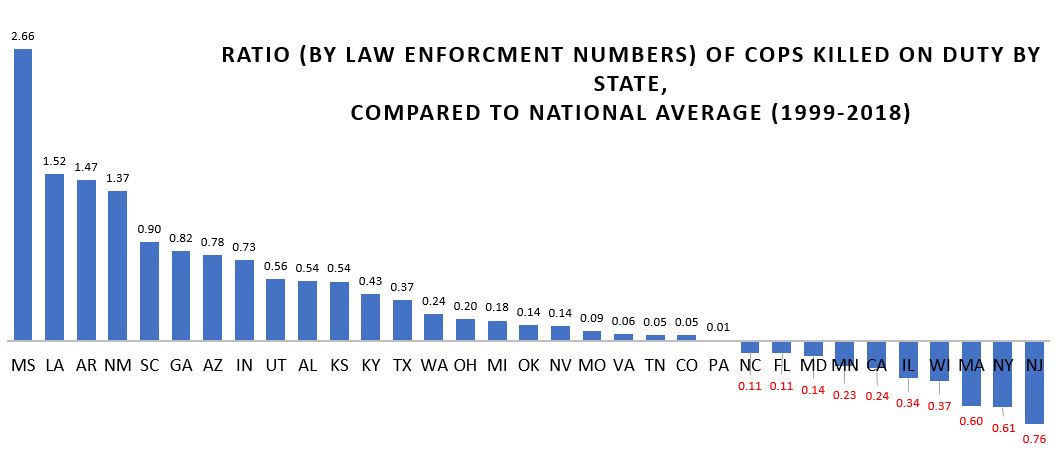
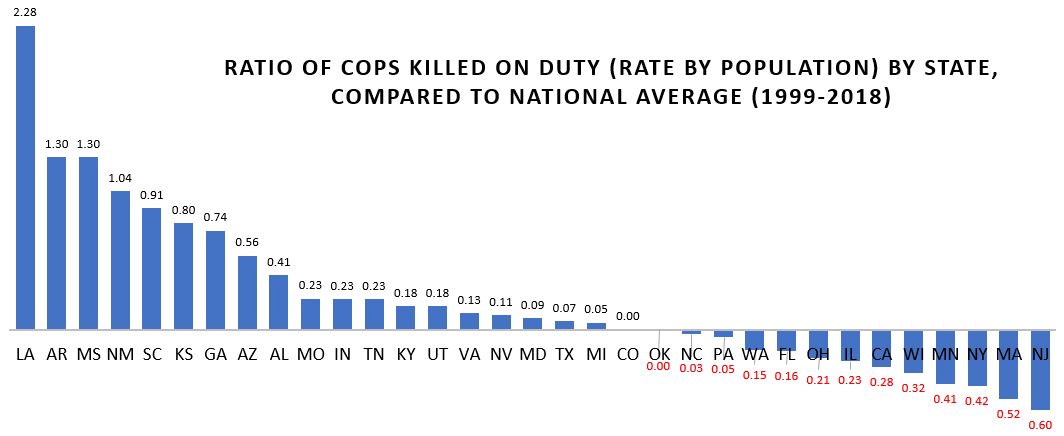
    I also looked at counties, which nobody has ever seem to have done before. If you live in a state like Maryland, Texas, California or Arizona, you probably know that county police of sheriff can be the major police department. Some of the counties are huge, and their very existence is seemingly noticed by research despite the fact that there are 88 county police departments that have jurisdictions of more than 100,000 people. The police departments of 20 counties police more than 500,000 people. County data is tricky. So take this with grain of salt. Population (the denominator is the rate) is based not on the entire county but on the population policed by the department. It could be wrong (corrections welcome). And I tried to exclude jail operations from cop population (by taking only sworn officers).

    LA County Sheriff’s Department kills an average of 12 people a year (2015-2019). That’s a lot. Their rate is 11 per million population (if my population figures are correct, which is tricky for county police and overlapping jurisdictions). The rate for Los Angeles City Police Department is 4.2. The national average is about 3. Riverside County and San Bernardino Counties also have very high rates. Riverside County is 32 per million, the highest in the nation. But that is only if Riverside County Sheriff’s Department polices but 180,000 people (which is the population of Riverside County minus the cities that have their own police department… but maybe that’s not a good way to figure it out; the population of Riverside County is 2.4 million). Either way, 1,795 cops killing 5.8 people a year over 5 years is a lot. That’s 1 killing for every 310 cops. In NYC, the comparable figure is 1 killing for every 4,605 cops.

    The Bernalillo County Sheriff’s department (Albuquerque) has a rate of nearly 20 (per million). Three-hundred Sheriff Deputies killed 10 people over 5 years. That’s a lot. Could be bad luck. Could be unfortunate but necessary shootings in cases for which there was no less-lethal alternative. But if the NYPD killed two people for every 300 cops, it would be over 200 police-involved shooting deaths a year in NYC. Last year in NYC police shot 15 people and killed 5.

    Other county sheriff departments in which there aren’t that many cops and kind of a lot of people killed are Spokane WA, Pierce WA, Clark WA, Volusia FL, and Lexington SC, King WA, and Greenville SC

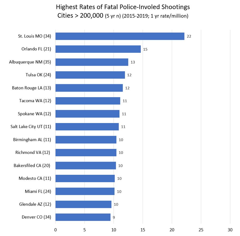
    Riverside County CA and Bernalillo County NM are interesting because the largest city police departments in their county (Riverside City and Albuquerque, respectively) also shoot a lot of people (but not nearly at such a high rate). Here are the cities of over 100,000 population with the highest rate of people shot and killed by police.

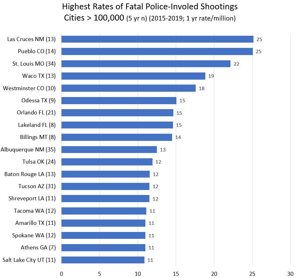
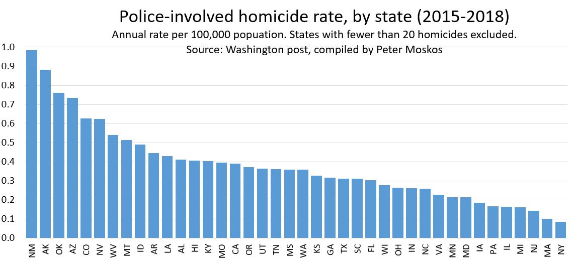
    Every single city on this list is west of the Mississippi (or in Florida). Every single one. The mean rate for cities in eastern states is 3.8. If you take Florida out of the east, the mean goes down to 3.5. For cities in western states, the mean rate is 5.4. That’s a big difference. (The median is 3.2 and and 4.2.) And whatever real differences account for the arbitrary geographic difference, there are many department in cities over 100,000 that shot and killed few few people from 2015-2019, or at a rate less than the national average: Plano TX, Irvine CA, Fairfield CA, Grand Prarie TX, Pasadnia CA, Mesquite TX. Were they just lucky? Or were they doing something right. Or maybe both.

    Maybe population greater than 100,000 isn’t the right cut off. The top cities just make the greater than 100,000 list. The total n (for 5 years) is between 8 and 35. So a little good or bad luck can affect the rate a lot. But still, a lot of shooting goes on in cities of this size. Also, the murder rate is high in a lot of these cities… but not all of them. And the murder rate is also high in Birmingham, Baltimore, New Orleans, Jackson, and Detroit, and they’re not on the list. And a lot of cities that are on this list have very few black people (Las Cruces, Pueblo, Westminster, Billings, Albuquerque, Tucson, Spokane, Salt Lake City).

    Once you start getting into larger cities, I should look not only at places where cops shoot a lot, but also at places where cops shoot very little. Sure, since shootings are rare, at might just be luck. But it might be police departments are doing something right.

    Thirty-one cities have rates under 1 per million. All but 4 have fewer than 200,000 people. So maybe they’re lucky. Irvine California is on the list. But hey, Irvine is rich. But what about Hialeah FL? Or Lexington KY? Or Lubbock TX? Zero fatalities all. What about New York City? 8.5 million people. And a rate of 0.89, less than a third the national average? That’s not an accident. That’s policy, training, and leadership. Why not learn from the cities doing it right?

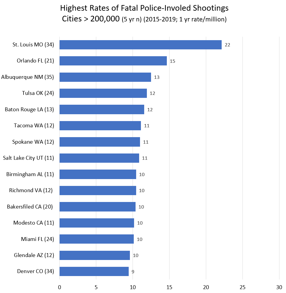
    Βetter cities (rate < 1.5 / million, half the national average) in the 200,000 to 300,000 range (n = 52), include Lubbock, Hialeah, and Greensboro. They aren’t rich. (Irvine, Oxnard, Glendale, Plano, and Jersey City are also on the good list.) In the most-shooting category (rate > 10 / million, 3 times the national average) are Orlando, Baton Rouge, Tacoma, Spokane, Salt Lake City, Birmingham AL, Richmond VA, and Modesto CA. These are mostly middle income places with a wide variety of racial demographics.

    In the 300,000 to 500,000 category (n=29), only Lexington KY and Raleigh NC stand out as better than average (rate < 2). Though Virginia Beach, Minneapolis, Pittsburgh have rates < 4. On the high end (rate > 10) are Miami, Bakersfield, Tulsa, and St. Louis. St. Louis tops the chart at a whopping rate of 22.2 / million. Though St. Louis has a terribly high murder rate of 60 (per 100,000). Though New Orleans has a high murder rate of 39,000 and a cop-involved killing rate of (just?) 4.5 per million. (The US murder rate is about 5 per 100,000.)

    Above half a million population, the range in rates of killed by police goes from above 8 in Albuquerque, Tucson, Denver, Mesa, Oklahoma City down to New York City with a rate of 0.89. Nothing comes close. Nashville, Philadelphia, Boston and San Diego have annual rates between 2 and 3 per million.

    (Note I’ve changed the scale from the above charts. The x axis went to 30. Now it’s 14.)

    Keep in mind there are hundreds of smaller cities and counties between Albuquerque and New York City. But the disparity between cities at the top and bottom of the list! It’s immense. And nobody sees to be able to look up from the latest outrage and ask, why?

    So let’s give credit where it is due. By my figuring these departments all have killing rates under 1 per million (and serve populations over 180,000. If my data is correct, which it may not be). Their success should be applauded and emulated:

    Travis County Sheriff’s Office
    Montgomery County Department of Police
    New Castle County Police Department
    Gwinnett County Police Department
    Loudoun County Sheriff’s Office
    Chesterfield County Police Department
    Prince William County Police Department
    Santa Clara County Sheriff’s Office
    Fairfax County Police Department
    Monroe County Sheriff’s Office
    Arlington County Police Department
    Macomb County Sheriff’s Office
    Oxnard Police Department
    New York City Police Department
    Lubbock Police Department
    Lexington Police Department

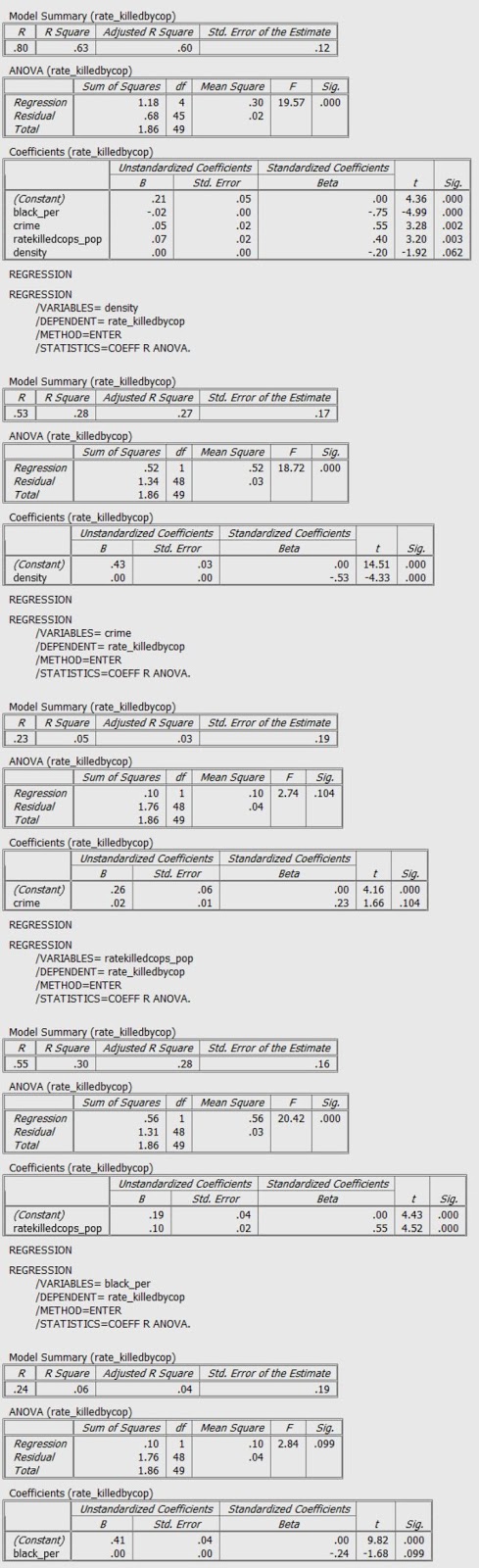
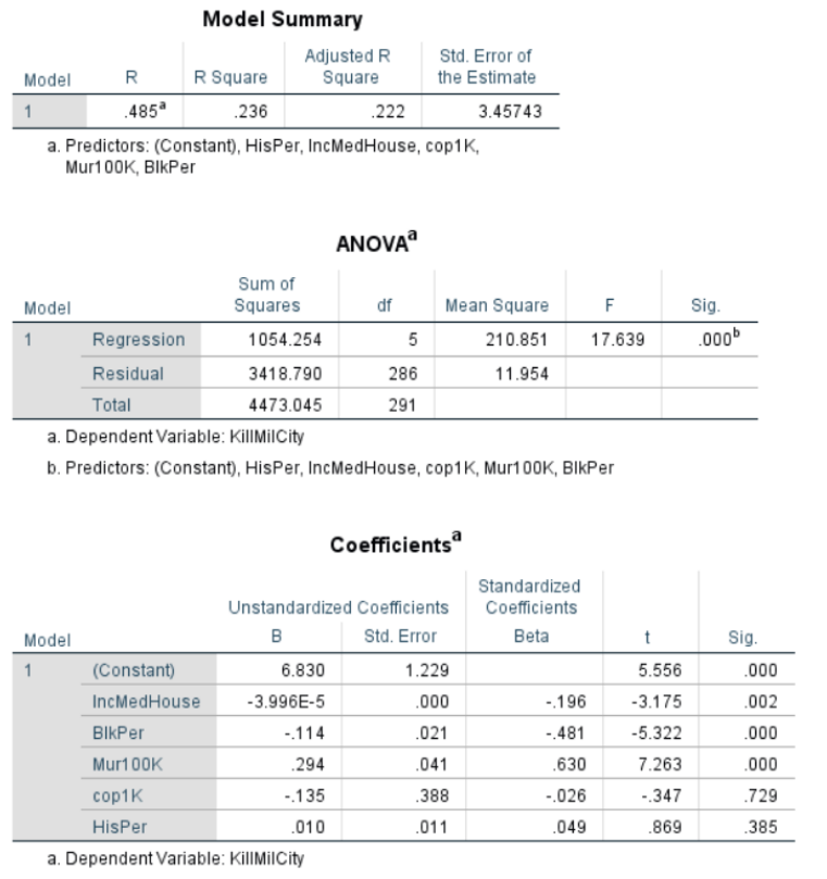
    For those who understand such things, I also ran this regression for cities > 100,000. Dependent variable being the rate of police killings and independent variables being median household income, percentage black, murder rate, cops per capita and Hispanic/Latino percentage. Income matters (not a surprise). So does murder rate (obviously). But the negative correlation with Black percentage is of note. I was not expecting the lack of correlation with Hispanic/Latino percentage. My knowledge of advanced statistics doesn’t get much advanced that this, alas.

    And this is all subject to errors and corrections. This a blog. Not a peer-review article. Leave a comment or better yet email me. Or twitter @petermoskos

    Methods and sources:

    Fatal Encounters. https://fatalencounters.org/
    Population and police numbers mostly from here: https://ucr.fbi.gov/crime-in-the-u.s/2018/crime-in-the-u.s.-2018/tables/table-78/table-78.xls/view.
    City murder number I mostly keep track of. But through 2018 from this kind of source: https://ucr.fbi.gov/crime-in-the-u.s/2016/crime-in-the-u.s.-2016/tables/table-6/table-6.xls/view
    Other number from wikipedia and police department websites.
    And here: https://www.census.gov/quickfacts/fact/table/US/

    Killed by police data is from https://fatalencounters.org/. I gave $100; you should give few bucks, too. This is really important data, and it’s all the work of one guy. Plus he puts the format of the Washington Post’s gathering of similar data to shame.

    Then I filtered for intentional gun killings for each city, county, and police agency. From this I created a data set (one row) for each city, county, and/or agency. County data is tricky. Best I could, I figured out the population policed by large police agencies. But it’s not an exact science. (Basically take a county and subtract the cities and towns that have their own police.) There’s a lot of overlapping jurisdiction. There’s also the issue that a lot of sheriff department are responsible for jails, and I tried to exclude correctional officers (by leaving out non-sworn employees). But then in the end it turns out the number of cops per capita seems to not be that revealing, other than being correlated with murders per capita (yes, cities with more murders have more cops, presumable in that direction of causality).

    It’s also likely that some of the counties shouldn’t be included because their work is limited to courts and jails. Some of the police in these counties probably aren’t doing active policing, and hence shoot nobody. Also, murder data is probably accurate, because it comes from county departments reporting. And departments don’t generally claim other people’s murders. And some county department just don’t report any data. So some of the rates may be wrong. Long way of saying take county data with a grain of salt. But it’s still worth looking at.

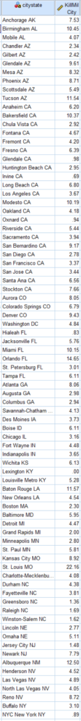
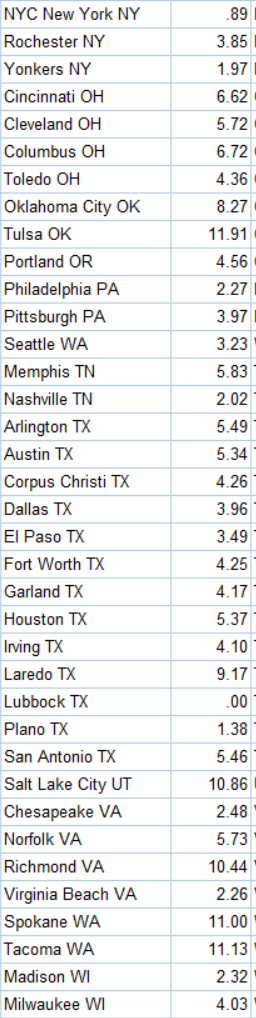
    [Update] Here are the rates for every city in America with more than 200,00 people. Because somebody asked requested. This is the annual rate of people shot and killed by cops (2015-2019) in this city. Rate per million.

    Here’s county data. (Sorted by state, then city). Here I am including more data because I’m not confident about these rates. What is correct is the number of people killed by the agency in 5 years (Avg1yrKillAgcy). I’m not certain about the rate (KillMilAgcy) because I’m not certain about the population policed (Or the number of cops). If you know better, let me know.

    2020 caveat.

    Here’s some fancier statistical regression courtesy of Professor Gabriel Rossman. This is a work in progress.

    I think we get a few things from the Poisson:

    1. The satisfaction that it’s done right, or at least that it’s less wrong.
    2. Cops/1000 population is now significant. Given that the specification is technically better, as in the data better fit the model’s assumptions, you can probably trust this, or at least trust it at least as much as you could the OLS of rates
    3. You no longer need to worry about small n and zeroes biasing the models which means that even with a rare event you can include small cases. You no longer need to drop Mayberry from the dataset though obviously data cleaning is a pain with a bunch of small towns.

    12/7/2020 KillMilCity and KillMilAgcy are deaths as police homicides per million population.

    cops <- read_csv(file = "moskos_copshootings.csv")
    ## Parsed with column specification:
    ## cols(
    ##   .default = col_double(),
    ##   citystate = col_character(),
    ##   statecity = col_character(),
    ##   statecounty = col_character(),
    ##   state = col_character(),
    ##   agcy = col_character()
    ## )
    ## See spec(...) for full column specifications.
    glimpse(cops)
    ## Rows: 166
    ## Columns: 30
    ## $ citystate         <chr> "Kansas City KS", "Escondido CA", "Pomona CA", "S...
    ## $ statecity         <chr> "KS Kansas City", "CA Escondido", "CA Pomona", "M...
    ## $ murder1Avg        <dbl> 6.50, 4.50, 14.25, 15.00, 6.66, 1.25, 14.25, 4.00...
    ## $ statecounty       <chr> "KS Wyandotte", "CA San Diego", "CA Los Angeles",...
    ## $ FlagCityCounty    <dbl> 0, 0, 0, 0, 0, 0, 0, 0, 0, 0, 0, 0, 0, 0, 0, 0, 0...
    ## $ spendCapita       <dbl> NA, NA, NA, NA, NA, NA, NA, NA, NA, NA, NA, NA, N...
    ## $ Population        <dbl> 152958, 153073, 153496, 155179, 155503, 155637, 1...
    ## $ cop1K             <dbl> 2.4516534, 1.0125888, 0.9511649, 3.1511996, 1.929...
    ## $ Mur100K           <dbl> 4.2495326, 2.9397738, 9.2836295, 9.6662564, 4.282...
    ## $ BlkPer            <dbl> 23.5, 2.4, 6.0, 20.9, 18.0, 1.7, 24.1, 1.4, 1.3, ...
    ## $ HisPer            <dbl> 29.9, 51.9, 71.5, 44.7, 37.5, 17.3, 11.5, 23.1, 7...
    ## $ IncMedHouse       <dbl> 43573, 62319, 55115, 36730, 51917, 131791, 53007,...
    ## $ KillMilCity       <dbl> 9.152839, 1.306566, 5.211862, 0.000000, 3.858446,...
    ## $ KillMilAgcy       <dbl> 7.845291, 1.306566, 2.605931, 0.000000, 2.572298,...
    ## $ state             <chr> "KS", "CA", "CA", "MA", "FL", "CA", "TN", "CO", "...
    ## $ EastWest          <dbl> 2, 2, 2, 1, 1, 2, 1, 2, 2, 1, 1, 2, 2, 2, 2, 2, 1...
    ## $ agcy              <chr> "Kansas City Police Department", "Escondido Polic...
    ## $ Cops              <dbl> 375, 155, 146, 489, 300, 217, 278, 285, 151, 340,...
    ## $ countCity         <dbl> 7, 1, 4, 0, 3, 4, 3, 8, 2, 4, 1, 3, 6, 9, 1, 2, 1...
    ## $ killedByAgency5Yr <dbl> 6, 1, 2, 0, 2, 4, 2, 7, 2, 4, 2, 3, 4, 9, 0, 1, 1...
    ## $ CopsKill1Yr       <dbl> 0.003200000, 0.001290323, 0.002739726, 0.00000000...
    ## $ CopsKill20Yr      <dbl> 0.06400000, 0.02580645, 0.05479452, 0.00000000, 0...
    ## $ Murder4yrTotal    <dbl> 26, 18, 57, 60, NA, 5, 57, 16, 113, 244, 21, 32, ...
    ## $ LEO               <dbl> NA, 209, 269, NA, 394, 282, 342, 409, 204, NA, 40...
    ## $ Civs              <dbl> NA, 54, 123, NA, 94, 65, 64, 124, 53, 250, 88, 11...
    ## $ unique            <dbl> 26448, 19403, 24380, NA, 26303, 350, 25627, 27185...
    ## $ zip               <dbl> 66111, 92027, 91768, NA, 33024, 94089, 37042, 802...
    ## $ lat               <dbl> 39.11662, 33.14459, 34.05056, NA, 26.02650, 37.39...
    ## $ long              <dbl> -94.81942, -117.03364, -117.82068, NA, -80.22943,...
    ## $ `filter_$`        <dbl> 1, 0, 0, 0, 0, 0, 0, 1, 0, 0, 0, 0, 0, 1, 0, 0, 0...

    Replicate post

    Reasonably good match for Moskos’s 7/5/2020 blog post but numbers aren’t exact. Perhaps it’s minimum population of 100,000 (blog) vs 150,000 (this notebook). Alternately may be a counties issue.

    summary(lm(data=cops,KillMilCity~IncMedHouse+ BlkPer + Mur100K + cop1K + HisPer))
    ## 
    ## Call:
    ## lm(formula = KillMilCity ~ IncMedHouse + BlkPer + Mur100K + cop1K + 
    ##     HisPer, data = cops)
    ## 
    ## Residuals:
    ##     Min      1Q  Median      3Q     Max 
    ## -6.3049 -1.6853 -0.1688  1.5078  9.7141 
    ## 
    ## Coefficients:
    ##               Estimate Std. Error t value Pr(>|t|)    
    ## (Intercept)  8.333e+00  1.347e+00   6.185 5.05e-09 ***
    ## IncMedHouse -4.975e-05  1.434e-05  -3.469 0.000673 ***
    ## BlkPer      -1.288e-01  2.242e-02  -5.742 4.61e-08 ***
    ## Mur100K      2.752e-01  3.707e-02   7.423 6.53e-12 ***
    ## cop1K       -2.078e-02  3.636e-01  -0.057 0.954492    
    ## HisPer      -1.659e-02  1.220e-02  -1.360 0.175703    
    ## ---
    ## Signif. codes:  0 '***' 0.001 '**' 0.01 '*' 0.05 '.' 0.1 ' ' 1
    ## 
    ## Residual standard error: 2.782 on 159 degrees of freedom
    ##   (1 observation deleted due to missingness)
    ## Multiple R-squared:  0.3511, Adjusted R-squared:  0.3307 
    ## F-statistic: 17.21 on 5 and 159 DF,  p-value: 1.368e-13
    cops %>% ggplot(aes(x=KillMilAgcy)) + geom_histogram() + labs(x='Police Homicides Per Million Population', caption='Agency, not city')
    ## `stat_bin()` using `bins = 30`. Pick better value with `binwidth`.
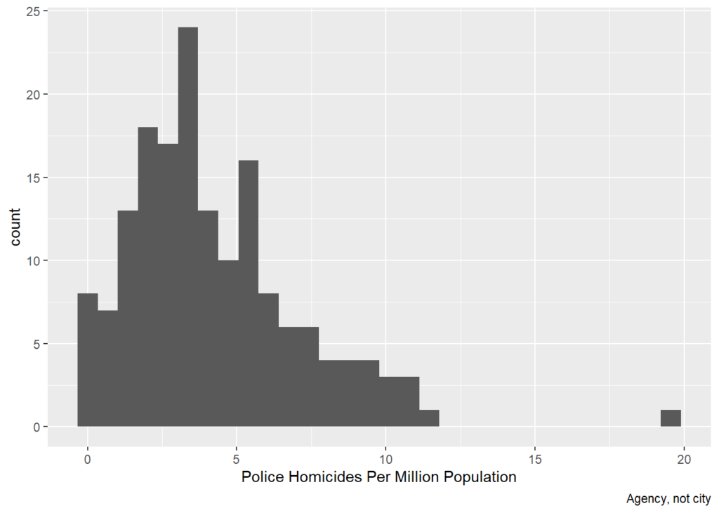
    cops %>% ggplot(aes(x=killedByAgency5Yr)) + geom_histogram() + labs(x='Police Homicides Over 5 Years, Raw Count', caption='Agency, not city')
    ## `stat_bin()` using `bins = 30`. Pick better value with `binwidth`.
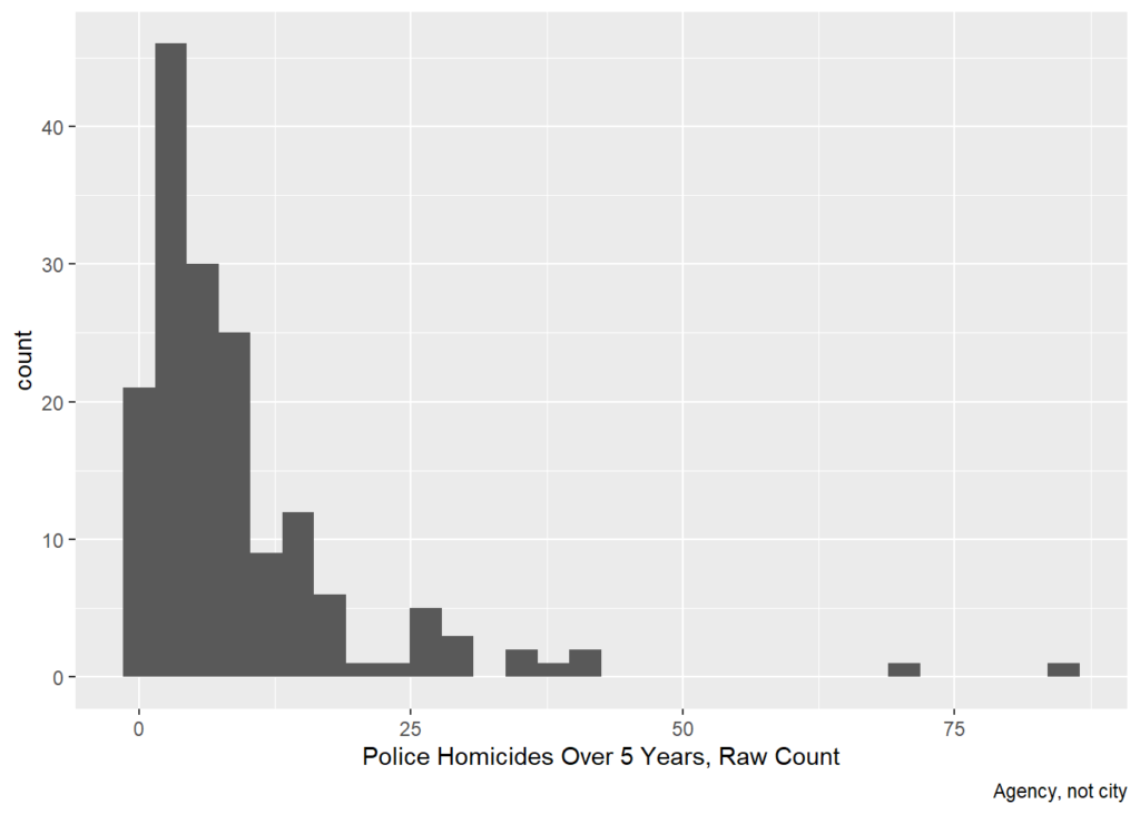
    cops %>% ggplot((aes(x=cop1K,y=killedByAgency5Yr,size=Population))) + 
      geom_point() +
      labs(x='Number of Cops / 1000 Population',y='Police Homicides Over 5 Years, Raw Count')
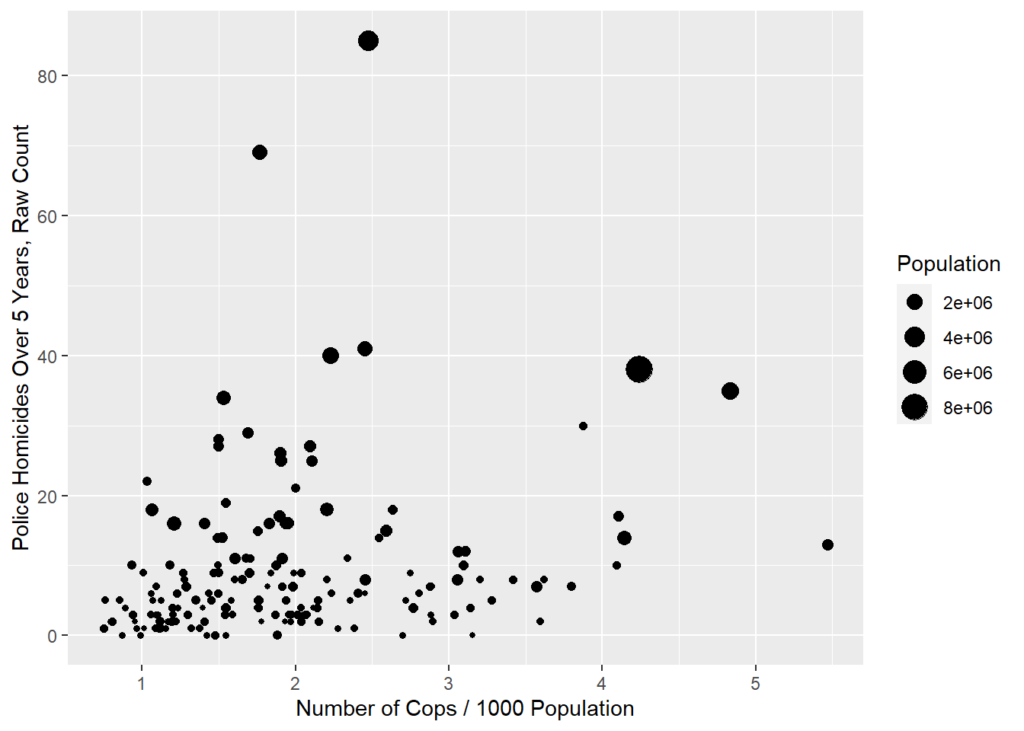
    cops %>% ggplot((aes(x=Population,y=cop1K))) + 
      geom_point() +
      labs(x='Population',y='Number of Cops / 1000 Population')
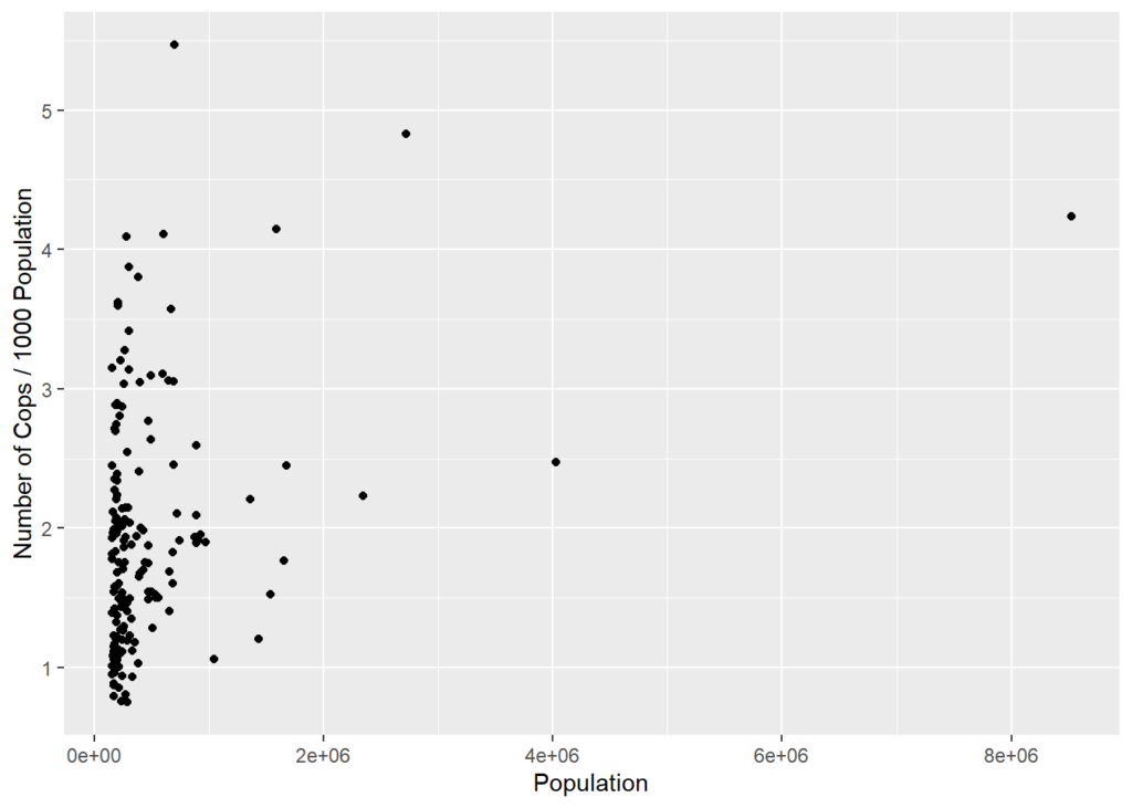
    Poisson

    Because police homicides are events, they can be modeled with a count model. Assuming the events are independent net of observables, a Poisson is appropriate. This seems consistent with the histogram. If the histogram were much more right-skewed or if there were strong theoretical reasons to think police homicides were not independent, then a negative binomial could be appropriate.

    Because cities/ agency jurisdictions vary wildly in size, it’s best to include population as an offset to model the different exposure. That is, more people means more people at risk of getting shot by cops and the model accounts for that.

    Compared to the OLS analysis of rates, the Poisson analysis of counts is similar but now everything is significant, including number of cops and percent Latino, both of which are negatively associated with the counts of police homicides.

    summary(glm(killedByAgency5Yr~IncMedHouse+ BlkPer + Mur100K + cop1K + HisPer + offset(log(Population)),
                data=cops,family="poisson"))
    ## 
    ## Call:
    ## glm(formula = killedByAgency5Yr ~ IncMedHouse + BlkPer + Mur100K + 
    ##     cop1K + HisPer + offset(log(Population)), family = "poisson", 
    ##     data = cops)
    ## 
    ## Deviance Residuals: 
    ##     Min       1Q   Median       3Q      Max  
    ## -3.9061  -1.2174  -0.1628   0.9152   3.3863  
    ## 
    ## Coefficients:
    ##               Estimate Std. Error z value Pr(>|z|)    
    ## (Intercept) -9.609e+00  1.748e-01 -54.973  < 2e-16 ***
    ## IncMedHouse -1.068e-05  2.140e-06  -4.993 5.95e-07 ***
    ## BlkPer      -2.789e-02  3.018e-03  -9.242  < 2e-16 ***
    ## Mur100K      5.070e-02  3.583e-03  14.149  < 2e-16 ***
    ## cop1K       -2.050e-01  3.459e-02  -5.926 3.10e-09 ***
    ## HisPer      -5.088e-03  1.536e-03  -3.312 0.000925 ***
    ## ---
    ## Signif. codes:  0 '***' 0.001 '**' 0.01 '*' 0.05 '.' 0.1 ' ' 1
    ## 
    ## (Dispersion parameter for poisson family taken to be 1)
    ## 
    ##     Null deviance: 654.06  on 164  degrees of freedom
    ## Residual deviance: 369.63  on 159  degrees of freedom
    ##   (1 observation deleted due to missingness)
    ## AIC: 960.63
    ## 
    ## Number of Fisher Scoring iterations: 4

    Percent Black vs Murder Rate

    There is a 0.772 correlation between % black and the murder rate, which suggests possible collinearity. As such,

    Note that the murder only version has a lower AIC so if forced to choose that’s the better model. Also note that when only one at a time is included, murder remains positive and black remains negative. Whatever is driving the murder and black effects, it is not collinearity.

    cops %>% ggplot((aes(x=BlkPer,y=Mur100K,size=Population))) + 
      geom_point() +
        labs(x='Percent Black',y='Murders per 100,000')
    ## Warning: Removed 1 rows containing missing values (geom_point).
    cops %>% ggplot((aes(x=Mur100K,y=killedByAgency5Yr,size=Population))) + 
      geom_point() +
      labs(x='Murder Rate',y='Police Homicides, Raw Count')
    ## Warning: Removed 1 rows containing missing values (geom_point).
    cops %>% ggplot((aes(x=BlkPer,y=killedByAgency5Yr,size=Population))) + 
      geom_point() +
      labs(x='% Black',y='Police Homicides, Raw Count')
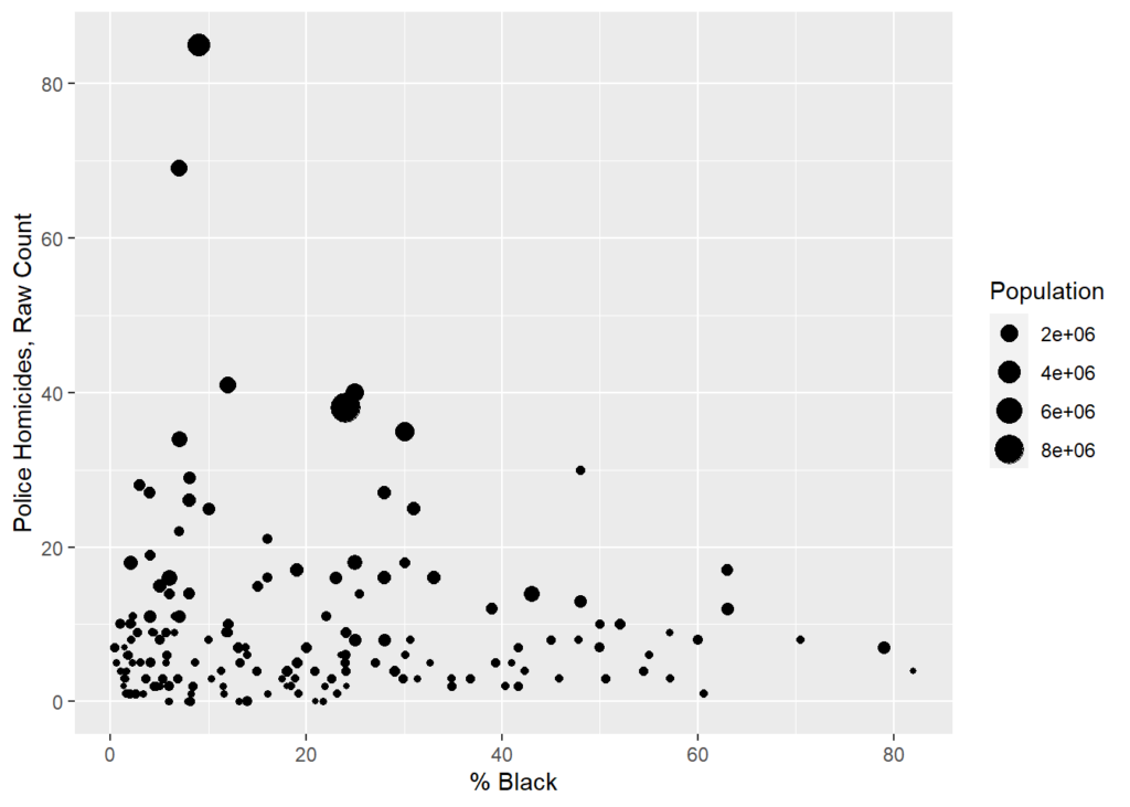
    summary(glm(killedByAgency5Yr~IncMedHouse+ Mur100K + cop1K + HisPer + offset(log(Population)),
                data=cops,family="poisson"))
    ## 
    ## Call:
    ## glm(formula = killedByAgency5Yr ~ IncMedHouse + Mur100K + cop1K + 
    ##     HisPer + offset(log(Population)), family = "poisson", data = cops)
    ## 
    ## Deviance Residuals: 
    ##    Min      1Q  Median      3Q     Max  
    ## -4.068  -1.450  -0.369   1.020   4.553  
    ## 
    ## Coefficients:
    ##               Estimate Std. Error z value Pr(>|z|)    
    ## (Intercept) -1.015e+01  1.696e-01 -59.874   <2e-16 ***
    ## IncMedHouse -5.010e-06  2.025e-06  -2.474   0.0134 *  
    ## Mur100K      3.071e-02  3.195e-03   9.612   <2e-16 ***
    ## cop1K       -3.397e-01  3.132e-02 -10.846   <2e-16 ***
    ## HisPer       1.663e-03  1.378e-03   1.207   0.2274    
    ## ---
    ## Signif. codes:  0 '***' 0.001 '**' 0.01 '*' 0.05 '.' 0.1 ' ' 1
    ## 
    ## (Dispersion parameter for poisson family taken to be 1)
    ## 
    ##     Null deviance: 654.06  on 164  degrees of freedom
    ## Residual deviance: 458.59  on 160  degrees of freedom
    ##   (1 observation deleted due to missingness)
    ## AIC: 1047.6
    ## 
    ## Number of Fisher Scoring iterations: 5
    summary(glm(killedByAgency5Yr~IncMedHouse+ BlkPer + cop1K + HisPer + offset(log(Population)),
                data=cops,family="poisson"))
    ## 
    ## Call:
    ## glm(formula = killedByAgency5Yr ~ IncMedHouse + BlkPer + cop1K + 
    ##     HisPer + offset(log(Population)), family = "poisson", data = cops)
    ## 
    ## Deviance Residuals: 
    ##     Min       1Q   Median       3Q      Max  
    ## -7.4545  -1.3608  -0.2578   1.0028   7.3989  
    ## 
    ## Coefficients:
    ##               Estimate Std. Error z value Pr(>|z|)    
    ## (Intercept) -9.177e+00  1.750e-01 -52.428  < 2e-16 ***
    ## IncMedHouse -1.642e-05  2.183e-06  -7.524 5.33e-14 ***
    ## BlkPer      -6.959e-03  2.518e-03  -2.764  0.00572 ** 
    ## cop1K       -1.973e-01  3.238e-02  -6.094 1.10e-09 ***
    ## HisPer      -4.604e-03  1.548e-03  -2.973  0.00295 ** 
    ## ---
    ## Signif. codes:  0 '***' 0.001 '**' 0.01 '*' 0.05 '.' 0.1 ' ' 1
    ## 
    ## (Dispersion parameter for poisson family taken to be 1)
    ## 
    ##     Null deviance: 654.55  on 165  degrees of freedom
    ## Residual deviance: 533.19  on 161  degrees of freedom
    ## AIC: 1125.7
    ## 
    ## Number of Fisher Scoring iterations: 5
  • More on state differences in cops shooting people

    Inspired by some twitter threads — mostly this onewith Gary Cordner and this onewith Andrew Wheeler — I thought I’d look more at the cops getting killed as a factor in cops killing people.

    I like presenting this stage of research. In part because coming up with ideas and hypotheses and basic number crunching is what I like doing most. (I’ll leave the journal article submitted and advanced stats to others.) I’ll explain my steps partly to help others, but also to help me go through this on the old assumption that if you can’t explain it to others clearly, you don’t really understand it yourself. (I used Excel and PSPP.)

    I’m always partial to fewer better-data over more bad-data. So, as I often do, I’d like to stick with good old murder: officers shot and killed on duty (from the officer down memorial page, which over the years I’ve found close to faultless, which is more than one can say for the UCR or anything else.)

    The problem (from a statistical not a moral sense) is that there are many states in which very few officers are killed. So I went back to gather 20 years of data (for no particular reason, just a choice, it could have been 10 or 30) and got the number of officers killed between 1999 and 2018, by gunfire, for each state. 50 states. 990 total deaths. I dropped the states where n < 10. That leaves 33 states. Texas and California top the list, which isn’t surprising because they’re big states. But then come Georgia, Florida, and Louisiana. Interesting…

    But what’s the best denominator? I mean obviously one needs to look at population to get a rate. But which population? In order, I’m going to consider 1) number of cops, 2) population levels, and 3) violent crime levels, 4) population density, and 5) percent of population that is African American.

    1) Perhaps we should look at cops killed in terms of how many cops there are in any given state, so as to consider the chance of any given cop being killed on duty. Makes sense to me, the problem is that the official data even on how many cops there are looks dodgy. It seems unlikely to me, for instance, that Mississippi went from 5,222 cops in 2007 to 2,524 in 2014 (the two years anybody attempted to count, but reporting is voluntary). If I don’t trust the data, I don’t want to use it. But I still did the numbers, based on the average between 2007 sworn officers and 2014 sworn officers.

    For presentation purposes, let’s use the USA average (using all 50 states) as a baseline, set that to 0, and compare all the states:

    Cops are more likely to be killed in MS, LA, AR NM, SC, GA, and AZ. Keep in mind the small and safe states have been removed from the calculation. I don’t like this. If nothing else because I don’t trust the Mississippi numbers.

    2) So let’s just use overall population as the denominator. I’m using 2016 population because that’s what I already have in my file. Some states have grown a lot in the past 20 years. Oh, well. I don’t think it matters that much for these purposes. If it does, we can consider it later. Keep in mind these are ratios, the actual numbers by themselves are meaningless. But as a ratio, yes, a value of 1 means a cop is twice as likely to be killed per capita. It does appear that a cop in Louisiana is about 4 times as likely to be shot and killed as a cop in New Jersey.

    This says that Louisiana, by far, is the most dangerous state to police in. Arizona is next. And given that its population has grown drastically in the past 20 years, it should really be higher. And that would make LA seem like less of an outlier.

    New Jersey, Massachusetts, and New York are all comparably safe. I won’t say the safest because the 17 safest (and smallest) states have all been dropped for the statistical reason of having fewer than 10 cops murdered over the past 20 years.

    I think number 2 (population) is better than number 1 (number of cops). But they’re not drastically different. You get the same states on top and the same states on bottom. But I’m going with state population as the denominator because I don’t trust the count of cops.

    3) Now let’s consider violent crime as an independent variable (which is the variable that affects something else, on which something else is dependent). And back to using all 50 states.

    I just got some crude numbers off wikipedia and then took an average of 5 years of data for each state. (Not the best methods, but probably accurate. Certainly fine for preliminary work.)

    Let’s run some correlations. I like correlations because they’re easy to understand. They also tell you where you should look for deeper answers.

    First question: at the state level, is violent crime rate correlated with cops getting killed? Absolutely (Pearson Correlation = .62, Sig = .000). This is a strong and unsurprising relationship.

    Next, at the state level, is violent crime correlated with being killed by cops? Surprisingly, technically, statistically, no. (correlation = .23 sig = .104) Not at the state level; not with an N of 50. Now I know from other research that violent crime is correlated with being killed by cops, but you’ve have to delve down into the neighborhood level to see that effect. But still, if it that doesn’t come out at the state level, it’s a clue that something else is also at work! This is where things get interesting. Something else is also at play on a state level that is more significant than straight-up levels of violent crime.

    4) What about geographic area? This is where wikipedia is great because you can get state size in seconds. And then if you already have population and you’re handy with cut-and-paste and sorting on spreadsheets, you can get population density in minutes.

    And it turns out the population density is indeed correlated with a lot.

    Lack of density — more space — is correlated with being more likely to be killed by cops. Think of what this means. Common sense tells you it’s not a view of “big sky country” that makes cops shoot someone. Whatever really matters, is correlated to density (or lack thereof). Maybe it’s single person patrol. Or the time for backup to arrive. Or meth labs. Or gun culture. This is why they say “correlation doesn’t equal causation” (which is also the most frustrating phrases in social science, because correlation can very much indicate causality, and the phrase is often used to dismiss meaningful correlations as meaningless.)

    Population density (lack thereof) is also correlated with cops being killed. Density is not at all correlated with crime (like not even leaning in one direction). And yet both crime and density are heavily correlated with a lot of other factors. And both are correlated with cops being killed. More crime = more cops killed; more density = fewer cops being killed.

    So now lets do a brief multivariate analysis, which is about as far as I go. This means that we look at more than variable at the same time. Which is more important (plays a greater role) in cops being shot and cops shooting people? Crime or density? (Or something else.)

    Density seems to be more predictive than crime in terms of cops killing people and less important in terms of cops being killed (though for the latter both are correlated).

    When I move “cops killed” to the independent variable side and keep a focus on people killed by cops, density becomes less important and violent crime becomes more important. This makes intuitive sense. Because the issue with a spread out area is that cop, alone, would face greater threats.

    Keep in mind the above is about cops being killed. Much more talked about (by non cops) is people killed by cops. I wrote about that a few days ago.

    If you’re still with me, kudos. Causes here’s where the whammo happens!

    Were one to only look at individual variables, the key would seem to be density followed by crime and rate at which cops are killed. But it turns out that much of what is measured in those variables are simply correlated with and less important than the percentage of black population in a state. Crime matters. Police being killed matters (independently of violent crime), population density may matter a little, and of course other variables that I’m not even looking probably matter a lot. The question is always if they can be identified and accurately quantified.

    Last year I observed that cops shoot more often in states that have fewer blacks. So I already had a strong hunch to look in this direction.

    When one puts the state’s percentage of African-American residents into the equation, things start to fall into place. This is also taking into account how often cops get shot, crime, and density (which finally starts to lessen in importance — because as we know is only indicative of other factors — but still probably important in terms of gun laws and culture and police-backup).

    If one considers crime, density, and black percentage — but only when one does so all together — all three are significant (with an R-squared of .55). When one adds the rate at which cops are killed, r-squared goes up to .62.

    [R-squared is technically the distance (squared to take account of negative numbers) that data points are from the trend line of a chart. At some level, r-squared is supposed to indicate how much of what is being looked at is explained by the independent variables in the statistical regression. But that’s more in a statistical sense than a real-world sense. Still, generally, other things being equal, a high r-squared is better than a low r-squared. And an r-squared of 0.63 ain’t shabby for this kind of game.]

    So what does all this mean? Density matters, but not so much for what it is but for things correlated with it (same could be said for race). All these variables have “intervening variables,” the way people act, the choices they make, the factors that make us do what we do. Things that may be harder to measure than crude indicators like “population density” and “race.”

    Still, looking a these variables, density seems mostly to correlate with the lack of African-American in a state. The black percentage of a state seems to be the most significant factor in determining how many people are shot and killed by police (with overall violence and cops being killed also being important). But, contrary to what many people believe — and basically all of the “narrative” of the past few years — the relationship is inverse. The greater the percentage of blacks in a state, the less likely cops are to shoot and kill people.

    This is counter-intuitive to a lot of people, particularly if you think cops only shoot black people. But it makes perfect sense if one thinks about it in two parts:

    1) Whites don’t really care about who police shoot; period; end of story. And without the pressure over bad (or even good) police-involved shootings, cops never learn how to shoot less. Other things being equal, cops simply shoot more people if there isn’t any push-back from (to over-generalize) blacks and liberals and media and anti-police protesters. Call it the Al Sharpton Effect, if you will. Basically, in many places, police organization and culture do need to be pressured into changing for the better.

    2) Police can be recruited, trained, and taught to less often use legally justifiable but not-needed lethal force less. The state variations in police use of lethal force are huge. Some states (and particularly jurisdictions within states) do it better than others. Instead of saying “police are the problem” we could look at the states and cities and department that are doing it better and learn.

    Ultimately what we need are well and better trained police officers who shoot less often, but still shoot when needed.

    I’ll leave you one final bit of data. I don’t know if there’s a there here or not. My guess is this does matter. But maybe it’s just a clue that leads to the above. Or maybe it’s something else. Maybe you can figure it out.

    This is a table that shows a simple ratio: the number of citizens killed for each cop killed. Good people can debate what this ratio should be. I don’t want to go there. The correct ratio is no cops getting killed and few criminals getting killed. But what’s interesting to me is the that there is such a large difference between the states, and by a factor of 10! By and large the states on the high-end (more citizens getting killed) are very white and the states on the low-end (fewer citizens getting killed) are disproportionately black.

    Take Oklahoma. Cops in Oklahoma are not getting killed a lot, per capita or per number (0.6 per year over the past 20 years). There’s not a lot of violent crime, and yet in the past 4 years cops in Oklahoma have killed 118 people. Again, I don’t want to get into what the correct ratio is, but seeing how the national average is 20 civilians-to-cops shot and killed, and seeing how some states are down under 10, why the hell is Oklahoma pushing 50?

    Louisiana cops are getting shot at and killed three-times more often than cops in Oklahoma (and 8 times more often than cops in New Jersey). Both Oklahoma and Louisiana cops shoot a lot of people. But in Louisiana, dare I say, they have good reason to.

  • Pushing the Ideological Narrative

    Pushing the Ideological Narrative

    I updated the Brennan Center’s crime report from 2016, to update it for 2018. I still have this urge to show how goofy their methods are. Why? Because, the authors are still cited by reputable journalists as experts, despite never acknowledging or correcting their past efforts to intentionally mislead journalists and the public. It’s advocacy data-analysis. It’s unethical, wrong, and harmful to the cause of truth.

    Here’s my parody of the Brennan Center style, adopted for 2019. The numbers I use are actually accurate, based on the best available city-data. The logic and conclusions and push, however, are just as absurd.

    Crime in 2018: Final Year-End Data

    Chicago accounted for more than 34 percent of the murder decrease last year, according to a new analysis of crime data based on faulty methods often used by the Brennan Center.

    January 4, 2019

    This analysis finds that Americans are less safe today than they have been at almost any time since 2014.

    Based on new year-end data collected from the 30 largest cities, murder in 2018 remained higher than just 4 years ago. Although there are some substantial decreases in murder in specific cities, these trends do not signal the start of a new national crime drop. What’s more startling, this analysis finds that the decrease in murders is even more concentrated than initially expected. Just three cities — Baltimore, Chicago, and Columbus — accounted for more than half (59.9 percent) of the decrease in murders. Chicago alone now accounts for more than 34.3 percent of the total decrease in urban murders.

    Final Year-End Findings:

    • The murder rate fell in this group of cities last year by 7 percent.

    • Amazingly, Chicago accounted for 34.4 percent of the total decrease in urban murders.

    • Three cities — Baltimore, Chicago, and Columbus — accounted for more than half (59.9 percent) of the decrease in murders.

    • Some cities are experiencing a decrease in murder while other forms of crime remain relatively high. Celebration about a national crime drop are premature, but these trends suggest a need to understand how and why murder is decreasing in these cities.

    Highlights of this style (faulty logic obscured by dressed-to-impress layout, footnotes, and statistical concepts).

    1) The murder rate fell in this group of cities last year by 7 percent.

    * “In this group of cities” added only when called out. http://www.copinthehood.com/2017/07/two-year-increase-in-homicide.html

    2) Amazingly, Chicago accounted for 34.4 percent of the total decrease in urban murders.

    *Note: this simply is not true. But is a reflection of only looking at a number cities.

    3) Three cities — Baltimore, Chicago, and Columbus — accounted for more than half (59.9 percent) of the decrease in murders.

    *This is true when one includes the caveat “of the sample used.” And if one includes this caveat, the statement is statistically worthless.

    4) Celebration about a national crime drop are premature — America remains much more violent than just 4 years ago — but these trends suggest a need to understand how and why murder is decreasing in these cities.

    *If you cherry pick the baseline year, you can say anything!

    One lesson is always be suspicious of data presentation. Is somebody pissing on your leg and saying it’s raining? Trust your gut or your “lying eyes.” When crime is up and people say it’s not, be wary. But use the same vigilance when crime is down and people say “be afraid!”

    Know your source, if possible. Assuming people aren’t just making numbers up, see when people use one form of logic when data go one way, but sing another tune when the same data go in the opposite direction. (Could be crime, the stock market, gas prices, etc.)

    Luckily, murder really was down in 2018. I wouldn’t want to waste your time pretending otherwise.

  • Still trying to explain…

    Still trying to explain…

    What’s wrong with the Brennan Center’s analysis? There are many problems. But here are a few:

    1) They take a non-random sample (which isn’t bad in and of itself) and then A) don’t tell the reader in the text and B) state conclusions as if the sample were a random sample (every data point equal chance of being picked), representative of the nation.

    2) They take short time frames (1 year) to point out that fluctuations could be random. True. For a short time frame. They could take a longer time frames (3 years) and see more clearly developed patterns.

    3) This is bit trickier to explain. And that’s why I’m giving it another shot. They base their findings on a magnitude of changes within their sample. This has the perverse effect of attention getting conclusions — “more than half” — that are noteworthy only in direct proportion to the limitations of their sample.

    Let’s take an analogy. Say they want to look at murder in the City of Moskopolis (a fine city, despite a bit of a crime problem). So they take a sample of three police districts (out of ten equally sized police districts). Now it just so happens that we already know that murder in Moskopolis is up 20 percent. But our study looks at District #1, where murder is up 30 percent, and District #2, where murder is up 10 percent.

    Now maybe District #1 is important for its own reasons. “Murder is up 30 percent in District #1.” No problem there. Or maybe, the mayor of Moskopolis prefers to give a bit of spin: “Murder is up 30 percent in District #1, but not so much in rest of city.” That’s fine, too.

    But you can’t say this: “District #1 accounts for 75 percent of the murder increase in Moskopolis.” This is not true. It is false. District #1 accounts for 15 percent of the city’s murder increase.

    So some guy who has a stick up his ass about accurate data (me, even though I really do have better things to be doing with my time) gets all huffy and points out this inconvenient truth to the Washington Post, which listens to me because I’m generally a trustworthy guy.

    So the Washington Post calls the authors and says, “What’s up?”

    “Oh,” they say. “I’m sorry. I was talking about 75 percent in my sample. Did I not make that clear?”

    No. You did not. The Washington Post dutifully makes the correction and updates the story: “District #1 accounted for 75 percent of the murder increase in two districts.”

    This is now no longer a false statement, but it’s a still meaningless one. Who cares about what percentage of change there is in one district in my sample? Why are we talking about two districts when we could be talking about six, eight, or even all ten of them. And here’s a doozy: What if murder went down in District 2? Could District #1 account for more than 100 percent of the increase in my sample? Mathematically, yes, says my calculator. But statistically an increase of 100 percent is absurd. Methodologically, this should be a big red flag.

    Anyway, Moskopolis is still a fine place. And indeed, we shouldn’t overreact to an increase a murder. But if the mayor says murder isn’t up, perhaps you shouldn’t believe the mayor.

  • Data presentation and the crime rise in Baltimore

    Data presentation and the crime rise in Baltimore

    Data presentation fascinates me because it’s both art and science. There’s no right way to do it; it depends on both hard data, good intentions, and interpretive ability. Data can be manipulated and misinterpreted, both honestly and dishonestly. And any chart is potentially yet another step removed from whatever “truth” the hard data has.

    Where I’m going isn’t exactly technical, but there’s no point here other than data presentation and honest graph making (and also crime being f*cking up in Baltimore after the riots, but that’s not my main point). If that doesn’t interest you, stop here. [Update: Or jump to the next post.]

    I took reported robberies (all), aggravated assaults, homicides, and shootings from open data from 2012 to last month. I then took a simple count of how many happen per day (which is strangely not simple to simple to analyze, at least with my knowledge of SPSS and excel). You get this.

    It takes a somewhat skilled eye to see what is going on. Also, since the day of riot is so high (120), the y axis is too large. With some rejiggering and simply letting that one day go off the scale unnoticed, you get this.

    It’s still messy, but is the kind of thing you might see on some horrible powerpoint. Things bounce up and down too much day-to-day. And there are too many individual data points. Nobody really cares that there were more than 60 one day in July 2016 and less than 5 in early 2016 (I’m guessing blizzard). It’s true and accurate, but it’s a bad chart because it does poor job of what it’s supposed to do: present data. Again, a skilled eye might see there’s a big rise in crime in 2015, but the chart certainly doesn’t make it easy.

    Here’s crimes per day, with a two-week moving average. A moving average means that for, say September 7, you take Sep 1 through Sep 14 and divide by 14. Why take an average at all? Because it smooths out the chart in a good way. It’s a little less accurate literally but much more accurate in terms of what you, the reader, can understand. One downside is that the number of crimes listed for September 7th isn’t actually that number of major crimes that happened on that day. You can see why that might be a big deal in another context. But here it isn’t.

    For a general audience it’s not clear what exactly the point is. You still have lots of little ups and downs, and the seasonal changes are an issue. (Crimes always go up in summer and down in winter. And it’s not because of anything police do. And it’s nothing do to with the non-fiction story I’m trying to tell.) On the plus side, you do see a big spike in late April, 2015, after the riots and the absurd criminal prosecutionof innocent Baltimore cops. But it needs explaining.

    Also, you need some buffer for the data. The bigger the average, the more of a buffer you need. But for this I think this is one perfectly fine way to present these data, at least for an academic crowd used to charts and tables.

    Another tactic is to take the average for the past year. Jeff Asher on twitterover at 538.comdoes good work with NOLA crime and is a fan of this. It totally eliminates seasonal issues (that’s huge) and gives you a smooth line of information (and that’s nice).

    You can see a drop in crime pre-riot (true) and a rise in crime post-riot (also true). That’s important. Baltimore saw a drop in crime pre-2015 that wasn’t seasonal. It was real. And the rise afterward is very real. But there are two problems with this approach: 1) you need a year of data before you get going and 2) everything is muted. What looks like a steady rise (the slope since 2015) is actually a huge rise. But it looks less severe than it is because it takes an average from the previous year. But that’s not exactly true. Crime went up on April 27, 2015. And basically stayed up, with a slight increase over time.

    Here’s my problem. I want to show the rise in crime post-riot. But I want to do so honestly and without deception. But yes, for the purpose of this data presentation, I have a goal. (My previous attempts were pretty shitty.)

    Also, you need at least a year of data before you can graph anything. That’s a downside.

    Here’s my latest idea. If one is looking at a specific date at which something happened — in this case the April 27, 2015 — and trying to eliminate seasonal fluctuations, why not take the yearly average for the previous year before that time and the yearly average after that date for dates after that time? I think it’s kosher, but I’m not certain.

    Here’s how that works out:

    This shows the the increase that was real and immediate. And as minor point I like the white line on the day of the riot, which I got from removing April 27 from the data (because it was an outlier).

    Now if I wanted to show the increase in more stark form, I would move the y axis to start at 20. But being the guy I am, I always like to have the y-axis cross the x-axis at 0. That said, if the numbers were higher and it helped the presentation of data, I have no problem with a y-axis starting at some arbitrary point.

    Take into account that graphs are like maps. While very much based on truth, they exist to simplify and present selected data. I mean, you can have my data file, if you want it. But I do the grunt work so you don’t have to. But of course my reputation as an academic depends on presenting the data honestly, even though there’s always interpretation (e.g.: in the case of a map, the world, say scientists, isn’t flat). The point, rather, is if the interpretation honest and/or does the distortion serve a useful purpose (In the case of the Mercator Projection it was sea navigation; captains didn’t gave a shit about the comparative size of the landmass of Greenland and Africa.)

    So taking an average smooths out the line of a chart, which is a small step removed from the “truth,” but a good stop toward a better chart. It’s not a bad approach. But it tends to mask quick changes in a slow slope, since each data point in the average for a lot of days. A change in slope in the graph actually indicates a rather large change in day-to-day crime. There are always pluses and minuses.

    If you’re still with me, here’s what you get when just looking at murder. Keep in mind everything up to this point has been the same data on the same time frame. This is different. But homicides matter because, well, along with people being killed, it’s gone up much more than reported crime.

    [My data set for daily homicides (which is a file I keep up rather than from Baltimore Open Data) only goes back to January, 2015. So I don’t have the daily homicide count pre-2015. 2014 is averaged the same for every day (0.5781). This makes the first part of the line (pre April 27, 2015) straighter than it should be. This matters, and I would do better for publication, but it doesn’t change anything fundamentally, I would argue. At least not in the context of the greater change in homicide. Even this quick and imperfect methods gets the major point across honestly. ]

    Update and spoiler alert: Here’s a better version of that chart, from my next post.

  • How to make people care about violence

    How to make people care about violence

    Over at Nola Crime News, Jeff Asher tweeted this graphicjust now.

    Click on it; it moves! So while people are dying, I’m thinking about data presentation. There’s something about a moving line that may make one pay attention to dead people in a way that actual dead people don’t.

    Jeff’s graphic looks at Baltimore City shooting victims over the past 365 days. Each data point tallies the total number of shooting victims over the past 365 day. This nullifies seasonal change, which is worth a lot. But by taking a past-year average, you lose the “BAM” of what happened literally overnight, after six police officers were criminally charged for the death of Freddie Gray. The violence didn’t just “increase.” It stepped up, by two-thirds. Overnight. After April 27, 2015. The visual above indicates a rapid but continuous increase over the course of a year. But it’s still a good visual and can’t think of better one.

    I don’t know how to present a good visual that shows what has happened in Baltimore. In the past I’ve tried with a pre- and post-riot trend line. Not just once, but twice. But that’s hardly convinced the masses that police (or more dead bodies) matter.

    People are already talking about the rise in violence in Baltimore in terms of poverty or drugs or police legitimacy or blah-dee-blah. And sure, all that matters. But stop it! None of that, not any of that, explains the increase in violence. Police because less proactive because A) innocent cops were criminally charged and B) Political pressure (from the mayor, the police commissioner, and the US DOJ) told police to be less proactive as a means to reduce racial disparity in policing. You see it Baltimore. You see it Chicago. You see it in New Orleans. The problem is you’re seeing it basically everywhere.

    Here’s New Orleans, again from Jeff Asher.

    These increases are no joke. This is a “holy shit” type increase in violence. And the chart under-presents the quickness of the increase.

    What happened in New Orleans? I don’t know NOLA as well as Baltimore or New York. But the NOLA PD has seen a 30 percent reduction in manpower and a massive reduction in proactive policing (as measured by drug enforcement. I also suspect the consent decree hasn’t helped police in terms of crime prevention, since, and this is important: crime prevention isn’t one iota of any consent decree. Somehow, crime is supposed to manage itself while police are better managed.

    The only big city of note without an increase in violence is NYC. And even here, people objectto the exact kind of proactive policingthat keeps crime from rising. Luckily, at least in New York, even liberal Mayor de Blasio isn’t listening to the “police are the problem” posse.

  • “A Bird’s Eye View of Civilians Killed by Police in 2015”

    More on the article in Criminology & Public Policy by Nix, Campbell, Byers, and Alpert. My previous post pointed out that if you use 2016 data rather than 2015 data, their conclusions would totally change.

    [Update: also see Nick Selby’s take on this. And David Klinger’s]

    How do we get data on police-involved shootings?

    Trick question. We don’t! A few departments, like the NYPD, issue great annual reports on shots fired by police. But other than that, we don’t know. We don’t know how many people cops shoot. So at best we’re left with those shot and killed by police. And that’s probably less than half of those shot by police.

    When academics call for “more study,” it’s usually a cliché. But the need here is real. We don’t know how many Americans get shot police each year? Are you effing kidding me?!

    Given that, there’s nothing wrong with using the best data you have. And I’m partial to using the Washington Post data myself. But that doesn’t mean the data are good. (By good I mean valid, in that they show what they claim to show.) (I also have a bias problem with their “ticking” counter, like last year’s shootings numbers are still going up. No, dude, every time I click on 2016 data, it’s going to go to 963. You’re not actually compiling the data on the spot.)

    1st question: Is the basic number of people shot and killing by police correct?

    Answer: Probably. It’s an unknown unknown, but we have a lot of reasons to think most killings are here.

    2nd question: Is their coding correct.

    Answer: Depends on what you want. For race, probably. For threat, probably not. The data might be “reliable” (you might get the same code if you did it again). But what does “threat” labeled “other” mean? And how is that different from “undetermined”?

    Others have pointed out to me that reporters don’t have the expertise to judge what experienced police officers are trained to see. There’s a great deal of truth to that. But more importantly, is the Post categorization valid? We don’t know.

    Say somebody gets killed on the street. How does that data get to us?

    Well, in the traditional manner — going from the street to the Uniform Crime Report (UCR) — usually somebody calls 911 cause a crime happened. Some young officer shows up and takes a report. This is a local form, for a local department, not at all coded to the standards requested by the UCR (Hispanic data is a key issue here). The cop writes a report that is collected by their sergeant toward the end of their shift. It well enough written, so it goes up to some supervisor and then to some police data consolidator and then, once a year to the FBI.

    At each stage it might get “cleaned up” a bit, as needed. And then, 9 to 21 months after the incident occurred, it gets published in the UCR index or Part I (or II) crimes. I’ve actually been able to check individual incidents I handled, later, in the UCR data. It checked out. All the facts were basically correct.

    But you only know what the UCR tells you, and it isn’t much. Nevertheless the UCR is considered the “gold standard” of crime data. But it sure ain’t perfect. And it’s particularly bad when it comes to police-involved shootings. Mostly because most departments simply do not report data on those killed by police.

    Because of that, after Michael Brown in Ferguson, the Washington Post (and to a worse extent the British Guardian) said “we’re going to start counting.” Good on them, because nobody else was. [As was pointed out to, and I should have mentioned, killedbypolice was doing it first.] They use whatever they can, which means google searches of news accounts, basically.

    So a cops (or criminal) shoots somebody. Some local reporter (most likely) with a police scanner goes to the scene and files a report. People don’t get killed by police that often. It bleeds, so it leads.

    That reporter either does or does not do a good job. They gather some of the information that seems relevant. But since they weren’t there, they don’t really know happened. It’s called an investigation. Who do you believe? The cops say the guy was armed; his family says he wasn’t. Reporters file a story and then the Washington Post has to decide if the guy was armed. Usually (for good reason) they go with the cop’s version. But what if the cop is lying? Isn’t the crux of the matter? Even if it doesn’t happen much, how would we know? Of course high-profile cases get more investigation.

    Which system is better? Neither. Both. It depends. But no existing data gather system is universal, mandatory, or really gets to the context of the incident.

    But then even more, there’s the subjective recording of data.

    Miscoding threat level

    The Washington Post labels a threat as either “attack”, “other,” or “undetermined.” That’s an odd trichotomy. Police care if a shooting is “justified” or not (aka “good” or “bad”). Courts care if it was criminals or not. The public may care if it were “necessary” or not. These are all different standards. But how can one tell 3rd-hand if a shooting was “good”?

    The article’s authors equate “other” with non-attack. This is wrong.

    Take Paul Alfred Eugene Johnson, who robbed a bank with replica guns.

    He forced the bank employees into the vault at gunpoint, told them he would kill them if they called police, and stole cash, police said shortly after the robbery.

    Surveillance images from both robberies show someone dressed in similar-looking white hooded sweatshirts and carrying guns in their left hands.

    There was a crazy chase. Johnson got out of his car and officers opened fire. I wasn’t there, but I’m willing to call this a justifiable shooting. The threat level in the data is coded as “other,” but in the journal article this gets recoded to “non-attack”? Come on, now.

    Kevin Allen charged at officers with a knife. Kaleb Alexander had a gun he wouldn’t drop. Troy Francis chased his wife and roommate with a knife, and then charged at responding officers. Hashim Abdul-Rasheed, previously not guilty by reason of insanity in an attempted murder case, tried to stab a Columbus, Ohio, police officer and was then shot and killed. Markell Atikins was wanted for the death of a 1-year-old, and then threatened officers with a knife. Tyrone Holman threatened to kill officers with a rifle and a grenade. Joseph Tassinari told an officer he was armed (he was) and then reached for his waistband. Harrison Lambert threatened his father with a knife before officers responded.

    What do all these cases have in common (along with mental illness in most of them)? They’re all categorized as “other” in the threat department. I don’t fault the Washington Post for how they categorize. They may not have proof of attack beyond and officer’s (self-justifying) account. I wish they did better, but they do what they need to do. (And nobody is doing better.) I do fault others who then group all these “others” into “non-attack” (n = 212), implying the cops did wrong.

    I’m more curious about the label of threat called by the Post: “undetermined” (n = 44). Many of the potentially worst shootings are in this category. And yet: “Cases involving an undetermined threat level were excluded from multivariate regression models.” I’m not certain why. Couldn’t you go one by one and look at them? Isn’t that what researchers do? I looked at a few.

    The Post says Robert Leon:

    exchanged gunfire with police, stole another car at gunpoint and fled. was first accused of shooting at cops and then shooting himself.

    This account seems simply to be not true. Further investigation may have revealed that Leon didn’t have a gun and died from police bullets. I wasn’t there. I don’t know. But it sure seems like an odd one to me.

    The “unarmed” issue

    If you’re looking for bad shootings, “unarmed” sure seems like a good place to start. But it’s not enough. “Unarmed” is a flag, but it is no guarantee that a suspect isn’t a lethal threat. Officers have and will be attacked and killed by “unarmed” suspects.

    Some of these cases, like white officer Stephen Rankin killing unarmed black William Chapman, resulted in the officer’s criminal conviction. The Washington Post codes Chapman as attacking the officer. The jury may not have thought so.

    The problem here, one the researchers seemed to have, is that if you look at “unarmed” suspects and those categorized as “non-attack” (the ones that people are most concerned about) you don’t have a large enough n (number of cases) to do statistical analysis.

    In 2015, you’d be down to a grand total of 50 people shot and killed by cops. It’s enough for an outrage of the week, but you can’t do much data analysis with 50 cases. And if you were to use “undermined” rather than “other” as meaning “non-attack” (I think a better but still horribly flawed categorization) you’d be down to a total of 9 cases.

  • What a difference a year makes…

    What a difference a year makes…

    There’s an article in Criminology & Public Policy by Justin Nix, Bradley Campbell, Edward Byers, and Geoffrey Alpert that has gotten some press: “A Bird’s Eye View of Civilians Killed by Police in 2015: Further Evidence of Implicit Bias”

    Although we could not determine whether officers were quicker or more likely to fire their weapon at minority suspects, we argue that if minorities were more likely to have not been attacking the police/other civilians, or [emphasis added*] more likely to have been unarmed, this would indicate the police exhibit implicit bias by falsely perceiving minorities to be a greater threat to their safety.

    I replicated their data and got 93 “unarmed” suspects killed in 2015. (Replicating data should be a given, but often it is not. So kudos to the authors for this.) In 2015, 38 unarmed black men and 32 unarmed whites were shot and killed by police. If the distribution were proportional to all those shot and killed, one would expect 24 blacks and 46 whites killed. This is a statistically significant difference. From this, the authors conclude “Black civilians were more than twice as likely as White civilians to have been unarmed.” Twice sounds big. The absolute number? Not so big. Still, if you’re one of the 38 unarmed black men killed, it matters.

    Here’s armed versus “unarmed” by race (for whites and blacks), for 2015 [click both to “zoom” and “refine”]:

    I also looked at “threat level.” For 2015, I get what the authors get:

    You can see that for the threat = “other” (Ie: non-attack, in theory), one would “expect” to find 49.9 blacks in that square (if race wasn’t a factor). But in reality 63 blacks were killed. That’s a big and statistically significant difference.

    [I’m limiting the presentation of my analysis (as is my wont) to percentages, crosstabs, and univariate correlations. If one can’t describe statistics to a lay-person, it all becomes too abstract. And a problem with doing advanced statistics is then most people don’t understand what they mean (and that includes most academics). And so then the reader has to take the scribe at their word.]

    [Also, I have serious non-trivial issues with categorizing “other” as “non-attack,” but I’ll leave that aside, until my next post. Also, for replication purposes, I too exclude “undetermined” threat level (n = 42), but I don’t think one should. More on that in the next post.]

    Here’s where things get interesting! Unlike the authors, I can publish this in seconds and, for better and for worse, not wait for peer review (though corrections and comments are always welcome).

    So with the click of a button on SPSS (a statistics program), I can include 2016 data and even 2017 data right up to February 8 (when I downloaded the data).

    Here’s what I get when I do their analysis on threat, but for 2016:

    Compared to 2015, in 2016 the results are reversed. This is a big deal. There are fewer blacks in the “other” threat level than one would expect. And the results are equally statistically significant.

    A similar things happens when one looks at armed and unarmed (again, I think this is too simplistic of a division, but that’s what they use).

    Here’s armed versus unarmed by race, for 2016:

    While the data isn’t completely reversed, the differences in 2016 are minor enough (and the “n,” the number of cases, small enough) that the racial disparity is no longer statistically significant.

    What gives? Did the problem of racial disparity in police-involved killings disappear last year? Did it even reverse? I don’t know. But replicating the 2015 study with 2016 data would lead to a very different conclusion.

    Here are some other interesting tidbits.

    • From 2015 to 2016, total shootings deaths by police went down from 990 to 963. Given the increase in homicide, I would have expected the number of police-involves shootings to go up (they are usually correlated). I suspect that the number went down because A) given the focus on the issue of police-involved shootings, cops are less likely to pull the trigger and B) the number of discretionary interactions between cops and criminals has decreased.

    • From 2015 to 2016, killings of unarmed people dropped from 88 to 49. The drop was most pronounced among blacks (35 to 17).

    • Twenty-five percent of those killed by police are known to have pretty major mental health issues. This is a Big Red Flag. No doubt the real number is even higher (undiagnosed mental health issues among the poor, or simply a family that doesn’t want to tell a reporter about it). Implicit racial bias might (or might not) contribute to a dozen or so deaths. Mental health issues contribute to 250 a year! You want to reduce shootings? Provide mental care for people who need it.

    • Seventy-eight percent of 2015 killings (This if from Nix et al.I haven’t recoded the 2016 data) happened in the South and West (with 60 percent of the population). Again, if one wishes fewer people to be killed by police, best to focus where police kill a lot of people.

    • We really need more data, not just on police involved killings, but on all police-involved shootings. A lot of people are shot and not killed. We know next to nothing about this. And we need to know the context of these shootings. How did they start? How many are initiated by a call for service rather than a police officer’s discretion?

    • We really need to be concerned about unintended consequences of policy decision. Perhaps a laser-like focus on police shootings and police misconduct combined with lawsuits against proactive policing really have ended the racial disparity in police-involved shootings. If so, that would be great. It’s just as likely that a laser-like focus on police shootings and police misconduct combined with lawsuits against proactive policing have contributed to less proactive policing and an increase in homicide. (It’s hard to argue one without the other, though people will try. Oh, they will try.) Eighteen fewer unarmed blacks were shot and killed by police in 2016 compared to 2015. Meanwhile, 2,000 more were murdered, most of them black (using the Brennan Center’s estimate of a 13 percent increase in homicide).

    It’s not crazy to see some connection between these two variables: less proactive policing could [ie: does] mean fewer police-involved shootings and also more criminal shootings. Is this the best we can do? Is this the trade-off we want? Can one or should one talk about the value the lives in this way? I don’t know. But since more people are dying (though fewer at the hands of police) these are things we need to be talking about.

    • Also, the number of unarmed Asians killed by police since 2015: Zero (of 30 killed, total).

    [* The use of “or” is interesting. The numbers are really low. Cops just don’t shoot many unarmed unarmed attackers. You can’t really do multivariate analysis on a few dozen cases. Given the number of people killed by police, you can’t look at racial discrepancies (statistically) when the person killed is not-attacking cops and unarmed.]

    [comments are (only) available on the next, related, post.]

  • A Refresher on Regression Analysis

    That’s all. And not a bad refresher at that, by Amy Gallo in Harvard Business Review:

    “You have to go out and see what’s happening in the real world. What’s the physical mechanism that’s causing the relationship? … A lot of people skip this step and I think it’s because they’re lazy. The goal is not to figure out what is going on in the data but to figure out is what is going on in the world. You have to go out and pound the pavement,” Redman says.

    “And if you see something that doesn’t make sense ask whether the data was right or whether there is indeed a large error term…. And, he says, never forget to look beyond the numbers to what’s happening outside your office: “You need to pair any analysis with study of real world. The best scientists — and managers — look at both.”